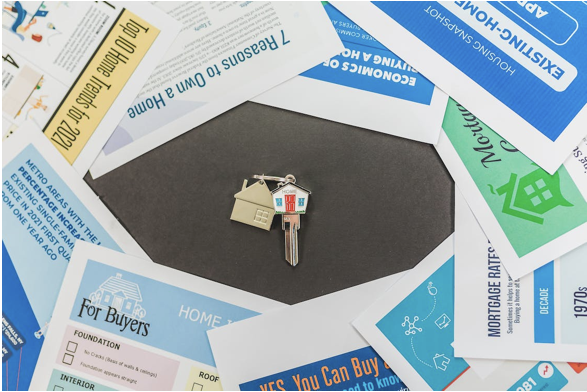
Flyers are a popular and cost-effective way to advertise products, services, events, or businesses. However, in today’s crowded market, it’s not enough to design and distribute flyers randomly and hope they catch someone’s attention. You must create flyers, for example, with a flyer maker like Vista Create, that stand out, grab people’s attention, and effectively convey your message. In this blog post, we will share some tips and strategies for creating flyers to help you achieve your marketing goals.

Define Your Purpose and Audience
Before you start designing your flyer, you need to have a clear understanding of your purpose and audience. Ask yourself, “What is the main goal of your flyer?” “Are you promoting a sale, announcing an event, or introducing a new product?” Knowing your purpose will help you determine the content, design, and layout of your flyer.
Also, you need to know who you’re writing for. What do they want, what do they need, and what hurts them? What makes them want to do something? If you know who you’re talking to, you can make sure your message and style speak to them and grab their attention.
Keep It Simple and Focused
When designing a flyer, less is often more. You want your message to be clear and concise, so people can understand it quickly and easily. Avoid cluttering your flyer with too much text, graphics, or information. Instead, focus on the most important message or benefit you want to convey.
Your headline or title should be short, catchy, and attention-grabbing. Use a large and bold font to make it stand out. Your body copy should be brief and to the point. Use bullet points or numbered lists to highlight the key features or benefits of your product or service.
Use High-Quality Graphics and Images
Images are a powerful tool for grabbing people’s attention and conveying your message visually. Use high-quality graphics and images that are relevant to your message and target audience. Avoid using generic or stock images that look unoriginal or out of place.
Moreover, make sure your images are high-resolution and in a format that is suitable for printing. A blurry or pixelated image can ruin the overall quality of your flyer and make it look unprofessional.

Choose Colors and Fonts Wisely
Colors and fonts can also affect how people perceive your flyer and your brand. Choose colors that are consistent with your brand’s color scheme or that complement your message or product. Avoid using too many colors or bright colors that may overwhelm or distract people.
Similarly, choose fonts that are easy to read and consistent with your brand’s tone and personality. Avoid using too many fonts or fonts that are hard to read or too small.
Include a Call-to-Action
A call-to-action (CTA) is a clear and direct message that encourages people to take a specific action, such as visiting your website, calling your phone number, or making a purchase. Your CTA should be prominently displayed on your flyer and easy to follow.
Use action-oriented language and a sense of urgency to motivate people to take action. For example, “Limited Time Offer,” “Act Now,” or “Call Today.” Also, make sure your CTA is aligned with your purpose and message.
Print and Distribute Your Flyers Strategically
Once you have designed your flyer, it’s time to print and distribute it. Choose a high-quality paper that is suitable for your purpose and budget. You can print your flyers yourself using a printer, or use a professional printing service for a more polished look.
When distributing your flyers, be strategic and targeted. Choose locations where your target audience is likely to be, such as coffee shops, gyms, or community centers. You can also use direct mail, hand-deliver your flyers to potential customers, or post them on bulletin boards.
Moreover, consider partnering with other businesses or organizations that share your target audience or purpose. For example, if you are promoting a fitness class, you can partner with a local gym or health food store to distribute your flyers.
Conclusion
In conclusion, creating flyers that stand out in a crowded market requires careful planning, design, and distribution. Define your purpose and audience, keep it simple and focused, use high-quality graphics and images, choose colors and fonts wisely, include a clear call-to-action, and print and distribute your flyers strategically. By following these tips and strategies, you can create effective and memorable flyers that will help you achieve your marketing goals.
In today’s competitive and crowded market, it’s essential to create marketing materials that stand out and catch people’s attention. Flyers are a popular and cost-effective way to promote products, services, events, or businesses, but designing an effective flyer requires more than just putting together some text and graphics.
