Bento for iPad
Company: FileMaker, Inc.
Price: $4.99
http://itunes.apple.com/us/app/bento-for-ipad/id363230518?mt=8

There are times when I find my life becomes just too busy. Between planning my high school science classes, grading papers, writing reviews for MyMac.com, maintaining a home and running about for our children, I really need to keep track of my constantly changing schedule without being tied to my iMac. The folks at FileMaker have come up with an elegant solution for iPad owners with Bento for iPad.
Bento for iPad is a fully customizable database app that allows you to manage your contacts list, keep track of your business/home inventories, log expenses, keep track of projects, keep track of your to do lists and much more. Many Mac users are probably already familiar with the desktop version of Bento, and perhaps even own Bento for iPhone. Bento for iPad takes the iPhone version and adds to it by taking advantage of the larger screen and snappier performance the iPad affords.
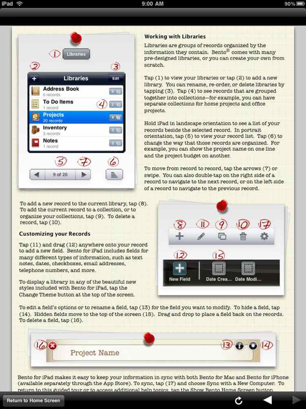
When initially starting the app, the first thing a user should do is take a look at the short guided tour FileMaker includes with Bento for iPad. The next task you should consider is setting a pass-code to keep your personal information away from potentially prying eyes. In a matter of minutes, you’ll quickly figure out most of the ins and outs of the app. I’m very impressed with the app’s intuitive interface and rich graphics. It’s clear that Bento for iPad will stand out as an app that takes advantage of the iPad’s capabilities, setting a standard for other companies.
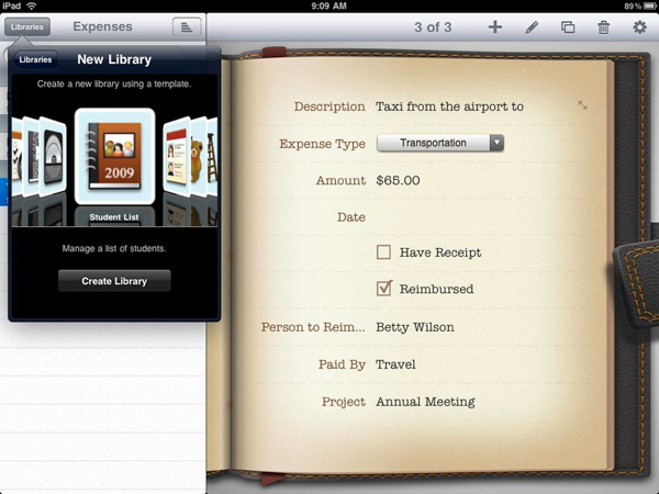
Bento for iPad comes complete with 25 templates for libraries, which are the main groupings of your personal information. There are templates for your address book, inventories, projects, student lists, notes, to do lists, recipes, expenses, time logs, vehicle maintenance, exercise logs and more. Each is well thought out with various appropriate data fields that are fully customizable by the user. There is even a blank theme for you to go completely nuts and create a database that’s unique to you.
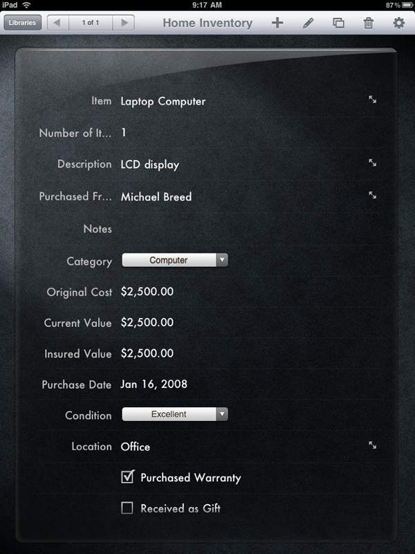
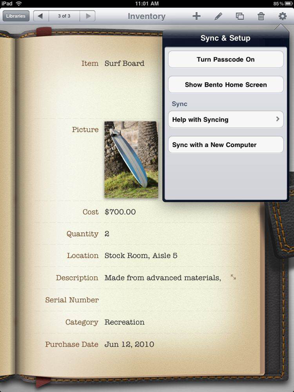
The way Bento for iPad does all this is a fun experience on the iPad. Rotating the iPad to landscape allows you to see all of your libraries on the left while working on data on the right. Switching between libraries and records is fast and easy. Want to focus upon a single record? Rotate your iPad to portrait and your record expands to fill the screen in one of three customizable backgrounds: a leather portfolio, a clipboard, or a sleek sheet of glass on a black background. All of the graphics are very realistic and add the to Bento for iPad experience.
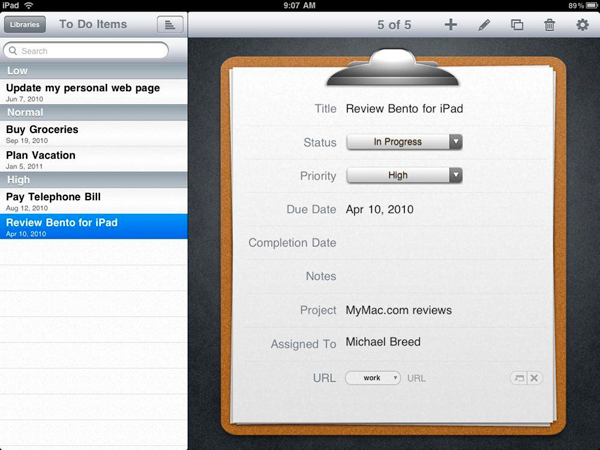
If you’re already a Bento user, syncing with Bento for iPad is easy. A touch of the "Sync & Setup" button at the top of the screen allows you to connect to your desktop Mac, keeping any changes in your records consistent.
I plan to use Bento for iPad to bring my sometimes chaotic life to a more Zen-like level. Owners of iPads know that using one is a new and exciting experience. Bento for iPad is what I hope is just the beginning for well thought-out apps that help keep your life manageable while making use of the capabilities of the iPad. Kudos to FileMaker for helping to set the standard!
MyMac.com Review Rating: 9 out of 10
email – MyMac Magazine – Twitter – Advertise – Reviews Archive – Podcast

I’m both a filemaker and Bento 3 fan, but just left a review for Bento for iPad and was surprised to find such rave reviews for the iPad version. If you look at the reviews on the Bento page in the iPad Apps section, you’ll discover your glowing review of the iPad app is in a distinct minority. Most are giving the App a one star, thumbs down review.
Due to the fact that To Do and Task functions are not available — and the fact that it can only sync with address book and not iCal, Bento for iPad is little more than a list maker, with barely any semblance of a database. There’s a great free project available from the Bento website called Power Projects, yet very few of the the file’s fields will transfer over to Bento for iPad since so few of Bento’s attributes are applicable to the iPad app. For now my app is sitting on the window of my iPad that I reserve for apps rarely used. I’m hoping a future update will provide the app with some of Bento 3’s iCal functions as well as fixing the applications bugs such as its refusal to find the computer that hosts the Bento 3 database for syncing.
I totally agree with dwboston. In addition primary among my hoped for improvements is the ability to enlarge the note field. For example the tiny little 5 line window makes the recipe template unusable. Yes, you can scroll but when cooking, you need to see all the ingredients and/or directions at a glance. Also a list view is a must.
I totally agree with dwboston. Bento 3 for iPad’s inability to transfer & display all fields and restricted view of fields that do transfer, makes this app largely useless.
Bento for iPhone actually does a far better job for viewing information! Instead of allowing only a few lines of text viewable in a scroll, you can view the entire text…. all on a screen about 80% smaller than the iPod. Bento for iPad is all form and very little useful function. How about letting your iPhone developers take a shot at Bento for iPad?
I could not agree more with dwboston! I so wanted to love Bento 3 for iPad. It’s little 5 line note display pretty much makes this a useless product as far as I am concerned. Now it has been months since it was first released and it seems Filemaker has already forgotten it. They got an app out there so they can say that “Bento runs on the iPad” but it shares only a name with the Mac version.
I have used Apple products for 30 year, but I sometimes wonder why. So much about them seems to be the brainchild of a brilliant diletante who quite soon gets bored and moves on. Claris Organiser was a great little program, but sold off to Palm, and now deceased. Appleworks is other good program that disappeared into the ether.
Bento appears to be following this tradition. Some of the central ideas are quite brilliant. Usability is second to none. But there is a lot that is second rate.
And the iPad implementation comes into that category. I use it because it allows me access to the information on the Mac version. There is little in the iPad version to make it attractive on its own.
And the person who designed the presentation should be taken out and shot – its tacky, and out of sync with the overall intention of such a database.
I actually prefer the iPhone version – far better at presenting the information.
Alguien sabe porque bento para ipad no funciona en multitarea