OS X 10.2, “Jaguar”, was pretty much an essential upgrade. The early versions of the new Mac operating system had been rather slow, which rather offset any benefits like stability, more efficient virtual memory, and the ability to run UNIX programs. So while early adopters enjoyed playing with the very first iteration of OS X, known as 10.0 or “Cheetah”, home and office users preferred to stick with OS 9 whatever its shortcomings simply because it was the only operating system that could run their programs quickly enough for them to get their work done. Apple released an updated package not long after, 10.1 or “Puma”, and this version cleaned up some of the rough edges to OS X and more importantly upped the speed significantly. Still, for many users Puma was still too slow, and it wasn’t until version Jaguar that OS X shifted from being a toy for Mac nerds to a viable operating system for home and business users. Unsurprisingly, Jaguar was the first OS X operating system that Apple marketed aggressively, and the turning point for many Mac users that had been holding off from switching away from OS 9. Of course there was more to Jaguar than just plain speed, not least of all the Quartz Extreme graphic acceleration and the seamless integration of OS X with Windows-based networks, but for the majority of users the key selling point to Jaguar was its speed.
Apple has pitched its latest commercial release, OS X 10.3 or “Panther” into a rather different marketplace. Unlike Jaguar, Panther doesn’t promise any dramatic increases in speed, and on paper at least the Panther feature lists reads more as an exercise in evolution over Jaguar than revolution. Given that Jaguar is a fast, stable and modern operating system many users will wonder whether there is any reason to spend the money on buying this particular upgrade. After all G3 and G4 computers running Jaguar have proved themselves to be fine machines of home and office use, and if you plan to buy a new Mac over the next year or two, it’s likely to come with Panther installed anyway. In this article we’ll put the hype aside and take a look at Panther to see whether or not it really is a “must have” upgrade for the average home or small business user.
Finder
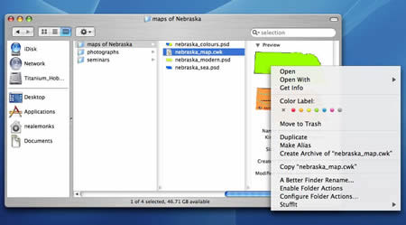
The biggest differences between Panther and the previous versions of OS X are in the style and functionality of the Finder. Though Jaguar may have felt different to its predecessors in being so much faster, it looked pretty well identical to them. Panther extends the brushed metal finish familiar to users of Safari, iTunes and many of the other recent Apple programs to Finder windows and other elements of the user interface such as progress bars and preference panels. The main menu bar running along the top of the screen is now tinted grey, so that it appears somewhere between brushed metal and the original stripey-white Aqua menu we’ve become used to.
 |
|
Besides having a new look, more stuff can be done in the Finder than in earlier versions, including the creation of archives and the assignment of coloured labels. One pleasant surprise is that wider range of previews can be shown in the column, as shown here with AppleWorks graphics file.
|
Besides these changes in appearance, the Finder windows have new “Sidebar” toolbars that include a variety of icons for specific locations. This toolbar is divided into two segments, the upper one contain places that could broadly be considered disks, i.e., mounted volumes, network locations and the user’s iDisk. The lower segment includes buttons for specific folders. These can be changed as required in much the same way as the Dock: unwanted icons can simply be dragged off, while new icons will be created for folders pulled over the panel. There are some additional subtleties as well, such as small buttons for ejecting mounted disks and synchronizing the local mirror of the user’s iDisk with the real thing. A more streamline selection of buttons runs along the top of the Finder window including buttons for going backwards or forwards through recent Finder windows and ones for switching between icon, list and column view. A new action button brings up a selection of options that are otherwise included in the main menu bar at the top of the screen, and there is a slightly modified search window that can be used to restrict or expand searchers as required. This window has a memory, and remembers the scope of the latest search, which can range from the entire disk (“Everywhere”) down to just the icons or folders selected in the Finder window (“Selection”). There is one drawback to all this added functionality. If you have a computer with what Apple seems to consider an undersized monitor, for example an iBook with an 800 by 600 pixel screen, then you will probably prefer the rather smaller toolbar that ran along the top of the older versions of OS X.
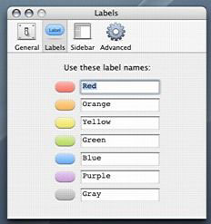
Contextual menus continue to be an essential part of the OS X experience, and give the user a quick way to take advantage of two new features, coloured labels and the ability to create compact archives on the fly. Coloured labels were a part of the Mac user interface for many years making their appearance in System 7 and surviving more or less unchanged right through to System 9.2, and were one of the most notable absences from OS X. Some people loved them, others found them completely pointless (the present author being among that latter group), but if you want them, they’re back. They don’t tint the entire icon as they used to do, and instead only add a background to the name part of the icon, but you can play around with the colours and change the “meanings” of the colours using the revamped Finder preferences panel.
 |
|
Apparently someone, somewhere must have cornered Steve Jobs at a dinner party and told them how much she missed the coloured labels. Anyway, they’re back.
|
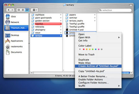
The integrated file archiving tool creates archives based on the InfoZIP format and can be used for single files, groups of files or even folders. Of course it also opens these archives too. Although nothing more than a front-end for a built-in UNIX tool savvy OS X users have been using for years (“zip” and “unzip” can both be invoked via the Terminal), this is certainly a much nicer way of getting to these powerful tools and one that is likely to be enjoyed by virtually all Mac users.
 |
|
Files and folders can be archived on the fly, providing users with an easy way to compress data for storage on other disks or to send as attachments to e-mails.
|
FileVault & Fast User Switching
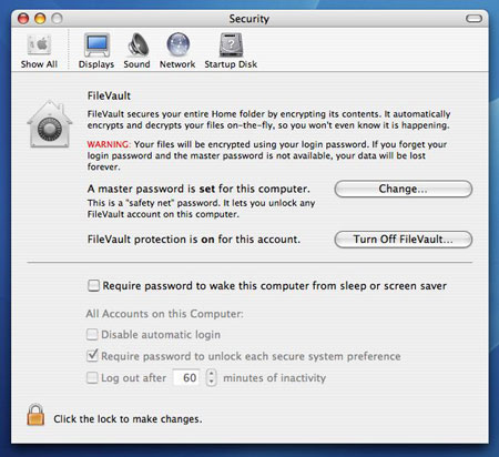
The innate security of a UNIX-based operating system was one of the advantages Apple laid before OS 9 users to encourage them to switch. Unfortunately, how ever safe your home folder appeared relative to other OS X users of the same machine, this security evaporated completely if some ruffian was as sneaky as to boot the machine up in OS 9. A new option available in the System Preferences allows the user to encrypt their home folder. Essentially, the computer makes a secure disk image of the home folder and only allows the user with the right password to access files on this image. Although creating this secure home folder takes several minutes but once that is done files can be accessed without any noticeable delay. Logging onto the computer with the correct password doesn’t take any longer than usual either, although logging off does take a bit longer trims away unwanted space for the disk image it has been using.
Anyone else using a Mac with a secure home folder will see only the encrypted archive and not the folder, effectively keeping them out. However, administrators can set up a “master password” that allows them access to all encrypted home folders. Obviously there can be only one such master password at a time, although the password itself can be changed if it needs to be, and for maximum security the administrator should set this master password when the computer is set up. Otherwise any other used with administrator privileges could do this before the legitimate administrator, which would lead to all sorts of problems. Another important aspect of the improved file security is the Secure Empty Trash option in the Finder that overwrites data that is being deleted instead of just making the space available to the operating system.
 |
|
A new panel to the System Preferences allows the user to encrypt their home folder (which takes several minutes). Once this is done files in the home folder are safe from prying eyes.
|
A home folder protected by FileVault isn’t completely indestructible. Although booting up in OS 9 doesn’t allow one user access to another user’s files, an entire home folder can be deleted. Of course this won’t be a problem with the current range of Macs, which cannot be booted in OS 9 at all, so presumably Apple are seeing this loophole as one that will go away by itself over time. Taken as a package then, the new security features of Panther are far better than in previous versions of OS X but still not quite perfect.
One clunky bit of Jaguar that has been consigned firmly to the wastebasket of bad design is the way that operating system handled user switching. When a user logged out, the computer quit all applications, with the net result that there wasn’t much difference, time-wise, between shutting down and logging out. Fast User Switching when activated (using the Login Options of the Accounts panel) provides the ability for multiple users to quickly share a single machine without needed to quit programs while doing so. There’s eye-candy too, as the desktop changes from one user to the next, it revolves like a three-dimensional cube.
Exposé and the Function Keys
For sheer dramatic flair, none of Panther’s new features
rates as highly as Exposé, and it is one that
positively oozes Apple’s understanding of how people
use computers. My guess is that many people will wonder
how they got by without them. At its most basic, Exposé
is a way of combining toggling between applications
and hiding windows with a sort of “cleaning up”
of the entire screen. Pressing F9 causes all the active
windows (be they from applications or the Finder)
to separate and scale down such that all can be shown
at once without overlapping. F10 dims all windows
except the one at the front, the active window, and
F11 quickly zooms all the windows to the edge of the
screen nearest to them, exposing the Desktop. This
latter feature persists even if you open a folder
or file on the Desktop, which is useful if you’ve
hidden the active features so that you can root around
your home folder for something like a graphic or text
clipping you want to add to the document you are working
on. Pressing any of these buttons a second time reverses
their effects, and for those who just want to show
off, hold down the Shift key as you press the function
keys to see these sparkly new features in slow motion.
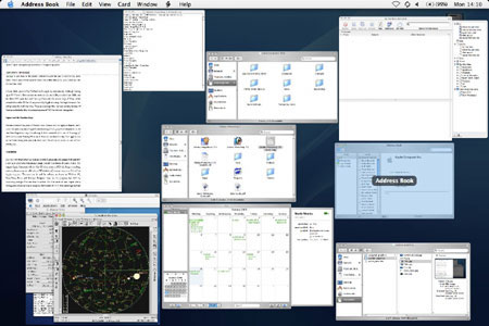 |
| Pressing the F9 key resizes all the open windows and spreads them out evenly over the screen. Moving the mouse over a window brings up the name of the Finder window or document, and clicking once on a given window makes both the window and the application to which it belongs active. |
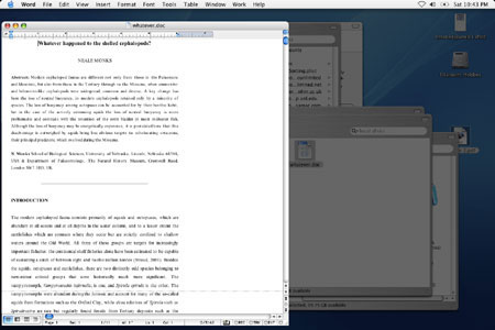 |
| F10 dims inactive windows, and will be especially appreciated by those showing off documents or graphics to clients or co-workers. |
Speaking of function keys, there are some issues
with the function keys generally. There is now a greatly
expanded Keyboard & Mouse panel in the Software
Preferences making it possible to pre-assign different
keystrokes to all sorts of things, including screenshots
and Universal Access settings. On the other hand,
switching off the pre-assigned keyboard commands,
for example the sound volume and screen brightness
buttons that use F1 to F5 on many PowerBook computers
isn’t so easy. With Jaguar, the trick was to restart
in OS 9, and use the keyboard control panel there
to require the “fn” key to be pressed at
the same time as the function key before the PowerBook
would treat that keystroke as a command to change
the sound or brightness settings. Amazingly this would
persist once you restarted in OS X, but with Panther
this trick doesn’t work anymore, even assuming you
have a PowerBook that will start up in OS 9 at all.
Instead, you need to hold down the “fn”
key to override the sound or brightness functions
of the function key in question. This will be unwelcome
news to game players for whom quick key strokes are
essential, and often find their software assumes a
function key will serve a certain purpose in the game.
This is particularly true if the game is a port from
the world of Microsoft Windows, for example Quake
and Diablo, two games that extensively use function
keys.
More Goodies: Mail & Preview
Of these two applications, it’s the changes to Mail that are going to be the most widely used and appreciated. Among the main renovations are improved performance, threading of messages, drag and drop aware addresses, and improved spam filtering. Searching for text within mailboxes has been sped up greatly, as has filtering. Downloading e-mail from a spam-laden addresses feels much more responsive than ever before, in part because Mail will take advantage of mail filtering at the ISP end of your connection, but also because it won’t download images to messages it reads as spam until you tell it to, a great boon. The threading of messages works surprisingly well and could have great utility in small offices where groups of co-workers need to keep tabs on the development of a project they are all working on. Many people will also find this function useful if they subscribe to mailing lists. Last but certainly not least, e-mail attachments are encoded using a standard that Windows and UNIX machines are happy to accept, GNU Zip which should make sending files this way much more reliable and problem-free. On the other hand, Mail still isn’t a newsreader, so it cannot be used like Outlook Express to follow newsgroups on the Internet. Nor does Mail allow you to see and read messages from groups of mailboxes at once. This means that if you nest mailboxes more than one level deep you need to use the flip triangle icon to open up the enclosing mailbox to get at the nested ones before you can read the messages.
Preview is still not a terribly useful tool though Apple has made some improvements. On the plus side Preview is a much faster PDF viewer than before, and has some features, like text copying and searching, that were otherwise to be found only in Acrobat Reader. It will also read encapsulated Postscript files, or EPS, files, something that will be particularly handy to graphics professionals and people who lean heavily on UNIX applications, which frequently export graphical data as Postscript files. Preview is also fax-aware, and can be used to view faxes sent received by the computer. Any OS X application can send a fax as easily as it can print by choosing the fax option in the print dialogue box, but Preview is the application for viewing incoming faxes. System Preferences allow the user to divert incoming faxes to specific folders or even to send them along as e-mail to Mail for sorting and storing. So what’s wrong with Preview? It still doesn’t handle slide shows well. Full-screen mode is awful, with the image resized to fill the screen, and to set up a slide show you need to open pictures one at a time using Preview’s Open dialogue box. Simply dragging a bunch of files or a folder onto the Preview icon doesn’t work. In this regard, it’s still behind Aaron Giles’ ten-year old program JPEGView. It also doesn’t handle creating new graphics files well. Sure, you can paste from the clipboard into a new file, but you have to save it as TIFF before you go any further. Too bad if you’re creating JPEGs or GIFs for a webpage: you need to make the TIFFs first and then export them one at a time.
Power User Stuff: Font Book, X11, & Xcode
These are all interesting additions to the OS X feature
roster but none are particularly important to home
or small office users. To be sure, both Font Book
and X11 could be useful to certain people, but neither
is essential. Font tools of all kinds are popular
with graphic designers and people working in the publishing
industry, but the vast majority of office workers
barely graduate beyond Times New Roman and Helvetica.
As such, the ability to organize fonts will be of
minimal value. Nonetheless Font Book is a nice tool,
if only because it greatly simplifies the installation
of fonts. Enterprising Mac users will enjoy being
able to view the typefaces more easily, and being
able to produce groups of fonts for certain projects
or occasions is a useful ability. X11 is a part of
OS X that is close to my heart, and for users happy
to extend their Mac computing into the world of UNIX.
A number of books cover this topic, some of which
have been reviewed here,
and with only a little effort projects like Fink can
be used to set up powerful text editors, graphics
packages and more, usually at zero cost. Xcode is
a developer’s tool and falls outside the scope of
this article (unless of course writing software is
what you do at home or in your small office!). For
the average mortal, it’s irrelevant.
Conclusion
It is very easy to get swept up with the pre-launch
marketing, and imagine that somehow a new piece of
software will radically change your life. Sometimes,
of course, it does. The original Apple Macintosh with
its Mac OS when released in 1984 did change everything,
and every home computer sold today is “Macintosh-oid”
in some way, even if it isn’t an Apple computer. The
same can be said for software as diverse as Windows
95, PowerPoint, Doom and Netscape Navigator; these
are the programs that shift the computing paradigm
from one level to another. For Mac users at least,
Jaguar was a turning point of similar import, being
the first version of OS X that had enough features
and speed to fully live up to the promise earlier
versions only hinted at, and a clear sign that the
Mac had evolved into something far more powerful than
ever before. Against that record, Panther cannot possibly
be seen as being revolutionary as Jaguar. Panther
takes the best of Jaguar and refines it, polishes
the look and feel of OS X and then adds a few important
features to improve the overall usability of the thing.
Unquestionably the dramatically improved security of the Home folder and the ability of users to log in and out without restarting the computer will be reason enough for the upgrade for many people working in homes and offices where several people use the same machine. But the changes to the Finder are interesting but hardly compelling, and several of the key improvements that come with Panther, such as Xcode, the Font Book and better X11 integration are hardly things that someone who types letters, writes e-mail and surfs the web is going to care about. There are some very attractive features to be sure; the ability to work to a fake iDisk while offline for one, although needless to say doesn’t provide any sort of protection in the event of hard disk failure. Mail is steadily evolving into a very mature product that can now realistically be stacked against something like Outlook Express or Entourage, and there are nice tweaks to Preview and iChat that are going to make them more useful for a wider range of situations than before. But take the whole thing as a package and for someone working at home or in a small office with just a few colleagues sharing a laser printer Panther looks like exactly what it is: the latest refinement to OS X. Ultimately, Panther is a desirable rather than an essential upgrade.


Leave a Reply
You must be logged in to post a comment.