Are we having fun yet? You’ve made a Master Page, set up your Welcome page, played around with graphics and page sizes, all without knowing a single bit of HTML. Now, we’re going to get into what sets iWeb apart from most other web page creation software. Sure if you know CSS, PHP, HTML, and other buzz words I just pulled out of my head, you can make a site that dances and weaves across a web browser like some bad 60’s hippy movie. Unfortunately you probably don’t know about those things (don’t feel bad, neither do I), but you want your site to look like you spent a lot more time on it than you did.
Before we go any further, do you have a dotmac account? If you don’t, get one if you want to make the most of iWeb. It isn’t cheap, but it makes all the magic of iWeb work without you having to get your hands dirty. In the past, much of what dotmac was good for was available for a much lower cost or even free. Of course being free (as in beer) comes at a steep learning curve and most of the integrated features of dotmac and the iLife package as a whole isn’t there. With a dotmac account, setting up RSS feeds (that little bit of web magic that informs people that you have new content) for blogs, photo albums, and podcasts is a snap. This is a topic for another day, so let’s just talk about making your blog or podcast pages.
All the world’s a blog or podcast
All the tricks I’m giving you for blogs can also be applied when (or if) you create podcasts. Looking at how both sections are laid out you’ll see more similarities than differences. Naturally how the content is accessed is different for each. Most podcasts will likely be downloaded with iTunes and we’ll talk about that in a different post while blogs are usually discovered either through a search engine or some kind of RSS feed. Probably the number one way people are expressing themselves on their web sites today is with a blog. What’s a blog? It usually refers to a web log (take out the “we†and you’re left with blog! Clever eh?), like an online diary documenting the thoughts of the submitter. Many blogs from a single author have a common theme although they don’t have to or even have to be coherent. If you want to post page after page of nonsense (many blogs I’ve read follow this theme even though they use actual words and sentence structure) syllables, go for it. I won’t visit but maybe that’s the political statement you were going for. Like with just about everything else remotely creative, you want people to pay attention to what you’re doing and you want them to know when you’ve posted something new. That’s easily done with iWeb’s RSS support which I’ll talk about later. First off though, you have to make a blog page.
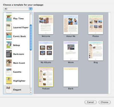
To make a blog page you first need to go to the “File†menu and select the “New Page†option or just hit the little plus symbol (+) at the bottom left of your iWeb window. Either way, the template selection window will appear. Choose the type of template (as said many times, either the White or Black templates lend themselves better to customization) and then select “Blogâ€. A new page will appear with all the pre-selected graphics and text that Apple thinks everyone wants. If you’ve made your own page template as instructed in the previous entries, you are about to become frustrated with how rigid Apple can be at times. Before we get into that, let’s talk about what you’re most likely seeing on the blog page you just had iWeb make.

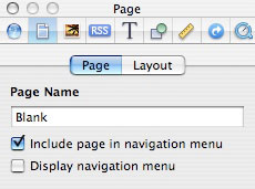
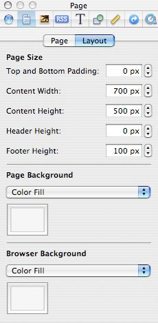
If you’ve chosen either the white or black template, you’ll see the navigation link to the page (and any others as well if you’re using Apple’s navigation menu structure). Because you’re such a creative type and you’ve made your own look for your website, let’s assume you don’t want to use Apple’s way. So, it’s off to Page/Page in the Inspector where you’ll turn off “Include page in navigation menu” and “Display navigation menu”. Also, if you’re using a different page width than the standard 700px that Apple uses, you’ll need to adjust that in Page/Layout in the Inspector too. You’ll also see that iWeb created two other default pages at the same time, “Entries” and “Archive”. We’ll get to those in a little while but let’s stick to the main “Blog” page for right now.

To make room for your Master Page layout that you’ve painstakingly created, you’ll need to move a few things out of the way…like everything. Click within the page (some blank spot), go to iWeb’s “Edit” menu and choose “Select All”. Everything currently on the page will be selected. Move your cursor to any spot within a selected box and move them down out of the way. A few hundred pixels should do nicely. Now go to your Master Page and do the “Select All” thing in the Edit menu again. Everything on your Master Page is now selected and ready for action! Go back to your Edit menu once more and select “Copy”. Once again go to your new blog home page and click somewhere within the window to make sure it’s selected (otherwise the copy and paste functions in the edit menu may not be allowed) and “Paste” your Master Page content. What you’ll see now is a real mess and it’s up to you to move stuff around to how you like it. Before you finish though you’ll want to do one more thing.
Faking to be real
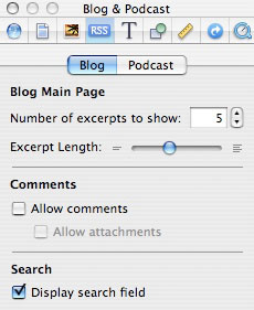
One nice thing about iWeb’s Blog page is that it does a lot of the hard work for you. Things like making sure your latest blogs are shown on the main blog page. How much of the blog that you’ve written is shown is up to you. Go to iWeb’s Inspector and select Blogs and Podcasts/Blog. Under the first section is an option to decide how many of you recent blogs you want to show on the main blog page. The default is 5 though you can choose anywhere between 1 and 50. 1 seems useless and 50 seems extravagant and just a little creepy so let’s stick with 5. You can also choose how many lines from the beginning of your blog is going to show on the page as a preview. Just leave it at the default for now. Adjust it later to suit yourself, but remember that making a change could affect your customized layout. It’s usually easy to fix depending on the amount of customization so all you need to do is keep it in mind for now. The reason why I bring it up now is because you’re going to do some pre-arranging even before you have any content.

When you created your generic blog section, you also got the aforementioned entries and archive pages as well. Naturally they don’t have your custom layout yet but it doesn’t matter right now. Depending on how many recent blogs to show on your front blog page you’ve selected, you’ll need to make a few fake ones to see what your layout on the front blog page is going to look like. Adding new content moves things around and you may need to make some changes to accommodate them.
Just go to the “Entries†page and hit the “Add Entry†button until you have the exact number of entries you plan to show on your main blog page. Now, go back to the main blog page and take a look at what it’s done to your design. HoChimama! Everything you put in from your Master Page is now either moved or covered. You probably have to move some things around. But at least after this, you’ll never need to make those changes again (unless you completely redo your site).
You’ve got your main blog page all set up, you’ve adjusted your graphics so iWeb won’t cover them up as you add new blogs and you’re done! Well, with the main blog page anyway. All that stuff you did you now have to repeat for the page where you’re actually going to write stuff to.
Go to the first iWeb blog entry. Ugh, here we go again. But take heart because after the first one every other blog entry will be a breeze in comparison. Begin by getting rid of all those fake blog entries. You only did that to set up your main blog page and iWeb will remember where you put everything. Then set your page margins to whatever width you want. Good old Page/Layout in the Inspector will handle that quite nicely. Move the existing stuff out of the way and add your Master Page graphics and place things where you want them. Add your content (words, pictures, movies, whatever) and you’re done.

But…but…but, what happens the next time I want to add a blog! Won’t I have to go through this hassle all over again? Fear not intrepid iWeb explorer, no you won’t. The next time you want to add another blog, go to the “Entries†page for your blog section and select the first one. You know, the one you’ve set up with your Master Page graphics. Now, hold down the “ctrl†key and select the previous blog. A drop down menu will appear with some options. Select the “Duplicate†command (you can also do this via the “Edit†menu) and a new blog with all the graphics in place exactly like the previous one. iWeb will time and date stamp it. Make your changes in the content and now you have a second entry will almost no work. You may still have to move some things around depending on the changes in content you’ve made, but this will be minor as compared to having to completely remake a page every time you want to add content.
All these tricks work for podcasting as well and if you want to write about particular subjects (Tech news, Big-foot sightings, Adventures in Root Canals) you can select the blog pages template in iWeb and do all the things I talked about in this section to have multiple updated via RSS posts. People can pick and choose from among your varied topics to get just the stuff they want.
Speaking on RSS and subscribing to podcasts, we’ll get to that in our next chapter.

Leave a Reply
You must be logged in to post a comment.