DrawBerry 0.8.1
Raphael Bost
Free/Donationware
DrawBerry is a free/donationware vector drawing application for the Mac that can be downloaded from the developer or any number of reputable sites such as MacUpdate, CNET or Softpedia.
In order to write this review I actually used this program to create this simple graphic so I could really test out the product and not just repeat what the developer’s website says. (I am sure that doesn’t happen here on MyMac.com, but I have read far too many factually inaccurate reviews of programs I know and use professionally where it is obvious the “journalist†responsible just regurgitated a press release.)
DrawBerry doesn’t seem to have been updated for some time, so any bugs I mention could have been introduced by Mavericks. As the application is still available I am going to review it as I found it.
I have decided to write this review in the form of a “walkthrough†of how I constructed this image.

Let’s open DrawBerry and get started.
The first thing I am presented with is the Toolbox and the New document dialogue.
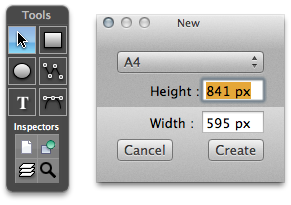
Unfortunately the New document dialogue only seems to work in pixels, but it has some handy presets, so I chose A4 out of convenience and was presented with a new blank document.
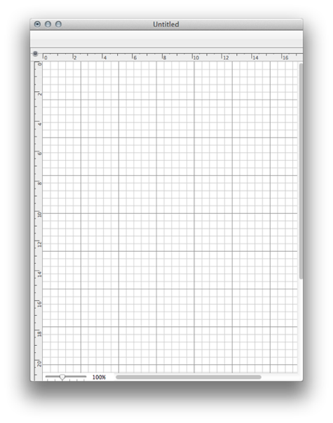
It doesn’t open to fill the whole screen nor does it make the page fit the window. I can live with that, so I expanded the window and took a look at the menus and available Inspectors.
Nothing overly surprising in the Menus (no Zoom settings) but there is a Scales slider in the bottom left of the window that only offers rather coarse 25-50-100-200-400-800 percent settings, but again, I could live with it. I proceeded to open the various Inspector palettes which comprise of View, Shape, Colour Panel (the System provided Colour Picker), Colour Swatches, and a Shape Library. My Shape Library appeared to contain nothing useful, though the Help file shows it containing a selection of basic geometric shapes.
The Page Inspector lets you turn the grid on/off, edit the grid spacing and colour, enable/disable snap to grid, change the background and pasteboard colours, and have rulers on or off. I elected to tone down the grid to a paler shade of grey and turn off the snap to. I moved on to the Shape Inspector which seems to contain the main substance of the program: Stroke, Fill, Arrows, Fill, Shadow, Text, and Geometry (which turns out to mean Rotation). The Inspectors adopt a dark semi translucent theme (like Pixelmator) and look modern and smart. In order to help save space the individual sections or the entire palette can be collapsed and expanded with the little disclosure triangles.
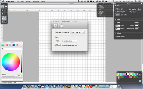
I then found another palette for Layers which is only available from the Toolbox. This gives the ability to create and reorder Layers, alter the blending modes and opacity, and from the little cog icon the ability to add the standard range of Apple’s Core Image Filters.
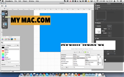
Are we all comfortable? Then I shall begin. I started by drawing a rectangle and attempting to fill it with blue. The Colour Swatches Palette appeared to have no effect at all whatever I tried, so I moved over to the Fill Inspector, and found nothing happens until you click the plus button. Then you can choose Solid, Gradient or Image as a Fill (a bit more about Image in a minute). I chose Solid and double clicked the colour to bring up the standard Apple Colour Picker. I chose a blue fill by dragging it from the Colour Picker to the Inspector Colour box and set a simple black outline from the Stroke Inspector.
Then I drew a text area just inside the blue box and got a helpful “Hello World†to show it is a text box. I tried to figure out how to edit the text. Eventually I figured out you have to double click the just created box. Here it gets a bit funky. The text flies off onto the pasteboard to the side. Here you can select it and use the tiny little T button to bring up the standard Mac Text Palette to set the font, size, shadows, etc.
There appears to be no way to control the line spacing, so to achieve the effect I wanted I had to create two separate text blocks. Getting the sizes right took a bit of trial and effort, but I got there in the end.
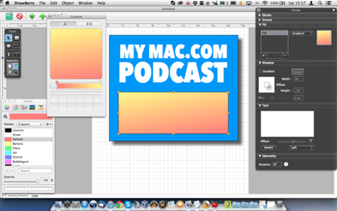
Next I added a shadow using the Shadow tools in the Inspector and drew in a second box below the text. I had a little experiment with the Gradient Fill just to show you what that looks like.
Then I moved on to what I really wanted to explore which was the Boolean operations. I chose the Difference option to cut a hole through the original block. This helpfully changed the colour, removed the shadow, and brought the object to the top of the stacking order hiding the text. I reset the colour and shadow, and moved the object back down the stacking order. I was then ready for the next operation which was to bring in the pictures.
I drew a frame and attempted to use the Image fill option to bring in Guy. It all worked as you would expect, except no picture showed up in the artwork. The little preview in the Inspector showed the picture I chose, but there was nothing on the page no matter what I did. I experimented with the fit options, like stretch and fill, but with no joy. I resorted to the next best trick.
I imported the picture, and then moved and scaled it to the position and size I wanted. This is fine, and unusually the app seemingly uses Alt as a constrain proportions modifier rather than the far more usual Shift, but it works nevertheless.
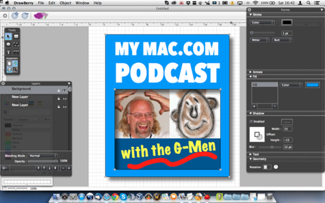
I repeated the exercise with Gaz Maz and put both pictures onto a new layer and moved the original layer up so the pictures are below the blue box. I created another layer between the pictures and the top frame for the panel with the lower text. I then put in a darker blue box, the yellow “with the G-Men†and used the Bézier Curve pen to draw the wiggly line. Again I have problems because the pen doesn’t want to work where there are already items. I locked the other layers, it didn’t help, I hid the other layers, that didn’t help. Finally, I opted to draw the line below the artwork and move it into position. Actually, the Bézier Pen is very good and works properly, unlike some other ones I have used in cheap vector drawing apps.
And finally, this is what I ended up with:
Lastly I wanted to export the image. DrawBerry offers an excellent range of export options supporting PDF, EPS, and SVG as vector options and TIFF, PNG JPEG, and PSD as image formats. I was impressed. Unfortunately I was rather less impressed when I checked the exported image formats and got this from JPEG and PNG. Somehow the shadow has reversed direction! Cripes!

Even worse this is what I got from the PSD. Now all the lettering has gone weird too! Gah!
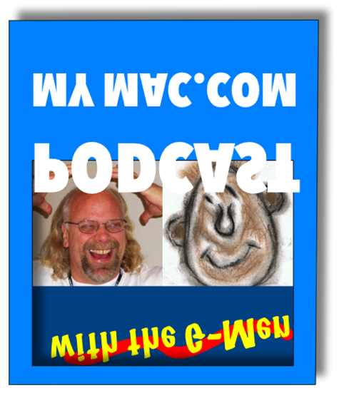
Luckily the vector formats worked better and gave me this.

Summary
DrawBerry is free, and it shows in the sometimes funky way it behaves. I am not going to rag on the developer for that as it is only rated as version 0.8.1. To be fair I think it does a passable job even if it is a bit weird in places and one or two bits don’t seem to work at all.
It has all the basics and it looks modern and professional. The Bézier Curve Pen Tool is actually very good and works as you expect it to if you have ever used one before. The straight line Pen is redundant as you can do the same with the Bézier Pen. DrawBerry has a basic set of working Boolean Operations. It supports layers with opacity and Core Image Filters. It doesn’t appear to support grouping, and seems to lack Scale, Reflect and Shear tools.
I only set out to create a simple graphic, and it took me longer than I expected due to one or two of the program’s oddities, but it did do the job, and I have used worse drawing apps.
DrawBerry hasn’t been updated for a long time and may not even be in active development any more. It is quite possible it worked better in earlier OS versions and Mavericks has caused some of the problems. Vector Drawing apps are reasonably common, but often fairly pricey too, and apart from Inkscape (which requires X11 and is much more complex) I don’t know of any other free options.
OverallÂ
DrawBerry may be worth a look if you want to have a go at vector drawing, but it isn’t going to make my pick of the week any time soon. Then again, it is free!
If you are serious about doing vector art, no doubt you have already invested in something more reliable and capable.
I would give DrawBerry a MyMac Review rating of 4 out of 10 and probably would have gone a lot higher if the exports were better!

Leave a Reply
You must be logged in to post a comment.