Oxford Advanced Learner’s Dictionary,8th edition (app edition)
Price: $29.99 US
Company: Paragon Software Group
You want to learn or perfect your skills in English? The Oxford Advanced Learner’s Dictionary, 8th edition (app edition) is something that may help you at this task.

The software is aimed at people who are trying to make their English better. It contains a huge list of words and examples on how to use them. You can search for a specific word in the search field and the results will display in the left panel of the application.
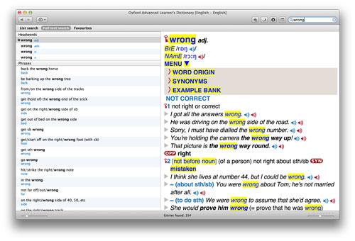
There are two main views: List search and Full text search. The first one will display results for the searched word, but will also contain a list of words that may not be related to your search. I prefer the second mode which is split into three sections. The Headwords section displays the word you’re looking for and some related ones. A Phrases section will show typical expressions for this word and relatives. Last you have an Examples section of the word usage. There is a third view which shows your Favourites: you can tag words with a star icon if you use them often or need to access frequently.
When you click a word the in the left panel, the result is shown in the right one, where you have lot of information displayed about your selection. Depending upon the word, you get definition, examples, word origin, synonym, opposite, pronunciation, idioms, speech, and probably a few other things I’m still discovering as I use it. For speech, you’ll see a blue speaker icon for the U.S. English accent, and a red speaker for the British accent. In the preferences, you can download the full content of speech sentences, or download them as you need.
While the application has a lot of content, I found the navigation a bit unintuitive and sometimes buggy. For example, the navigation back button don’t always go back where I was expecting it to go, but that’s an easy fix. What is more important is to find the information we are looking for and the way it is displayed, for which the application needs to be perfected.
For example the right panel of the application, where you find the content, is displayed as it would be in a standard book form dictionary: a list of content difficult to navigate. If you are looking to find a synonym to a word, it may appear in the MENU section just below the word name and pronunciation. But I never found any opposite section in any word search. And that is not because it does not exist, as showed in the example below of the word Wrong.
Another example, clicking on an icon such as OPP (opposite), SYN (synonym) or IDM (idioms) will bring you to the help section for that icon. It won’t show or filter for that specific detail as I would have expected. And the help section is displayed into the right panel, instead of its own window, so you have to hit the back button to hopefully get back where you were.
The application’s amount of content is really amazing and for the asked priced, I think it is very reasonable. But the navigation really needs to be perfected to make it efficient for the users. Learning a new language is difficult enough, so the tools need not to be an obstacle in the process. The interface is the main reason why I gave it a low rating score; not the content.
MyMac Review Rating: 6 out of 10


Leave a Reply
You must be logged in to post a comment.