Avid (North American distributors)
Price: $599 ($149 upgrade)
Review by Mark Sealey dedicated to the memory of Steve Jobs, 1955-2011
When Sibelius 7 was released recently, its appearance was sufficiently different from that of Sibelius 6 to have thrown some (long-time) users. Avid was criticized on those listservs and forums which do such a sterling job of supporting Sibelius owners and prospective owners. Since so many creative professionals and enthusiasts have so much invested in a piece of software which they use for extended periods each day and to the ways of which their muscle memories had become fully used, change seemed particularly hard.
Don’t be put off by what you might have read in this vein, though: after a couple of months (and two updates… the current version is 7.0.2) the consensus is – rightly – that the protests and worry were unfounded.
Sibelius 7 is a worthy successor to the earlier versions; the program keeps its lead over all-comers as far and away the best music notation software available.
Above all, the thought and care that have gone into the redesign are not only matched by the attention to retaining what is familiar; but have also paid off in terms of flexibility and ease of use. It isn’t too much of an exaggeration to describe Sibelius 7 not only as a major upgrade for a reasonable price; but also as a significant improvement over version 6.
The current review examines not the basic premise and functionality of Sibelius. Rather, it evaluates critically the changes in version 7 from a user’s point of view.
Most prominent among the changes – at least to Sibelius 7’s appearance – is the “Ribbon”.

Ribbon
Remarkably for a program of Sibelius’s complexity this version (7) only has five menu items (“Sibelius”, “File”, “Edit”, “Window” and “Help”) in the Menu Bar – with fewer than 30 basic, obvious, commands invoked therefrom… “Redo”, “Minimize”, “Preferences” etc. Everything else that you can do has been brought into a completely unified, intelligently-designed expandable/collapsible tabbed toolbar (or “Ribbon”) at the top of the Sibelius 7 window.
Even it can be toggled on/off by the time you know every keyboard equivalent. Most of these shortcuts have not changed from earlier versions of the product; what’s more, all of these keystroke equivalents are usefully grouped in the supporting documentation (which is all excellent) for printing out or otherwise making available for ready reference.
On occasions “Galleries” (larger windows) are necessary to display such sets of aggregated and related options as time and key signatures. Otherwise, eleven subtly-delineated tabs (“File”, “Home”, “Note Input”, “Notations”, “Text”, “Play”, “Layout”, “Appearance”, “Parts”, “Review”, and “View”) contain between five and nine equally sensibly-grouped (sub)sets of commands and controls. These have been actively placed and arranged in the way they have the better to reflect (then hence to facilitate) how most composers actually work. They are indicated by generally clear and obvious icons, and text. The former is often guaranteed to create controversy, criticism. In general, though, Sibelius 7‘s icons are descriptive, sensible and memorable.
What’s more, after a couple of months’ use for this review, the advantages of such a paradigm for this horizontally scrolling User Interface were fully apparent: you do indeed find yourself looking to the left for those operations which come first in a workflow or cycle of composing; to the right for later ones. It’s new – but based on sound research. It works.

These tabs (you switch between them in the usual ways) actually compactly contain items from previous versions of the software’s menus now redistributed across the “Ribbon”’s tabs. Nor is this a whim: the Single Document Interface (SDI) is surely a much more approachable and usable one for a screen and key intensive task-heavy software suite like Sibelius.
There’s even a “Find in ribbon” box at top right making it easy to locate any feature. Frankly, the program’s designers have done a remarkably good job and this works very well. Early critics seemed to have confused inadequacy with the need for adjustment to a new paradigm. Again, as usual, there are copious learning resources, videos and guided tours on the Avid website.
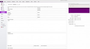
Other improvements keep the underlying workflow (and musical metaphors such as choosing manuscript paper at the start of a new composition) but present them in a new way… the Quick Start has been streamlined. It now gives access to the support videos; imports such files as those in PhotoScore, AudioScore, MIDI or MusicXML files; (latest) news… the Sibelius blog, as well as open a recent or start a new score. This Quick Start window, of course, is optional.
“File” in this “Ribbon” is somewhat different from the other tabs in that it leads to a conventional window containing all the activities necessary for file management, although the rest of the “Ribbon” remains visible and its itemsselectable. The “File” menu, it is to be noted, includes the ability to save files in all Sibelius formats back to Sibelius 2. As usual, no-one has been left behind.

The whole battery of Preferences has also barely been touched, on the other hand. Because it didn’t need to be. It really isn’t hard to find your way around Sibelius 7 and make it do just what all the previous versions have done. But that’s only half the story. There are many welcome additions and enhancements – all of these worked well in testing; very well.
Functions
Plugins (invariably a good – but not always noticed by the casual user – way to achieve extra results; often to save significant amounts of time) have now been distributed among the “Ribbon”‘s tabs… those used during “Note Input” (e.g. for accidentals) being at the far right of that “Ribbon” tab; those pertaining to “checking” scoring being at the far right of “Review” and so on. Previously they were under one catch-all menu. This is another example of how the design of Sibelius 7 (which supports Lion’s Full Screen mode, incidentally) works with the user; and – on only a few weeks’ evidence – seems able to speed up the invariably complex business of writing music.
In the same realm, there is a new context sensitive Inspector which contains much of the information previously displayed in previous versions’ Properties window. The most salient information (current/total page and bar counts; pitches and harmony indicators; current operation; zoom and other View settings) is displayed discretely in a single Status bar (like that of BBEdit) at the foot of the single window.

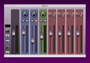
The Mixer has been rethought too; it now contains more conventional vertical faders. Although the tiny text indicating some settings is so small as to be all but unreadable in certain circumstances, this makes the Mixer easier to use.

This Mixer is one of several new dockable Panels… others include the Fretboard and Keyboard; these can be undocked, though the Navigator, Keypad and Video windows cannot be docked. Neither can the Playback panel – renamed “Transport” for consistency with similar functions in comparable audio/music applications. As usual, Avid has thought of what seems like something which every conceivable user and circumstance with options to hide/show/disable/describe/invoke/explain/retain positions of all those display objects would wish for.
Sounds
Sibelius 6 came with an OEM’d version of Garritan and some Avid library sounds for its virtual instruments (vi’s). Although Sibelius 7 still works, of course, with the more up market libraries like Vienna, the new Sibelius 7 Sounds is a much-improved set of vi’s, which are best installed on a separate drive (SSD if possible); they take up 38 GB. Their realism, flexibility of articulation and general sound quality are all markedly better than sets that came with previous versions of Sibelius.
Input Output
By the same token, the improvements to Note input are several: pitch can now be specified before note duration. Lines (such as slurs) can now be extended during input. Tuplets can be made “sticky”, a new note entered immediately after the current tuplet’s bracket automatically creates a new identical one next to it. There are about half a dozen other minor, but extremely useful, note input changes. As was the case for everything tested here during the evaluation process, this all worked just as intended and certainly resulted in more productive use for composition.
As for output, direct MusicXML export is now supported: no separate plug-in is needed. Printing has been drastically overhauled and is more fluid, fluent and efficient in a variety of ways. The text engine has been rewritten from scratch and the results are impressive supporting a much broader and more sophisticated set of advanced typography features approaching those of a very respectable DTP suite with its own text frames, justification, leading, indents, kerning and scaling. There is even a hierarchical text styling option. This is important: modern scores require greater and greater typographical and textual flexibility, customizability and support. Sibelius 7 is well up to that now. Similarly, those graphics which may be needed in the score can now both be manipulated with ease and imported and/or dynamically linked as external files.
Support
Help – which used simply to consist of opening the Reference PDF – is more available, more immediate; it’s integrated and includes live (notice of) updates, web resources and so on.
What’s more, there is a new book containing the substance of the Sibelius 7 Reference Manual, “Sibelius 7® Reference Guide“. Published by Avid themselves [ISBN 978-1-936121-48-9], it makes an extremely useful addition to the resources for the product. The Reference material for Sibelius has always been laid out logically, has always been well-indexed and easy to use. This hard copy is no exception; it’s a useful addition for novice and experienced users alike.
In the absence yet of other books supporting Sibelius 7, “Sibelius 7® Reference Guide” can be recommended as the best place to obtain guidance, background and quick pointers to the updated interface, the new capabilities of Sibelius 7 and the new and improved workflows which it sponsors. Although it costs almost $50, at nearly 800 pages, well-bound and with an attractive layout (it is, after all, essentially the PDF you get with Sibelius 7), it’s a sturdy “perfect” binding and may well sit at your elbow as an alternative to switching windows while working.
CPU
In what may be “behind the scenes” improvements for many users, Sibelius 7 now supports multiple CPUs. Never slow, the program can now take full advantage of Macs with more than one cpu, load-balancing Virtual Instruments and effects across cores more efficiently. Similarly, the default playback mode is 64-bit, allowing more than 4GB RAM (the limit of 32-bits) to be addressed. This is necessary for the Sibelius 7 Sounds collection.
It’s not easy to think of any (major: most people will have their pet likes/dislikes) area that needed improving which hasn’t been attended to in Sibelius 7. At the same time, all functionality, all ease of use, all paths to achieving – simply and reliably – what you want to achieve in writing music have been retained.
There are large changes – like the “Ribbon”. There are many small ones like the ability to find an instrument using Type-ahead; like the degree to which such options as Note input preset (see above, duration vs pitch) can be customized; like the highly flexible text editing capabilities; like some changes to the positioning of single buttons to invoke “Panorama” view and zooming etc. The blend and – despite some early squeals – is a felicitous one. This version is a winner.
Sibelius 7 is a highly complex piece of software. Given the multiplicity of input and output devices which it supports pretty nearly seamlessly, and given the flexibility with printing and the add-on utilities (“lite” versions of AudioScore and PhotoScore are still bundled with Sibelius 7) it would be nearly inconceivable if there weren’t a few teething troubles. And so there have been.
But you’re also buying a “concept” when you buy Sibelius (7); a way of composing life, even. This means that you’re also getting the benefit of a team of experienced and responsive engineers logging and fixing bugs as they are reported. This has been amply demonstrated since the launch of Sibelius 7.
Conclusion: Sibelius 7 had a lot to live up to in the already magnificent Sibelius 6. For features, elegance, flexibility and ease of use. But Avid has succeeded in every respect.
Pros: the good aspects of Sibelius 6 have almost all been preserved. Several additional ones have been added; many new strengths now apply to Sibelius 7. Many new, welcome features and much new functionality.
Cons: Expensive; but for what it can achieve, justifiably so.
System requirements:
Mac OS X 10.6.7 or later, including 10.7
1 GB+ RAM
750 MB hard disk space
DVD-ROM drive for installation
for Sibelius 7 Sounds sample library:
Intel Core 2 Duo or better
4 GB+ total physical RAM
40 GB total hard disk space (7200 rpm or faster drive recommended; SSD preferable)
For full specs, see also this page.
MyMac.com Rating: 10 out of 10
