Painter 12
Company: Corel
Price: $429 USD Upgrade $229
In my time at MyMac.com I have had the pleasure of being given the opportunity to test several of the past versions of Corel Painter and Painter Essentials. I have said the following in past reviews, and it is worth saying again. Instead of releasing a new Painter every year, Corel waits at least two years between releases and when they release a new version they pack it with new features. Painter 12 follows this pattern. It is packed with new features. Looking at the list on Corel’s website there are well over twelve new features in Painter 12! New features are great, but they have to be good to make upgrading worthwhile. Does Painter 12 have enough to pass the upgrade test? Read on.
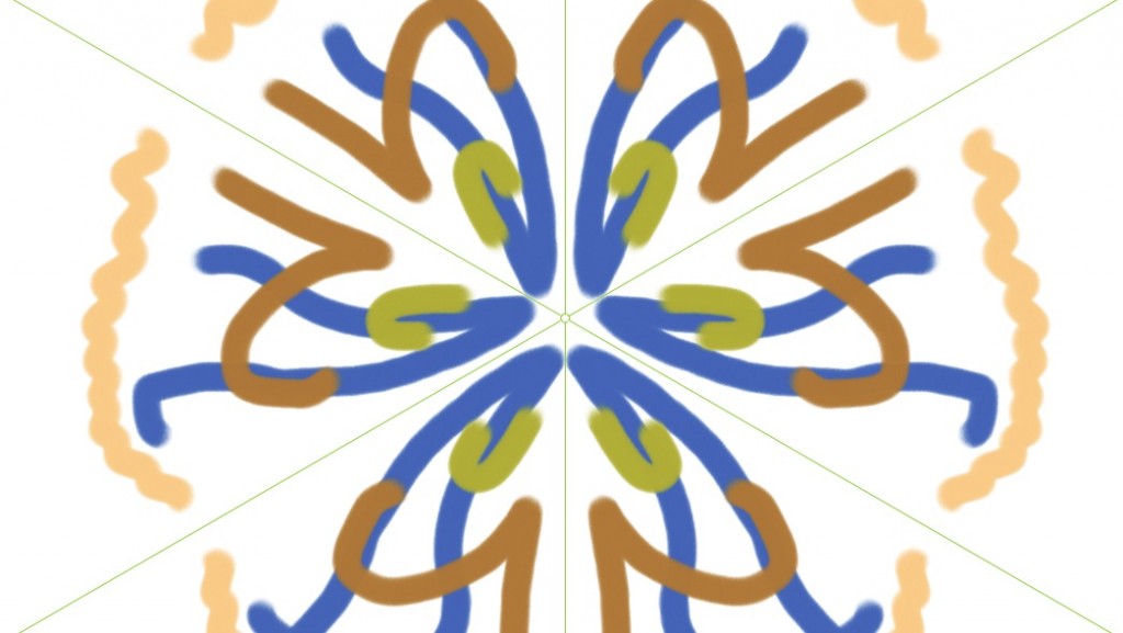
Let’s start with, in my opinion, is the heart of Painter and any drawing program- the drawing tools. The first two new tools are kaleidoscope painting and mirror painting. While both of these tools work great (and do what the names suggest) they are more gimmicky then useful, in my opinion.
Kaleidoscope gives the ability to create a kaleidoscope painting with up to twelve different sections. You can create some really interesting designs with this tool, but I personally don’t see myself or many others using it for drawing or painting a picture.
Mirror painting will mimic your drawing from one side of the screen to the other. Again, gimmicky, but I do see a little more use in this feature than kaleidoscope. If you are trying to draw a perfectly symmetrical drawing, this tool comes in very handy and will save you some copy and paste time.
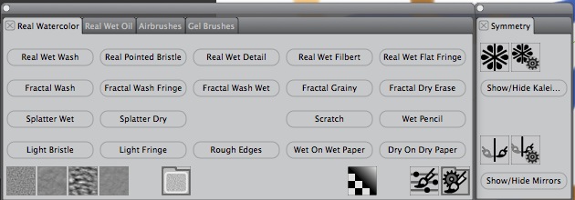
The real joy and new great drawing features are the real watercolor and real wet oil brushes. These are fantastic. If you thought Painter mimicked oils and watercolor before, these two tools take it to the next level. The paint acts and interacts on the screen just like the real deal and looks like the real deal. Just watching the watercolor blend itself into the canvas is fun. I spent at least ten minutes just playing with this brush.
There is also a new airbrush tool and gel brushes. I haven’t used an airbrush since I was a teenager, and that experience didn’t last long, so I can’t say how realistic this is; but it is another great tool to have access too. Don’t be fooled by the name gel for the gel brushed. These are not the gel pens that were all the rage with kids a few years back. These act more like markers in the way they work when you overlap colors. These are great for blending areas together.
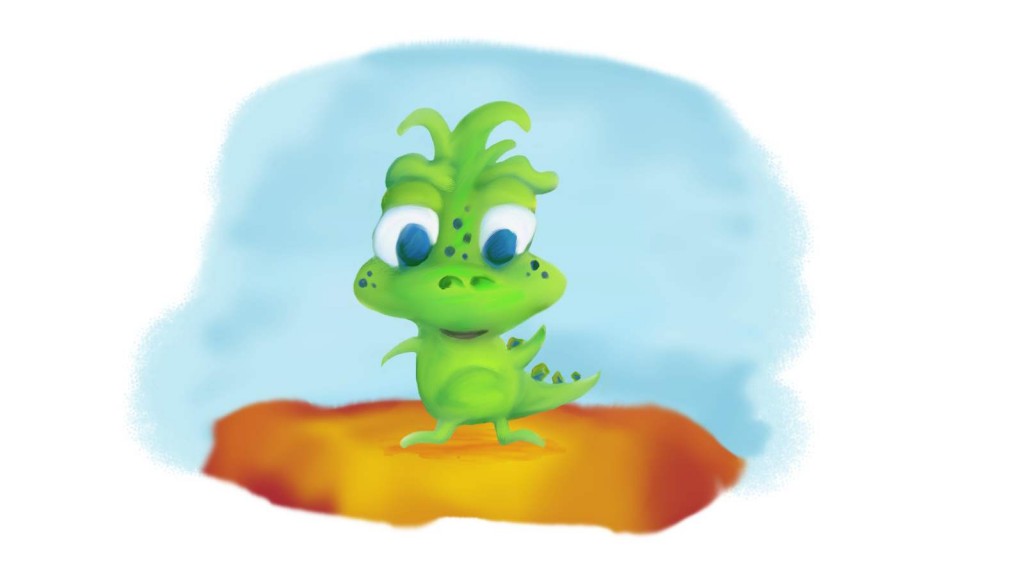
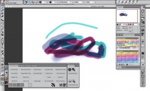
The image below was created in Painter 12 using many of the new tools and a Wacom drawing tablet. Painter has always shined with a drawing tablet and this release is no different. Drawing with a mouse is possible and I have done it, but there is nothing that comes as close to the real thing as using Painter with a drawing tablet.
Another feature I really like is the workspaces. Workspaces lets you pick a preset arrangement of tools and palettes based on your project. This gives you a nice starting point for brushes and tools and is a nice timesaver. You can also create your own workspace of tools and palettes you constantly use on projects. Corel even has a workspace showcasing what is new in Painter 12. This was very useful for me (and I imagine other reviewers).
Workspaces is one of several new features that let you customize the interface to make your workflow a lot easier to work in. One major change is the interface. The interface has been made more Photoshop like, which will make things easier for people coming over from Photoshop. At first I was trying to figure out what was different from older versions of Painter. However, when I opened Painter 11 I saw the big change and realized my brain must have been in Photoshop mode and was thinking that way. It does make it easier for users of both programs and not having to totally readjust your way of thinking.
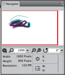
Another interface change, but not a new idea in programs, is the navigator. The navigator is a great addition for working on paintings that are too big for the screen-especially really big paintings. What is different on this navigator is access to some settings that you would have to dig through menus for. I also noticed that the navigator is really smooth and not choppy like other navigators I have used.
These interface changes and others, along with all of the new (and older) features of Painter 12 can be seen here with videos (there are just too many to mention in one article): http://www.corel.com/servlet/Satellite/us/en/Product/1166553885783#versionTabview=tab0&tabview=tab1. There are just too many features of Painter 12 to fit in one article.
One of the features Corel improves in Painter each year is speed. Each release they make the program faster and this release is no different. Corel is saying Painter 12 is 3-5 times faster then Painter 11. I can say that the program is definitely faster. I had none of the typical delays in tools rendering media on the canvas on my iMac making for a much smoother painting experience.. The only delays I did experience were brushes loading when I picked a new brush. The pause wasn’t bad, but a little annoying.
Overall, Painter 12 is a great program. It is still the king of natural media for the Mac in my book. The question is should people upgrade? As usual, this is a tough question. Is it a must-have update? I would say no. The new features are nice, but if you have no need for them then stick with version 11. On the other hand, the new brushes are great and if you use Painter on a daily basic the upgrade will probably be beneficial to your work.
For beginners to the digital painting world there are other, less expensive options (ie. ArtRage),. However, when you put them next to Painter, Painter is the winner.
MyMac.com rating 9 out of 10

Hi Donny –
I am the product manager for Corel Painter. Thanks for sharing your impressions of Painter 12. The dev team and usability lead worked very hard at this release.
I just got back from visiting some customers in ASIA. Illustrators that are into manga and fantasy characters do like the mirror painting feature – it saves them considerable time when they draw characters and faces. If you check out Tsukasa Kiryu’s site at http://citrocube.com/, you will note a character she painted with Painter 12 and the mirror feature. When I chatted with her, she called out the mirror painting as being a big time saver. This was echoed by other painters including Yoshitoshi Abe – he is a popular animator in Japan.
Hope that sheds some light on its usability and purpose 🙂
Andy
Hi Andy
Thanks for the comments and great site! I definitely see the use of mirror painting on that site. As I said in the article, I think mirror painting could be useful for some people and that site definitely shows it off.
Also, thanks for the hard work on another great release of Painter! I look forward to the next version in the future!
Donny
I’ve been a Painter advocate and serious user for more than 15 years. I use this program 7-8 hours a day, 5 days a week. It is THE production software I use as a professional illustrator. This latest release, while adding some attractive features, is the worst release Corel has ever put out. The software’s programmers have yet to resolve many of the earlier version’s crash problems, the interface redesign makes me question if anyone knows what they are doing, or perhaps they are simply outsourcing everything to India.
If you created custom palettes of brushes, colors, commands, etc. in prior versions, be forewarned: you will have to recreate every one of them again in this new release. If you rely on the portfolio feature (create portfolios of images or layers for reuse) be forewarned: you will run into problems importing many of them into this program. If you typically use the “paint inside or outside a selection” feature found in all prior versions, it inexplicably has been hidden in the navigation menu pull downs in this version. You can no longer shift select multiple layers in the document, you must go to the layer’s menu and do it there (absolutely ridiculous). The layer’s menu is poorly designed and glitchy. The brush size in the “Dab Profile” menu no longer updates in real time as you adjust sliders in the various brush control menus. The program continues to crash when dealing with layers, text and objects. I could go on, but suffice it to say, if you are a long-time user of this software, you will run into more problems and issues that drive you crazy and question your continued use of this software. Do not purchase this version, wait for Painter 13 and see if they correct their Painter 12 blunder.
Hi Ethan,
Thanks for your comments. I have been using Painter regularly too and have not experienced any of the problems you are mentioning. However, I do think it is time for a Painter 13 release and hopefully your concerns will be resolved. I am currently using Painter Lite for a review and it is working great.