By calling this major update “3.5†instead of “4.n†Steinberg has successfully adjusted Dorico’s release schedule: in future major releases are to appear in late spring/early summer. It is to be noted, though, that this version (3.5) has enough new features to have been called version 4. Even remembering that Dorico’s last update (Dorico Pro 3) was as recent as September (less than eight months ago), the upgrade price now of $59 is remarkably good value for money.
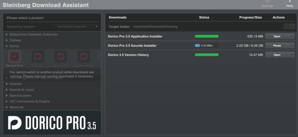
The best way to perform the upgrade is with the Steinberg Download Assistant software. Consider updating your license first, though, with the eLicenser (soft or hard/“dongleâ€) and let the fairly substantial installer packages run… several gigabytes.
It’s then safe to remove earlier versions of the Dorico application if you wish. This process worked well during the preparation of this review; as did Dorico 3.5’s operation with such auxiliary packages as NotePerformer. Help is always at hand, though – most of it from both Steinberg staff and experienced and expert users – on the Dorico forum.
Let’s group Dorico 3.5’s additions and improvements roughly to match the Modes (Setup, Write, Engrave, Play, Print) which it uses. Although we’ll look at editing, playback and presentation, Dorico’s Modes are so carefully integrated one with the others, that many of these new features will enhance your work in more than one area.
Note that not every one of which is available in every version of Dorico 3.5 (Dorico Pro 3.5, Dorico Elements 3.5, Dorico SE 3.5): consult this table for details.
This new version (Dorico 3.5) does not consist of a miscellaneous hotchpotch of new features. Rather, the greater control which this version affords users has clearly emerged organically from the software’s distinctive design. New and improved functionality builds on, expands and refines (and in some cases consolidates) those aspects of Dorico’s famed workflow which make notation so natural. It also transparently promotes digital adherence to established musical practices.
Editing, Interface and Workflow
Perhaps the most important changes are to be seen in Write Mode. This is where you spend half your time or more in Dorico. The fundamental activity in composition is note entry. Placing notes (and rests) on the staff; then editing (moving/removing) them.
Composers (and arrangers) need to be able to do this as quickly and effortlessly as possible… like text entry with a QWERTY keyboard, or drawing with mouse or tablet.
Each note in music has at least two attributes: its pitch and its length.
All previous versions of Dorico obliged users to specify the latter before being able to enter the former… “I know I want an F# here – but do I want a crotchet/quarter note, or a minim/half note?†In Sibelius and Finale it’s always been possible to specify either pitch or duration first. Some users switching to Dorico have found it inhibiting not to be able to decide on a pitch without having first to specify notes’ durations. It may seem like a small inconvenience, but when working at speed with contours, melodies, repetitions and thematic development as the kernel of what needs to be scored, the ability in version 3.5 simply to press K and be able to experiment with melody first – and only then (have to) set notes’ durations – is going to make a huge difference to the way we work in Dorico.
Such a welcome innovation dramatically increases the scope for experimentation, improvisation and just “seeing what happens†as, perhaps, you want to try out ideas on a MIDI keyboard for their melody without committing to particular note and chord lengths.
Typical of Dorico, though, are the attendant options to set defaults in preferences; to “preview†notes in a new color (light grey); to add rhythm dots and articulations after the note. These have all been implemented in such a way as to allow maximum flexibility to suit your workflow. This includes leaving things as they were for those users who were content with the original order.

Figured Bass is the notational convention (chiefly of Baroque music) that indicates to players which otherwise-unscored/unwritten chords, intervals and non-chord tones they should play (in the bass) when accompanying a melody. Instead of writing these out in full, a system of numbers and symbols (often accidentals) is used… a kind of shorthand or agreed-upon set of abbreviated prompts which continuo players learn to perform – without seeing their ornamentations “spelled outâ€, as it were.
Dorico 3.5 is the first commercial musical notation package to implement Figured Bass. It’s done so extremely well. Think of combining the “Type-ahead†feature in text entry (Google search suggestion strings, for instance) with the way in which calendar-based software like OmniFocus uses AI-like algorithms always to arrive at the same display of internally represented dates like “tomorrowâ€, “today+1â€, “2020-05-29â€, “Friday 29†etc. That’s how smoothly, robustly and faultlessly Figured Bass has been implemented in this new version of Dorico.
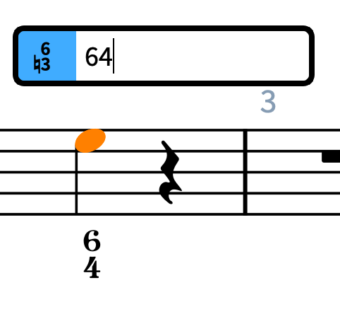
But explore it a little further (Figured Bass has its own popover), tweak the annotations in Engrave Mode and examine the corresponding Preference settings, and you’ll be impressed with just how much effort has gone into making what will be a real boon to a relatively small subset of users (composers rarely write using Figured Bass now). It’s an encouraging demonstration of the depth and skill of Dorico’s team that they’ve introduced this functionality so well. And introduced Figured Bass because it’s a venerable part of the lexicon of serious music.
If you still haven’t made up your mind to switch to Dorico, or to take it up for the first time, then let the next innovation in version 3.5 demonstrate just how well Dorico facilitates musical notation – rather than merely “tolerating†it. A “cascading model†of propagating properties has been introduced. “Properties†optionally appear in the panel at the foot of the Write screen with all the appropriately variable parameters of the currently-selected component in the score. Now you can set – and get visual feedback (color, font weight) to confirm – whether a property is “Local†to one of Dorico’s Layouts or “Globalâ€, and so applies to them all.
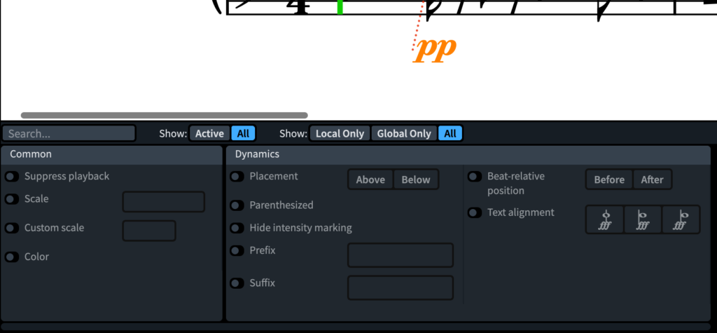
Different (groups of) performers (soloists, sections, conductors, conceivably even répétiteurs, page-turners and students etc) can now be given scores and parts prepared and printed with, say, different dynamic markings or slurs according to and depending on what they need. Crucially the composer/arranger now has infinitely flexible and highly granular control over where, how and when such properties appear; and for whom; and under which sets of circumstances. Their attributes can be easily searched for and filtered. Quite an achievement.
Analogously, Dorico 3.5 has a new way easily to produce parts (for wind and brass, say) of the same musical content but in different transpositions. Yet again, this has been implemented both cleverly (you create a new part Layout) and efficiently – with straightforward control… menus, preferences and sophisticated overrides.
Dorico 3 broke new ground by automating the creation of condensed scores such that certain sections of an orchestra or ensemble could be “collapsed†without losing any of the entered notation… a conductor’s score for example. Dorico 3.5 takes this intelligent, efficient and time-saving feature further. It supports condensed divisi for string sections.
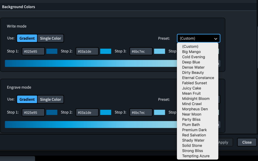
Another innovation looks as though it is essentially cosmetic. But it’s much more: Dorico 3.5 now allows you to change the color and background of Layouts. This is a useful introduction. For in Engrave and Write Modes you can associate, say, different working environments with different colors. You could have visually distinct reminders of where you are in the editing process, which Layout you have chosen and whether you are in full score or a part. Yet again, the degree and ease of user-control and customization of colors accords with what one has come to expect from Dorico.
Playing
The days when Dorico’s ability to play back the music you’ve written lagged behind Sibelius and Finale are long gone. As well as hearing a digital representation of your score with the HALion Sonic SE samples library that comes bundled with Dorico, the software makes installing, configuring and setting up third party Virtual Instruments (VIs) easier and simpler, quicker and less error-prone than do the software’s competitors.
You use expression maps to configure and control the correspondences between MIDI commands and the ways in which sample libraries’ instruments actually sound. They manage, for instance, the translation between ‘articulation’ marks in the score (plucked vs bowed strings; muted vs open brass) and the eventual audio output.
Dorico’s VST (Virtual Studio Technology) expression maps can be found in the “rack†at the right of the Play Mode screen. Now Dorico 3.5 renders the deployment of Expression Maps more transparent and straightforward – despite the huge array of different musical ‘effects’ of which even modest libraries are capable. A new Init switch, for example, allows you to manipulate sets, subsets and matrices of MIDI controller data and key switches for each VST instrument when playback begins.
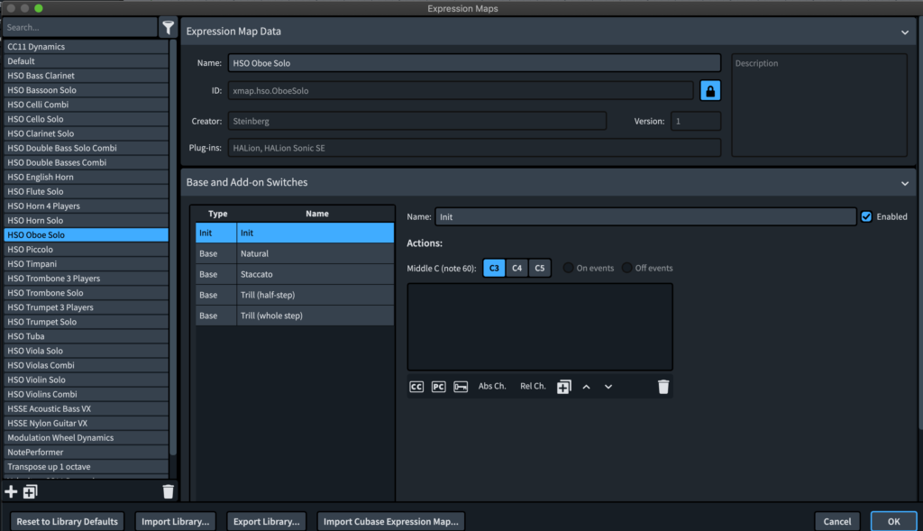
As well as simplifying and making the setup of Virtual Instruments more transparent, now the playback in Dorico 3.5 can be made to sound yet more natural… using cleverly-implemented Boolean logic.
For instance you can now determine the reproduction of legato, sustain, vibrato dependent on notes’ lengths. If you feel that nothing shorter than a quaver/eighth note should be played legato, for example, you can trigger the MIDI patch according to such a user-defined rule rather than having to rely on explicit case by case notation. Significantly, multiple playing techniques can be combined (“stackedâ€) for any given note or combination of notes.
Once you’ve experimented a little and become used to what’s possible in 3.5, the result is a more sophisticated and extensive set of controls to fine-tune playback – but one which is also easier to control and manage.
Specific to notation for the guitar is a handful of new techniques: vibrato bar dips, scoops, dives, hammer-on and pull-off. These illustrate nicely the observation made earlier in this review that Dorico 3.5 is evolving logically. When its development team considers the time right and the resources available to add functionality, the software’s existing capability is apparently effortlessly enriched to complement and/or enhance established best practice. This often happens in accordance with, and response to, users’ requests and feedback.
Presentation
One of the delights of working in Dorico is its clean interface. (“In†Dorico rather than “with†it because you are carried along as you create; the experience seems to form its own musical logic, rather than expecting you to adapt to (external) technical strictures.) Much has been done to build on that sense in version 3.5.
Slurs (the symbol to indicate that notes are to be played without separation… as a phrase, ’legato’) and beams (the lines to connect multiple consecutive notes (or rests) indicating rhythmic grouping) have both been enhanced.
Slurs are now sleeker and a little thinner; they can now span musical Systems; you have greater control of their disposition when they cross staffs and when they need to be applied to groups of notes with stems in both directions. It’s now no longer necessary to Alt+drag slurs’ endpoints in order to reposition their mid-points automatically.
Beams have new options for grouping where rests and “orphaned†stems are concerned; there is also greater control over beams’ slants. These don’t seem like major changes. But the greater elegance which these changes sponsor distinctly enhances and reinforces Dorico’s power to produce professionally-engraved scores for publication and performance. The printed score is even crisper, even more legible.
Dorico 3.5 refines still further the ways in which it “erases†components such as ties (symbols to join adjacent notes when playing) and note stems behind hairpins (changes in dynamic). Once again, the new Engraving options to mask these components near/behind both key and time signatures significantly aid readability. But you’re still able both to accept defaults and to override them if you know what you are doing. Typical Dorico flexibility.
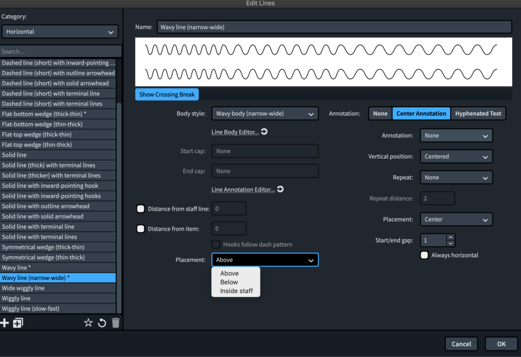
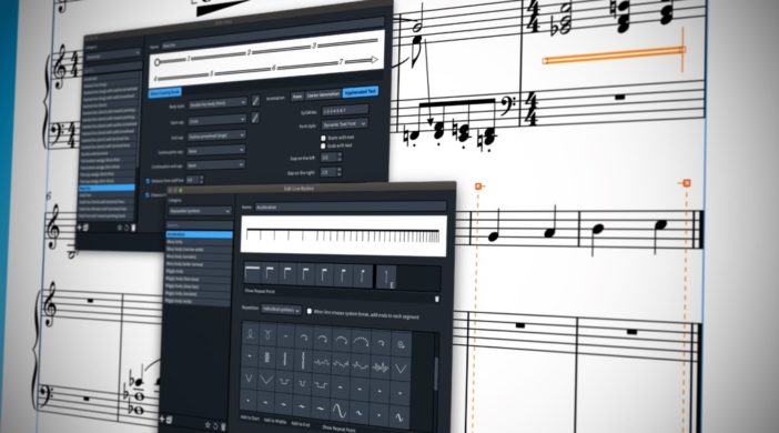
Lines are everywhere in musical scores. They are vital for players to appreciate horizontal phrasing: how long musical ideas last; when/where and how they end; match text; call for repeats etc. Dorico 3.5 takes to new heights the degree and ease with which you can customize every aspect of every line available to you in the program. Lines’ bodies, caps, style, weight, annotations and so on can now all be customized in the new Line Editors in the Engrave menu to achieve this. Many users will of course be happy to stick with the presets. But it’s good to know that anything is now possible when you want to add to your score’s sophisticated appearance.
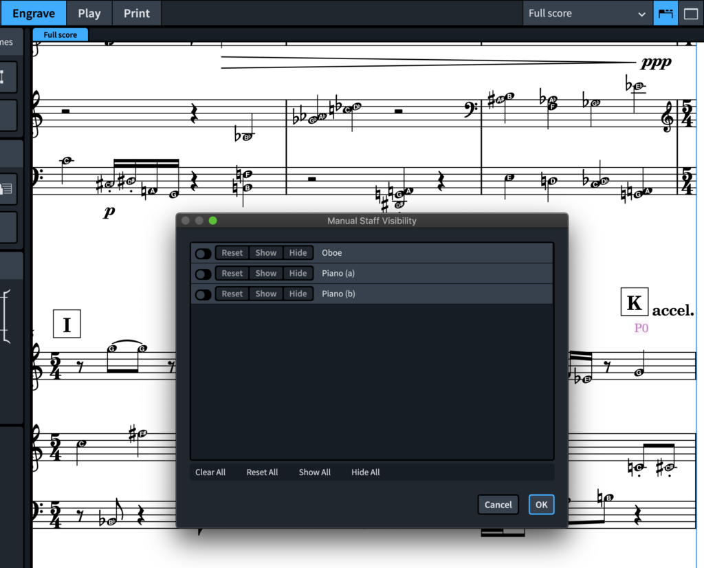
Remember the changes which Dorico 3 made to the hiding and displaying of staffs according to circumstance? Version 3.5 adds further welcome flexibility as you use the renamed Staff Visibility options (under Engrave Mode’s Edit menu). This functionality further streamlines the appearance, efficiency and economy of scores published with Dorico.
Engrave Mode now allows you to frame portions of a score with a boundary box (whose location and dimensions can be named and saved in the project file). These Graphic Slices can be exported (perhaps for students or independent examination of a tricky passage during intensive rehearsals) as multicolor or black and white PDFs, PNGs, SVGs or TIFFs.
There are other changes in Dorico 3.5 to the unique way in which harp pedaling is handled. This version also affords greater flexibility when setting bar-lines. “Hollywood-style†scores can now be produced: parts for film, TV and games often need extra staffs at the end of each cue so that written instructions can be added manually later. This reinforcement of Dorico’s credentials as a musical DTP package is also useful for teaching and the creation of exercises for students etc. Creating an entirely blank space in Dorico was previously a little tricky. Now it’s simple.
Among the other improvements in Dorico 3.5 are options for octave clefs; for editing the velocity (volume) of multiple notes simultaneously; for the positioning of rehearsal marks; for the syntax of tuplets in their popover; and with printing and MusicXML. Other improvements in Dorico 3.5 tighten, adjust or otherwise make more sophisticated the ways in which the software handles your score. Refer to this pdf <https://blog.dorico.com/wp-content/uploads/2020/05/Dorico_3.5_Version_History.pdf> for a full list. Again, for some users these may be small in significance. Yet they are sure to make life easier for many. They show Steinberg’s commitment to constant change and refinement.
Conclusion: Dorico 3.5 is recommended without reservation. If you own and use a previous version of Dorico, then – despite the recent release of version 3 – you’ll want to get the many significant improvements in 3.5.
If you’re new to Dorico’s world, then you’re likely to find that Dorico 3.5 offers almost everything you need. Certainly for the vast majority of users. These are arranged, however, in logical and well thought-out menu systems. Documentation is available which directs you to every option and feature until you become familiar enough with the software not to need it. Dorico 3.5 has an almost overwhelming array of features to suit many genres of music notation… it includes a new set of basic Indian drum sounds <http://keda.co.uk>, for instance.
As said, Dorico does things differently: the act of inputting and editing music is made more intuitive and natural than in other leading notation software. Dorico 3.5 significantly builds on its earlier versions while retaining everything with which users have become familiar. Dorico 3.5 is extremely stable given the massive array of operations which it supports.
The changes introduced in this version – while being obvious extensions and continuations of what we have grown used to – do break significant new ground. Of particularly impact is the ability to enter notes’ pitch before their duration. Overall Dorico 3.5 is a major step forward. Don’t hesitate!
Pros: Pitch before duration; improved VST Expression Maps; Line Editors; Transposed Parts; Figured Bass; better user interface.
Cons: None significant
System requirements:
- 64-bit Intel or AMD multi-core (i5 or faster recommended)
- 4GB RAM (8 GB or more recommended)
- macOS Sierra, macOS High Sierra, macOS Mojave, macOS Catalina
- Internet connection for download and registration etc.
MyMac.com Rating: 10 out of 10
Pricing (download version):
- Dorico Pro 3.5 full version: $559.99
- Dorico Pro 3.5 upgrade from Dorico Pro 3: $59.99
- Dorico Pro 3.5 upgrade from Dorico 1, 2: $159.99
- Dorico Elements 3.5 full version: $99.99
- Dorico Elements 3.5 upgrade from Dorico Elements 2: $29.99
- Dorico Elements 3.5 upgrade from Dorico LE: $74.99
Crossgrades from Sibelius, Finale; education versions also available

Leave a Reply
You must be logged in to post a comment.