Luminar 2018 — Beyond the Basics, Part One
Developer: Skylum (formerly Macphun) Luminar website
Download: $69
Last year, 2017, was a busy one for the Luminar developers. They won the TIPA (Technical Image Press Association) Best Imaging Software award; they introduced an updated version of the program, Luminar 2018; and they set about changing the company name to Skylum. Curt Blanchard has written a previous Luminar 2018 review for MyMac. Upgrade and development is proceeding at a fast pace, so we take another look.

If you have any familiarity with the older version of the program, it is worth checking out Key Features and Benefits to see the new operating routines and maintenance updates in the latest version.
Many reviewers have considered Luminar as an alternative to Adobe Lightroom and made comparisons based on that perspective. That approach is certainly valid, but that’s not only one way to view the application. If this is a topic upon which you need information, visit the Luminar Advantage page for a blow-by-blow tabulated comparison. An alternative perspective is to see Luminar as an innovative venture following its own unique development trajectory—at some point in the future, comparisons may be made in the opposite direction.
Old hands, experienced with photo-editing software from other publishers, will doubtless make their own comparisons. Opinions are most often determined by comfort with established workflows in familiar applications. Anyone new to photo editing, or anyone prepared to go with the flow of an unfamiliar application, has an opportunity with Luminar to step away from the tried and true to see if alternative ways of working have any advantages over the existing methods.
The flexibility of the Luminar workflows is only daunting for people who elect to poke and hope rather than spend a short time overviewing the easily followed User Guide, which is downloadable in PDF format. Really busy or impatient people might even get by with only reading the User Interface Overview section to get started.

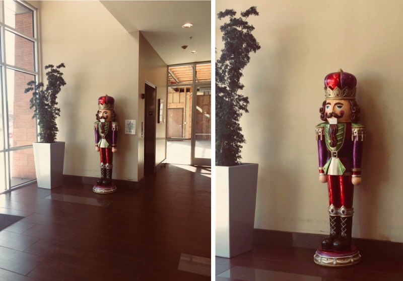
The test file was one of those shots every photographer dreads—a badly lit, casual iPhone snap that later had to be turned into something usable at a friend’s request.
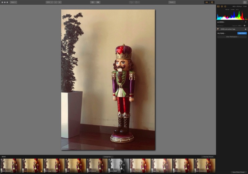
The user interface is minimalist until you are ready to dig deeper. There are three main areas: traditional tools and some controls are placed along the top of the application window; a sidebar on the right has controls for manipulating images; and along the bottom of the window is a gallery of presets with a preview and effect slider for the look that will be made to your loaded image.
The sidebar and the presets gallery can be hidden or revealed with a pair of buttons towards the right of the top toolbar. Buttons are orange when their feature is active and greyed out when inactive. The application does not have a traditional preferences panel, but it will retain settings between restarts: for example, if you are not a fan of black almost everything, four levels of monochrome for the image work area canvas are available under Menubar|View|Background.
The sidebar displays image Information, Filters, Workspace, and Layers. Information and Layers can be opened, closed, or adjusted with the orange or grey buttons in the top of the sidebar, but the image size and bit depth are always displayed. These four panels contain tools you can use fine tune your image to achieve the end result you want.
Luminar helps users build their own workflows. One easy introduction is to load a file and select a preset category and then one of the presets in the category. At this point, poke and hope is a good way to learn. By making extreme changes you can learn how to achieve results with more modest application of the effects.
Luminar is straightforward enough to get a beginner started, yet deep enough to grow along as skills are acquired and new techniques learned. This application is well worth watching as development proceeds—a free update with an asset manager is in the works for this year—and this editing software is recommended as it stands.

Cropped, mild enhancement preset applied, and unwanted wall notice removed with the Erase (heal) tool.
This is part one of a multi-part examination of Skylum photography applications, with additional articles to follow here at MyMac.com.


Leave a Reply
You must be logged in to post a comment.