Corel AfterShot Pro 3
Corel
Price: $79.99 (currently $39.99 during Black Friday countdown)
Update 11/20/2016: Corel AfterShot Pro 3 is currently 50% off for Corel’s Black Friday countdown!
Photographers who manage and edit their photos on the Mac have fewer options than they used to. Apple’s Photos app, while great for tossing general family and daily photos into, isn’t adequate for serious landscape or portrait photos. Adobe Lightroom and Photoshop are expensive, and are pushing people towards subscriptions. Pixelmator and similar native Mac apps hold promise, but fall short of meeting the needs of pure photographers.
Corel wants to help, and they offer AfterShot Pro 3 as the solution.
AfterShot Pro 3 was released in May of 2016. Almost six months later, I am presenting you with this review. There are reasons for the delay, which I’ll explain later. The main reason is that I encountered some issues when running AfterShot Pro 3 on my 2011 and 2012 Mac minis that caused me to want to try it on more substantial hardware. Now I have a late 2015 27†5K iMac. I’m glad I waited to finish the review until I got the new Mac because it gives me another performance reference point and an understanding of what kind of machine you’ll probably want for running AfterShot Pro 3.
In order to do Corel’s AfterShot Pro 3 justice and provide as in-depth a look at it as possible, I have organized the review into the following sections:
- Introduction
- Basic overview and application UI
- Image management and organization
- Adjustment tools
- Watermarking
- Selective editing
- Plugins
- The Good
- The Bad
- Summary
As you read the individual sections, bear in mind that I’ll revisit some of them in the “Good things†and “Bad things†sections in more detail, or at least regarding important details that I think will matter to you, the prospective buyer and user of AfterShot Pro 3.
Introduction
Photographers who edit their photos on the Mac will understand what I mean when I say that we live in interesting times. In the not too distant past, the Mac felt like a first class citizen of the photo editing world, with options like Apple’s Aperture 3 and standalone versions of Adobe Lightroom. Now Aperture 3 is but a distant memory, and Lightroom, while still available as a separate one-time purchase, is being nudged towards becoming a full-fledged Creative Cloud entry. That’s fine for professionals and serious amateurs who can justify a monthly fee for their photography applications, but for many of us, the prospect of Lightroom becoming subscription only constricts our options and fills us with dread.
Lest you be tempted to point me towards popular native Mac alternatives such as Pixelmator and Affinity Pro, I’ll just be kind and say that, while I love the fact that they exist and that I do own both products, they’re not substitutes for Aperture 3 or Lightroom CC. Maybe in a few years if the authors of Pixelmator keep up the pace of development on it, it’ll be a different story, but right now it’s got some rough edges and strange omissions. Few and far between are the serious photographers who consider Pixelmator a replacement for either Photoshop or Lightroom. Affinity Pro, on the other hand, seems to more closely encapsulate a traditional photo application workflow, but has no image management tools, something professionals rely on for efficiency and being able to quickly process together all the images from a photo shoot.
Corel is betting that there are Mac owners looking for powerful and feature complete alternatives to Adobe’s Lightroom, and they offer AfterShot Pro 3 as the answer. AfterShot Pro 3 is a full-fledged photo editor, more analogous to Lightroom than to Photoshop. Indeed, Corel’s own AfterShot Pro product page shows that they have chosen to make sending photos from AfterShot Pro to Photoshop simple. It’s clearly intended as a Lightroom replacement, and one with a simple marketing message: all the RAW processing and basic photo editing functions you expect, and one purchasing option — a $79.99 one time purchase ($59.99 for upgrades). No monthly subscriptions, no triple digit price tags, just give us your $80 and get to work.
Corel is positioning AfterShot Pro 3 towards three types of people: professionals, enthusiasts, and aspiring photographers. The first two groups are obvious.
Professionals make a living with their cameras and have low tolerance for wasted time and inefficiency. They also need to be able to trust their software to get the polish they need on their photos, including batch edit and export capabilities.
Enthusiasts may not get paid for their work, but they do know their equipment and range from good to extremely good photographers. They expect certain features in photo editing software, and have traditionally been Lightroom and Aperture users.
The last group, aspiring photographers, is defined by Corel as people who moving from snapshots and quick photos with a phone or point-and-shoot to becoming more thoughtful and intentional with their photography. This group also benefits from simple yet powerful software and non-destructive editing capabilities and needs an intuitive and well-organized UI.
Corel gives every indication of being a company that takes AfterShot Pro and its target photography market very seriously. I was given a personal presentation on the features of AfterShot Pro 3 by two Corel representatives, Alex Brazeau and Greg Wood, and it was clear in talking with them and seeing their passion that this program means a lot to them. Corel is not an unknown software developer trying something new. They have been in the graphics and imaging software business for a long time and they know how to write pro-level photo software and support it professionally. Based on my interactions with everyone I have talked to at Corel, the quality and stability of the company and the support you’ll receive should not be a concern if you choose AfterShot Pro 3 as your photo editing application.
Basic overview and application UI
Getting to work with Corel AfterShot Pro 3 for the first time is not difficult for anyone who has used either Aperture or Lightroom. The UI is easy to navigate and contains familiar elements. In addition, Corel offers video tutorials, a user guide, web-based help, and a user forum, all linked to from their AfterShot Pro learning page.
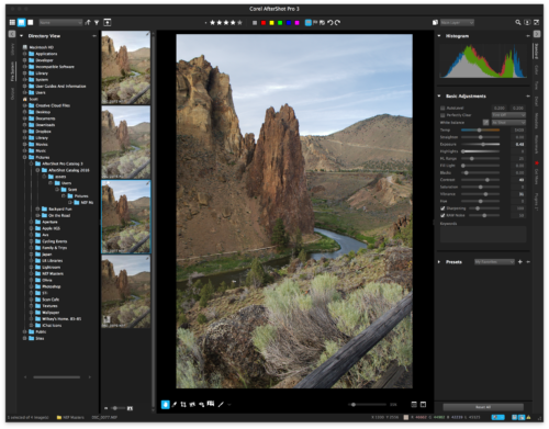
When you open the application, you’ll encounter a user interface that is easy enough to parse if you have any photo editing experience at all (and most likely even if you don’t). To simplify it slightly, you have a navigation pane for working with image catalogs or the filesystem, menus, a top toolbar for adding organizational metadata to images, image thumbnail viewer panel, selected image preview panel, layers panel, and adjustment tools panel. It’s that straightforward. There are additional tools and controls in some of the subsections mentioned, such as some simple editing and previewing option tools inside the image preview panel, but the basic UI is simple and clean.
One thing that struck me immediately about the AfterShot Pro 3 UI is that it really looks like a program from the Windows world. By this I mean that it lacks a certain design polish that I expect from applications on the Mac. The icons and image buttons used in AfterShot appear to be basic and unsophisticated. This even extends to the app’s icon; it looks like very little thought was put into it compared to anything else in my dock. It’s just a hard-edged square with no rounded corners, shadow, or other edge treatment. It looks out of place.
In the Windows world, no one seems to care what their programs look like, and on that platform I probably wouldn’t have thought about the appearance aspects of AfterShot Pro 3 at all. I have a Mac and I use Mac software, and part of the appeal of using the Mac is that someone gives a damn about how things look. To be quite honest, I wasn’t super impressed with AfterShot Pro 3 initially based solely on its design.
Fortunately, one of the benefits of waiting to write this review until I got my new Mac is that I was able to use the program longer and to develop a more nuanced perspective of AfterShot as a whole. Yes, the UI design could use some work if it’s going to look like a natural Mac program, but no, that doesn’t mean that Corel isn’t serious about AfterShot. They are. The look and feel of the program compared to other Mac apps you may be used to are not indicative of its capabilities, and you’ll soon discover that your first impressions are wrong if you judge it by its UI. Look and feel do matter, and photographers are people who care about how things appear. Photography is nothing more or less than an attempt to create a pleasing interface to the world.
Image management and organization
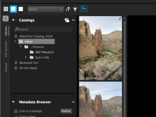
AfterShot Pro 3 makes easy work of getting photos into the application and managing them. As hinted above, you have the choice of working directly with image files in your computer’s filesystem, or importing them into AfterShot photo catalogs. Pulling them into AfterShot catalogs has a few advantages, including permanent edit history for all photos in the catalog, multiple folder browsing, versatile image search, and grouping images into image stacks. Corel recommends working with images in catalogs. In addition to the benefits listed above, it does greatly reduce the complexity of your source image folders. Because AfterShot implements non-destructive image editing, it stores a list of edits performed on an image in sidecar XMP files. Images imported into a catalog have these accompanying files stored in the catalog folder rather than as solo XMP files in the filesystem next to the master images. Permanent edit history alone is enough of a reason to use catalogs, but the reduction of clutter in the Mac’s filesystem is a great bonus too.
One thing you should know about AfterShot Pro catalogs is that importing photographs into them doesn’t actually move the master images. The catalog points to the location of the masters on your computer’s hard drive. This is different from what you may have been used to if you ever used Aperture, which by default imported all master image files into an internal bundle. With the AfterShot Pro 3 reference-based model, you still need to be mindful of where your photos are located and not move them around or delete them after you’ve imported them into an AfterShot catalog. Also, if you remove a version of a photo that happens to be a master image from an AfterShot catalog, be careful not to choose the option to delete the master file if you don’t want it disappearing from your computer.
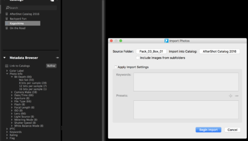
Working with catalogs is fairly straightforward, but there are a few little quirks, and I strongly recommend reading the section in the User Guide titled Library and Catalogs. For example, if you import pictures using the File > Import Photos from Folder menu option, you’ll have no choice but to import all photos in the specified folder (although you can choose whether or not to also import photos from subfolders). If, however, you use the Filesystem browser to drill down into a folder and then select specific pictures in the thumbnail pane, you can choose to import only those selected photos rather than all photos in the folder.
I also encountered some oddities with the Catalog browser that I didn’t fully understand. At one point, I imported some photos from a specific folder on my Mac, and then later deleted the catalog that I had imported them into. Subsequently, the Catalog browser insists on showing me the path to the folder that I had imported into that catalog, and I couldn’t find an obvious way to get rid of this from my Catalog browser.
Also, when working with catalogs, you’ll need to check the Import Photos dialog box carefully to make sure it has the catalog selected that you wish to import into, even if you highlighted the catalog in the Catalogs pane before beginning the import. More than once, I thought I was importing into a catalog that was highlighted in the Catalogs section of the Library pane, when in fact I was importing them into the first catalog in the list.
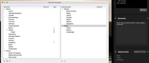
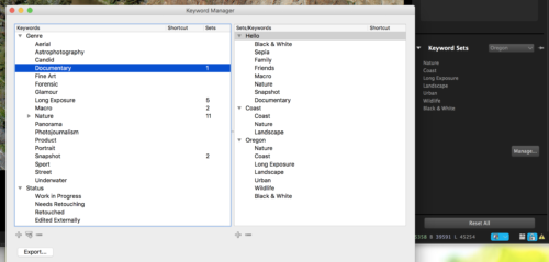
Besides basic organization tools such as the Filesystem and Catalog views, AfterShot Pro 3 provides image management and filtering options. You can rate, label, tag, and flag your photos to make them easier to filter, find, and categorize for different actions or assessments. You can also add keywords on the Metadata adjustment tab, although keywords can get a little weird. For example, if you create child keywords to other existing keywords and add them to your photos, instead of just seeing something like “Coast†in your photo keywords, you’ll see something like “Genre; Nature; Coast†instead, reflecting the entire keyword hierarchy for that keyword. It functions well enough, I supposed, but it looks cluttered and isn’t really how my mind works for keywords applied to a photo as opposed to how keywords are organized in the keyword manager UI.
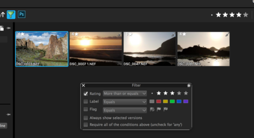
AfterShot Pro’s organization tool are effective and allow easy view filtering to find a subset of photos you want to work with. You can filter by rating, color label, flag, whether or not to always include selected images, and whether the returned photo set should include photos that match any of the selected filters, or only photos that match all set filter conditions.
Adjustment Tools
The real test of any good photo editing software is how quickly and how well a person can adjust and edit their photographs using it. All the management tools in the world mean nothing if photo adjustments are lacking or result in uninspiring images. Corel AfterShot Pro provides all the requisite adjustment tools for working with RAW images to prepare them for output to web or print.
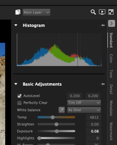
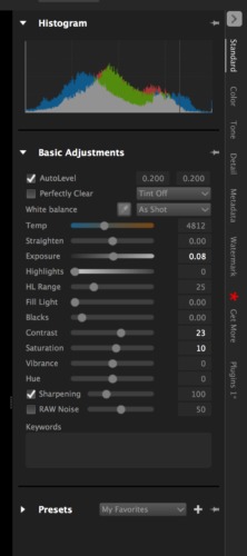
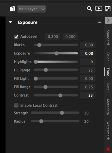
AfterShot Pro’s adjustment tools are arranged into six tabs: Standard, Color, Tone, Detail, Metadata, and Watermark. The first four tabs are where you’ll make your images look the way you envisioned them, and the final two provide the ability to control what metadata is attached to them and even to watermark them if you’re going to publish them to the web or provide them as proofs to your clients.
Standard Adjustment Tab
The Standard Adjustments are a set of basic adjustments you’ll probably want to tweak for almost any RAW image you’re working on. RAW by default tends to require sharpening and contrast and saturation adjustments, and the Standard Adjustments tab provides quick access to these and several other parameters that can make big differences in the look of a photo very quickly. Almost all of these are items that have greater adjustability on one of the other adjustment tabs, but for quick experimentation and dialing-in the desired look of an image, Standard Adjustments will get you headed in the right direction very quickly.
Two adjustments that Corel includes for quick “get me going†functionality are AutoLevel and Perfectly Clear. These adjustments are nothing more than checkboxes – simply toggle them on or off and AfterShot will adjust the black and white points or per-pixel lighting settings, respectively.
In practice, I found both AutoLevel and Perfectly Clear provided mixed results. Perfectly Clear sometimes tended to overly brighten substantial portions of some photos, but I did find it to be effective on others, such as beach sunset photos where it enhanced the glow of the sun and provided a warmer feel and better exposure. You’ll have to experiment with both AutoLevel and Perfectly Clear. They’re far from guaranteed improvements depending on the picture, but when they work to your advantage they’re really nice for providing a quick nudge in the right direction as a starting point.
Color Adjustments Tab
With the Color tab, you can control curves, color correction, color balance, white balance, and color profile. Any color related adjustments you made using the simple sliders on the Standard Adjustments tab will be reflected here, plus you have the greater control and manually adjusting your curves against a histogram, as well as additional sliders to play with under each color subcategory. There’s nothing revolutionary here, and there’s no need for there to be. Everything a photographer will expect for making color adjustments is present.
Tone Adjustments Tab
Similar to the Color tab, Tone provides greater control over tonal adjustments. Exposure, highlights, fill light, contrast, blacks, and local contrast are all in attendance, and as expected, any changes made via the Standard tab that affect these values will be reflected here.
Detail Tab
The AfterShot Pro Detail tab has the usual suspects you’d need for something related to photographic detail: sharpening, RAW noise removal (as well as a second noise removal option, Perfectly Clear Noise Removal), and lens correction.
The lens correction section is actually the source of one of my complaints about AfterShot Pro 3. I’m familiar with using lens correction in Adobe Lightroom, and it works very well there. When you tell the software what camera body and lens you have, it can use that with the focal length the image was shot at to determine what kind of distortion is present in the photo, and compensate for it. For example, your camera lens makes a building look as though it’s tilted away from you based on the angle and physical properties of the lens, lens correction can straighten out those lines appropriately by altering the line convergence in the picture.
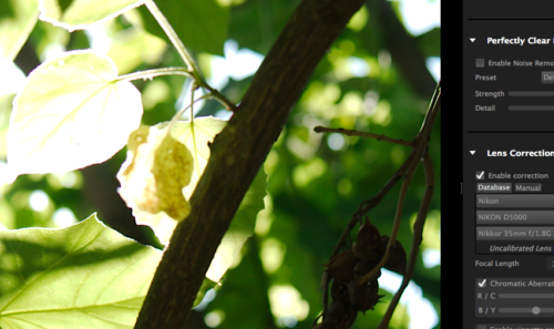
My problem with how this is handled in AfterShot Pro 3 is that, while my camera body and the three lenses I own for it all show up in the database for selection, all three of my lenses are flagged as uncalibrated lenses by AfterShot Pro 3. Corel helpfully includes a “Learn More†link beside the Uncalibrated Lens indication, but clicking that link just opens the introduction page of the web version of the AfterShot Pro 3 help file. Searching for “uncalibrated lens†returns no result. I’ll admit I was hard pressed to see the point of a help link that provides no help at all, and even harder pressed to see the point of lens correction that (in my case) seemingly provides no lens correction whatsoever.
If I had some bizarrely unique camera lenses, I could forgive Corel for calling them uncalibrated. But I don’t. My camera is a Nikon D5000, available since 2009, and two of my lenses are so-called kit lenses (lenses that are sold with a camera as part of a kit, and typically cost less than lenses that can only be purchased separately). Both of these lenses have sold in large numbers, because Nikon packaged them with several different camera bodies over a timespan of years. For a long time, you couldn’t go to Costco without tripping over a yellow and black box with one or both of those lenses inside. My third lens is also a popular Nikon lens, the Nikon AF-S DX Nikkor 35mm f/1.8G lens, introduced in 2009. It’s popular because it’s an inexpensive fixed focal length lens with a large aperture and, on a crop sensor (DX) body, is suitable for producing decent portraits.
At first I thought perhaps there was something I needed to do in order for AfterShot Pro 3 to accept these as calibrated lenses and provide the expected lens correction to my photos, but there’s no information anywhere as to how to do this. Lightroom provides automatic lens correction for all of my lenses just by selecting them from a similar dropdown list, so I know it’s possible. I’m not an optical engineer and don’t want to be. Corel should make sure that their lens correction feature works, especially with very common lenses, and that it doesn’t require a lot of explanation and help that doesn’t appear to actually exist anywhere.
AfterShot Pro 3 does have a manual option for its lens correction, but unless you know what 1st order, 2nd order, and 3rd order corrections do, and what numbers suit your situation given your particular lens, you’re playing a guessing game. Again, I don’t want to have to research how to correct my lenses or swap xml files with random people online, and neither will all of the other people who own these lenses. Adobe Lightroom is the clear winner in the lens correction department, which is an important detail in my opinion.
Also included in the lens correction section is the ability to compensate for chromatic aberration. Chromatic aberration is the result of the inability of a lens to focus all colors to the same convergence point. It results in weird fringing effects, such as the edges of something appearing purple in bright light or at wide aperture. My aforementioned AF-S DX 35mm lens has this issue, and it’s often very noticeable at any aperture larger than around f/2.2, especially in bright situations.
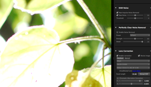
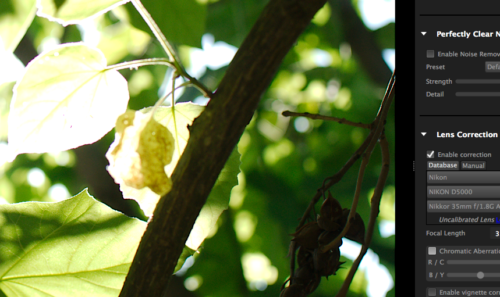
I did some testing with the chromatic aberration correction, toggling it on and off on a picture of some backlit leaves that show purple fringing to see how well it would help the photo. Oddly, all it seemed to do for me was to move the fringing by decreasing its appearance in one location, and increasing its appearance in another. I played with the sliders to see if I could improve the result, but the bottom line for me was that, at least with the sample of images I looked at, I couldn’t really eliminate the aberration. I don’t know if that’s because my lenses are considered uncalibrated and therefore the chromatic aberration controls didn’t really know how to compensate for my particular lenses and their characteristics, or if it’s just because it doesn’t really do a whole lot.
The first two images below are of the same photo with Chromatic Aberration Correction off. The second two are of the same photo with Chromatic Aberration Correction enabled.
All in all, I was disappointed with the lens distortion correction features in AfterShot Pro 3 given my camera and lenses.
Metadata Tab
As I mentioned previously while discussing AfterShot Pro 3’s organizational tools, the Metadata tab provides the ability to add keywords to a photo or photos, and allows keyword management with fully editable keyword sets and keywords.
One thing tripped me up a bit with regards to keyword sets. AfterShot came with an initial keyword set named “Default.” I added a second keyword set so that I had two keyword sets, one called “Default†and one called “Coast.” After creating and choosing “Coast†in the Keyword Sets dropdown list, “Default†disappeared, and I was unable to switch back to using keywords from the Default keyword set. Out of curiosity, I created a third keyword set titled “Oregon.” Subsequently, both “Coast†and “Oregon†appeared in the Keyword Set dropdown list, and I could choose either one at any time. Only “Default†was missing in action. I opened the Keyword Manager and renamed it to “Hello,” but regardless of what I did, the top keyword set in Keyword Manager remained inaccessible to me in the Keyword Set dropdown list on the Metadata adjustments tab.
The reason this is an issue is that in order to apply keywords to a photo, they must be in the currently selected keyword set. I tried dragging them from the keyword manager window into the keywords field, and it resulted in a blurb of XML associated with the keyword appearing there instead. As a result, I had a keyword that looked like this mess:
<!DOCTYPE PropertyScribe>
<PropertyScribe xmlns="http://www.bibblelabs.com//PropertyScribe/" version="1">
  <CKeyword hotkey="" isExpanded="false" isPrivate="false" path=";Genre;Macro" name="Macro"/>
</PropertyScribe>
Definitely not what I want.
It wasn’t until later that I realized what was happening: whenever I would select a keyword set in the dropdown list that wasn’t at the top of the list, the set that was at the top of the list would scroll up out of view. It was still there; somehow the dropdown list was being scrolled up, even if there were very few sets in the list and therefore absolutely no reason for it. It’s a very confusing UI feature, and one I have to assume is unintentional. If it is intentional, someone needs to spend a day with their customers seeing how people use software, and then another day feeling very sheepish about their life choices.
The metadata adjustments tab also shows the camera metadata associated with your photograph. There are also different metadata sets you can choose to view, using another dropdown list, and the same scrolling weirdness applies to this dropdown list as well. In fact, it was the dropdown for the metadata viewer that helped me figure out what was going on with the keyword sets. It’s strange and stupid, but manageable once you understand that the universe isn’t supposed to make sense. Down is up, up is sideways, and dropdown lists scroll even when there’s no reason on earth they need to.
You can also edit your metadata sets similar to how keyword sets are managed, although personally I have no desire to. I suppose someone may want to go crazy with metadata customization, but that someone is not me. Still, it’s good to have the ability to if you want it.
Watermarking
The final tab in the adjustments pane is one that Corel is very excited about. It’s called Watermark, and I’m talking about it in its own section because it’s a feature that Corel promotes heavily. Photo watermarking is very popular on sites like Flickr, and with professional photographers providing sample work to clients.
You can see some examples of watermarks on Flickr here, here, and here. In these cases, watermarks are just meant to help prevent theft and reuse of images without permission and attribution. It’s the Internet – it happens a lot.
We could probably debate the effectiveness of watermarks on photos posted online all day long. Suffice it to say there are reasons why some of the best photographers that I follow on Flickr don’t bother with them, and why the watermarks that do look like they’d be effective deterrents, resistant to cropping and other measures, tend to ruin the photos they’re stamped across. The bottom line is, if you’re going to put photos online, someone may come along and steal them and claim ownership, and watermarks can help with that if used effectively. My feeling is watermarks are probably best utilized on proofs for clients rather than things you put on the web for random people to enjoy.
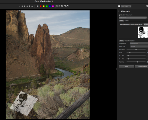
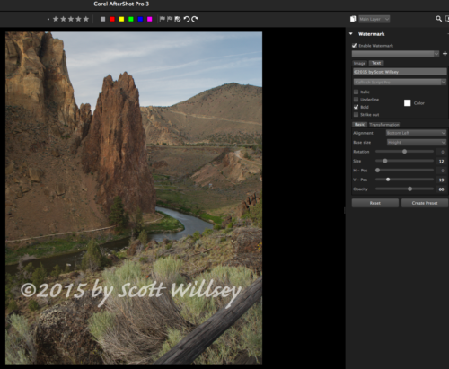
Regardless of how you like to use watermarks, AfterShot Pro 3 makes it simple. Type in some text, or choose an image on your hard drive, and then select the location on the image, the size, and you’re done. You can also skew it or stretch it, and naturally the text or image can be as opaque or transparent as you like to further make it unobtrusive.
Based on how simple watermarking with AfterShot Pro 3 is, it doesn’t require more than a couple paragraphs to explain how it works, but it’s a key new feature in version 3 of Corel’s photo editor that they’re quite proud of. Considering how easy it makes watermarking and that it’s built right in to the workflow, it’s a notable feature worth emphasizing to those who may want to make use of it.
Selective Editing
Effective photo editing requires the ability to make adjustments look natural and the ability to experiment and remove or alter adjustments. Generally speaking, if it’s obvious the photograph has been edited and if you can see a spot on the photo that you know has been manipulated, you’ve failed. AfterShot Pro 3’s selective editing features are a key part of enabling effective and efficient photo enhancement.
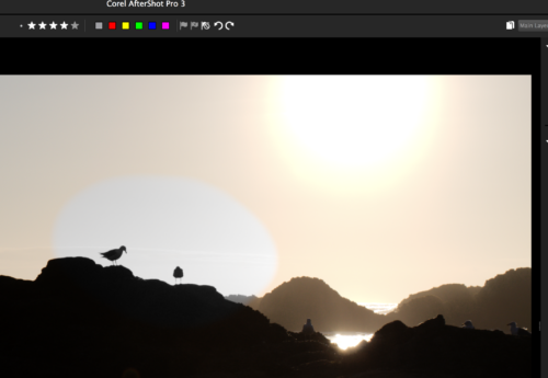
Selective editing is simply another way of saying that you can apply adjustments to specific portions of a photo. Further, and most importantly, you can apply these adjustments to different layers, meaning that you can remove or toggle the adjustments easily. You can also adjust the opacity of a layer, which is helpful for keeping changes to your photos looking natural.
In AfterShot Pro 3, you’ll use an individual layer for each type of adjustment. You can select as many or as few areas on the layer using Circle, Polygon, Curve, or Brush selection tools as you like, but any tweaks you make using the adjustment tools will apply to all selected regions on that layer.
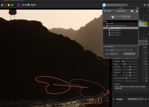
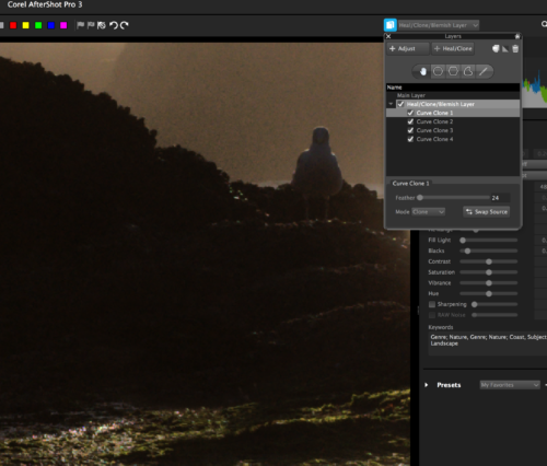
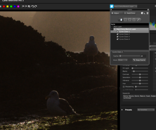
For example, if you want to remove a seagull hiding in the shadows but still visible enough to prove distracting, simply add a Heal/Clone/Blemish layer using the Layers tool at the top right of the window above the Adjustment Tools pane. Select the layer in the layers list, and choose from the available selection tools to select areas in the image you wish to repair. Your mode options with Heal/Clone/Blemish layers are Clone and Blemish.
Below, I’ve applied several curve clones to remove the seagull and its feet and tail. The first image shows the curve clone tool selection areas, the second picture shows the effect applied, and the third photo shows what it looked like originally, before I decided to remove the hapless victim from existence.
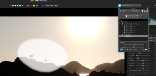
You can use adjustment layers to apply subtle adjustments of any type: contrast, saturation, exposure, sharpening – you name it and you can apply it to a selected region of a layer, or the entire adjustment layer itself. For example, the two pictures below show the addition of an adjustment layer, a brush selection within that layer, and the result of dialing saturation down to 0. If I had selected multiple regions on the adjustment layer, the saturation slider setting would have applied to each of them.
This is a spurious example and not an optimal use of an adjustment layer, but it illustrates the granularity and ease of applying adjustments in AfterShot Pro 3. Removing a specific selection on the adjustment layer, or even the entire adjustment layer, is very simple. AfterShot Pro 3 lets you experiment and adjust to your heart’s content without having to worry about making mistakes or performing an edit you cannot easily undo. Layers and the selection tools are one of your best friends in the photo editing process. Layers may very well be one of the most powerful aspects of this program, and certainly one of my favorite features.
Plugins
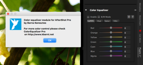
Another feature of AfterShot Pro 3 that Corel is eager to highlight is plugins. Plugins are just what they sound like: image adjustment tools that aren’t included with AfterShot Pro 3, but can be added later to upgrade your photo editing arsenal. Because third-party developers can create them, theoretically there could be a large range of functionality available for download and immediate use. Corel even includes the Black and White plugin to demonstrate the usefulness of the concept. Plugins can be added via a plugin download manager, titled “Get More†on the adjustment tools pane.
The reality is that there are a handful of effect plugins available, and some image preset packs (think image filters in an iOS app, for example). The plugin effects vary from zone tools to red-eye remover to split toning utilities. One issue with plugins is that not all plugins are available as 64-bit, but AfterShot Pro 3 doesn’t appear to accept 32-bit plugins anymore, according to Corel’s plugin page. Still, if you download a 32-bit plugin from the plugin page, AfterShot Pro will let you install it and restart the application, but the plugin simply isn’t available in the plugin section of the adjustment tools pane. It’s a bit confusing, and, much like the lens correction situation, it’s something that very few people are going to want to troubleshoot and figure out the nuances of. It should just work.
The good news is that if you stick to installing plugins from inside the application under “Get More,” you shouldn’t have any issues. The bad news is that the plugin listings inside the application aren’t very descriptive, and the webpage is much nicer for getting a feel for what exactly it is you’re about to download.
My impression of plugins is that they’re a great idea, but their utility is going to vary greatly depending on the plugin author and how much time you want to spend managing them. In practice, I never used them at all.
One request I have for plugins is for a more useful information button for them. Right now, when you click the question mark next to a plugin, you’re presented with a modal dialog box which displays the author’s webpage link as dialog box text, and it’s not possible to click on it and go directly to their site. It feels old and clunky and very much an afterthought.
The Good
After using AfterShot Pro 3 for a while now, I’m much more impressed with it than I expected I would be. Corel got a lot right here with their interpretation of the photo editing workflow. At the top of the good list are selective editing, including layers and regions, and photo management and organization. These are things that other Lightroom and Photoshop competitors either get wrong or don’t even try to include. Corel correctly recognized that photography enthusiasts want and need these capabilities.
Good photo editing is all about subtle adjustments and enhancements. Corel makes achieving this goal easy with adjustment layers and a variety of selection tools. Within minutes of playing with adjustment layers, I was able to develop an understanding of how I could effectively and efficiently use them in my workflow.
Corel also incorporated non-destructive edits into AfterShot Pro 3. Besides adjustment layers, which can be set to visible or invisible, all edits are placed into sidecar XMP files. This is pretty standard in higher-end photo editing software, but there are programs that eliminate this or disguise it a bit too much, and resort instead to making the photographer carefully manage multiple file versions. AfterShot Pro 3 does allow you to create multiple versions of your photos, but they’re all visible inside of the program next to each other, and any adjustments you make to any of them are still all individually reversible. Versioning in AfterShot isn’t about making sure you can reverse your edits, it just allows you to try new things. Non-destructive editing is what allows you to retain the ability to walk backwards through your adjustments.
This highlights one major advantage of importing your photos into an AfterShot Pro 3 catalog. For photos that have been imported into a catalog, the complete editing history is retained, and you can adjust the photo however you wish in the future, including undoing edits you’ve made in the past. By contrast, if you’re editing photos from the filesystem that are not imported into a catalog, the history is for the session only, and gets lost when the application is closed.
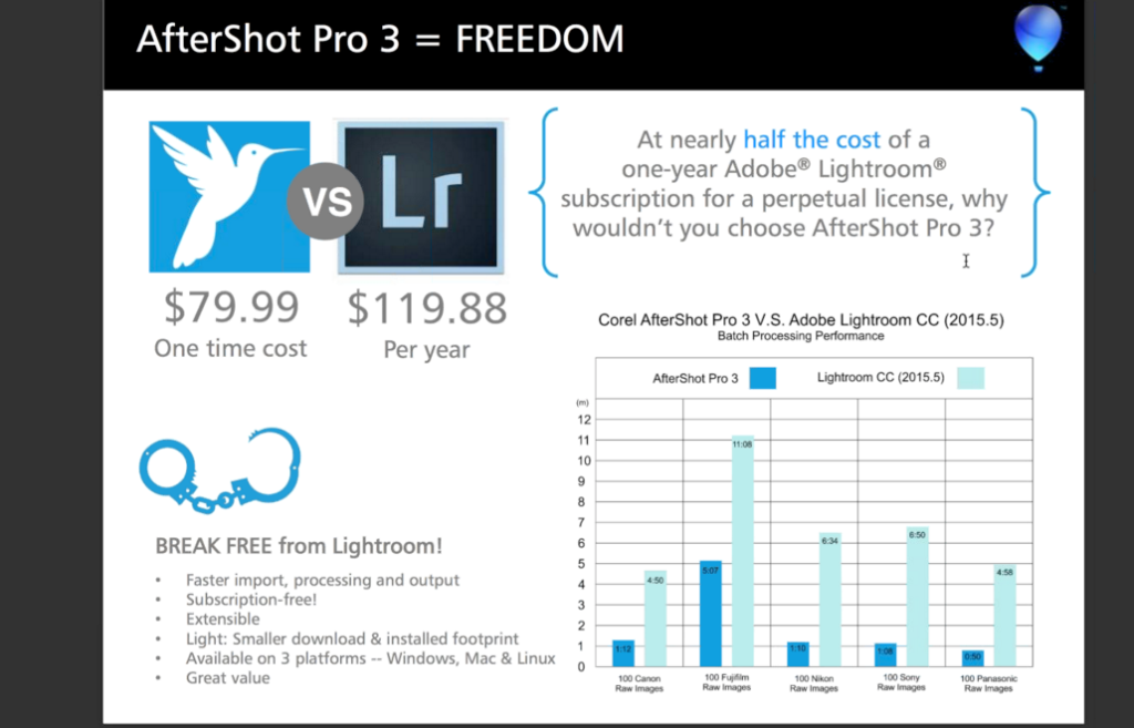
A final consideration of AfterShot Pro 3 that winds up in the good column has to be pricing and licensing. Corel charges $79 for a perpetual license. That’s it. No future obligation, no subscription, and a price solidly down in the double-digit category. You can even get a warm pair of socks from Pair Of Thieves with the change from a $100 bill.
Corel points out on their comparison list that the price for AfterShot Pro 3 for subsequent years is $0. Yes, this is technically true, and it illustrates well the benefits of one perpetual license versus a yearly subscription, à la Lightroom CC. It does ignore the fact that at some point, you’ll want to and have to upgrade to a future version of the application. Honestly, using the same program for three years without ever upgrading to get new features or performance seems unlikely. Still, you can buy AfterShot Pro 3 for $79 and use it for as long as you like, assuming some future macOS update doesn’t render it inoperable.
AfterShot Pro 3 provides a combination of price, features, and ease of use that is hard not to like. Corel has done a really good job of understanding key components to an effective and efficient photo management and editing workflow.
The Bad
No program is perfect, and AfterShot Pro 3 is no exception. My two biggest problems with it are both UI related, and both affect my confidence in being able to make the adjustments I want without accidentally messing up my photos. You can see examples of both in the video at the end of this review.
The first is a weird issue I call Jumping Photo Syndrome. Images jump and appear to refocus when edits are applied with adjustment tools. It doesn’t happen every time, but it happens a lot, and it seems to happen regardless of the adjustment tool used. To my eyes, not only does the photo seem to hop and then spring back to its previous location, the apparent sharpness of the photo changes as well. To say this makes it difficult to know how the final product will actually look (not to mention what to do with sharpness sliders, for example) is an understatement.
Jumping Photo Syndrome was the major issue that caused me to hold off on reviewing AfterShot Pro 3 when I first received a license for it in May of this year (2016). At the time I had a 2011 Mac mini, and I thought maybe my computer just wasn’t up to the task. I also experimented with it on a 2012 Mac mini with the same results, and decided to play a bit of a waiting game until I could get a new Mac.
I finally got a new late 2015 iMac at the end of August. While no current Apple hardware will ever be featured in a lineup of the most amazing graphics processing machines, the new iMac is not really a slouch either. It’s got an AMD Radeon R9 M390 with 2GB of VRAM on top of a quad-core Core i5 3.2GHz CPU and 24 GB of RAM. These specs far exceed Corel’s listed Mac hardware requirements of OS X 10.9 or later, Intel CPU, 2 GB of RAM, 250 MB available HD space, and a 1024 x 768 16-bit display. It’s not going to blow anyone away in the gaming department, but it should certainly be able to handle some photo edits without visual anomalies like the kind I’m describing.
And truthfully, it does — if you use Adobe Lightroom or basically anything besides AfterShot Pro 3. I do not see this type of weirdness when editing photos in any other application. Given how annoying and detrimental it is to the photo editing workflow to have the image jump around and vary in sharpness just because a slider was moved, this is a pretty substantial flaw in my book. Corel needs to exorcise the Jumping Photo Syndrome demon as rapidly as possible.
The second major issue I have with AfterShot Pro’s UI is related to sliders and adjustment tabs, and I call it Unintentional Sliding. Sliders can (and will) be moved just by mousing near them. The results range from annoying (zoom level of the image I’m working on constantly gets changed unintentionally) to downright dangerous (all kinds of adjustment levels get moved without realizing it). Again, this puts the user directly in the position of never being 100% sure they didn’t make some change they didn’t mean to and don’t realize they made. I can’t tell you how many times I went past a color balance or exposure slider, for example, and wound up changing the effect that was applied to my photo. Not cool at all.
The same thing applies to the adjustment tabs themselves; you can be looking at the “Standard†adjustment pane, for example, and just by moving the mouse slightly, suddenly you’re on the detail or metadata pane. It’s very disorienting, and (worse) time consuming to keep having to make sure you’re where you think you are, or going back to the toolset you want if you inadvertently jumped away.
I honestly don’t know if the slider/tab/mouse thing is intentional or not, but it happened on all three of my Macs, under both OS X 10.11 El Capitan and MacOS 10.12 Sierra. Even if somehow Apple is at fault, the fact is that Corel has placed their product on this platform. It doesn’t seem unreasonable to ask they they test it with all standard modern hardware, including both trackpads and mice that come with the various Macs sold today. If this is actually intended to be a feature, and not a bug, then I’d submit that perhaps this should be rethought carefully on the grounds that it was a bad move and is a major impediment to getting work done efficiently and reliably.
The rest of my complaints about the program are far less serious. Auto-level and Perfectly Clear give mixed results, and seem too aggressive in many cases. I’m not a fan of the plugins UI; I’d rather just have plugins managed in preferences and just show up in the menus, or more similar to the way Photoshop handles plugins. The related “Get More†feature seems a bit wonky due to the lack of information or previewing capability for new plugins, and also because there aren’t very many interesting plugins showcased there, even five months after the program’s release. Finally, the UI is a bit rough, as I mentioned in the Basic Overview and Application UI section above. I would like to see something more Mac-like, but considering the price and utility of AfterShot Pro 3, it’s definitely not a show-stopper. All in all, any gripes other than Jumping Photo Syndrome and Unintentional Sliding are fairly minor.
Summary
Unless you’re deeply in love with Adobe products and are willing to start considering a subscription service to get the most out of them, you’ve probably found yourself looking for a good alternative photo editing solution. It’s an interesting time on the Mac for photographers with the disappearance of Apple Aperture and the release of Apple Photos, which can only be described as a disappointment for anyone hoping for Aperture power in a simpler wrapper. There are other options, such as Pixelmator or Affinity, but both have their own issues that ruin the workflow in one way or another. Other photo editors are being worked on, but Corel AfterShot Pro 3 is here now, and Corel does seem to know their way around a photo editor.
If you’re currently using Apple Photos or have been trying Pixelmator or Affinity Photo and would like to find something that feels more like a traditional photo workflow and management tool, Corel AfterShot Pro 3 is a solid choice. You can try before you buy with Corel’s free trial option, so if you’re worried about the frustrations I had with it, you can gauge your own feelings on it and decide if it’s for you or not. I recommend that you do try it, whether you think you’re a prospective buyer or not.
Corel AfterShot Pro 3 is a competitive photo management and editing application with a simple yet powerful workflow. Corel gives every impression of being serious about making AfterShot Pro 3 a contender in the Mac photo editing space. If they can fix the problems that plague the editing UI, they will solidly achieve their goal.
MyMac Review Rating for Corel AfterShot Pro 3 is 7 out of 10.



Leave a Reply
You must be logged in to post a comment.