No, MyMac has not become an Android site (unless Tim follows through on his threat to switch if Apple drops the headphone jack in the next iPhone), but while surfing around I found an article talking about a company called Jide. Never heard of them? Not surprised as they’re a small Chinese company that seems to be a relative newcomer. Like most other Chinese companies, the products they make are firmly rooted in the Android world. However Jide is doing something a little different from most of the rest. They’ve kinda forked Android and turned it into a desktop OS. How does it do? Surprisingly well, thank you very much.
At the moment Jide has two products for sale, the Remix Ultra-Tablet and the Remix Mini. Both are running Android 5.x (Lollipop), a quad-core ARM processor, and 2GBs of RAM. The Mini has a slower processor (1.2GHz as compared to the 1.8GHz for the tablet) and less internal storage (16GB vs 64GB), but the price for each is the big difference. The Ultra-Tablet goes for about $300 while the Mini comes in at around $70.
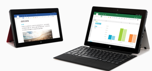
I’m including some information about the tablet just because it’s part of what they do, but haven’t tried it myself. There’s lots of stuff about it over at the Jide site if you’re interested and of course you can buy one from Amazon (links above), but because I didn’t win the PowerBall Lottery last week, I decided to get the Remix Mini instead and give it a run through.
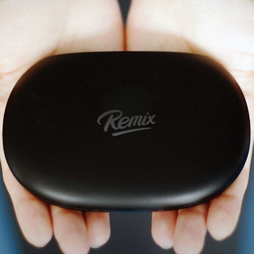
Gaz and I actually talked about it on MyMac Podcast 588Â last week with both of us deciding to get one. Gaz’s came pretty much broken at the point where power plugs in, so he wasn’t able to immediately test one. Mine arrived safely in a small brown box that had the look of something that someone had actually put some thought into. Upon opening it, the Mini was in a small cradle on the top with two smaller boxes underneath that held the power adapter and a (very short) HDMI cable. Everything was in small cardboard boxes with very little waste. A nice touch.
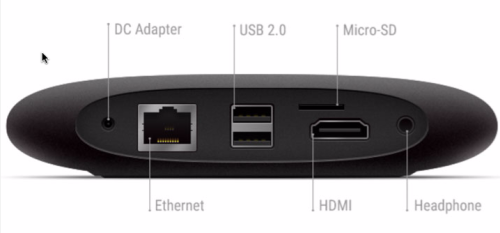
I connected it first to a spare 22-inch monitor I wasn’t using for anything else, then added a wired Apple Keyboard and the only wired mouse I had available…an old iMac hockey puck (I’ve since gone out and gotten a cheap USB wired one because few things in life suck more than that iMac mouse). I then added a 64GB Micro-SD card that are silly inexpensive these days and plugged in the power adapter.
Finally IÂ booted it up and waited to see what would happen. The splash screen looked pretty snazzy (like THAT’S hard to do) and a few setup screens popped up. One was for WiFi (even though it was directly wired by ethernet to my network) and after connecting to my WiFi network, I got a screen telling me that an update was available with really no way to NOT get it. So I hit OK and then it appeared to be dead. No progress bar, nothing telling me what was happening and after a few minutes just as I was going to reboot, it opened up to the desktop.
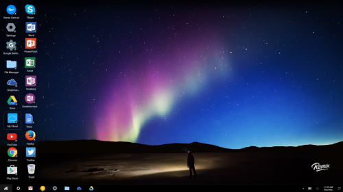
Next was to load some apps on it. I decided to go for broke and installed the mobile version of Microsoft Office since I have a Microsoft Office 365 subscription. No problem and each application worked just as well as they do with iOS though having to enter my account name and password for each the first time was annoying. I also threw Skype in even though I don’t have a microphone or webcam attached (yet) because…reasons. I threw in some Cloud storage apps on except for DropBox since I share that with others and don’t yet trust Android THAT far. I also added a few photo editors like Aviary (which is a kind of cool little mobile editor) and another called in a fit of originality Photo Editor that reminded me why free apps aren’t always free. It insists on showing ads everytime I open a new image. However this isn’t about the follies of app developers, it’s about this little box.
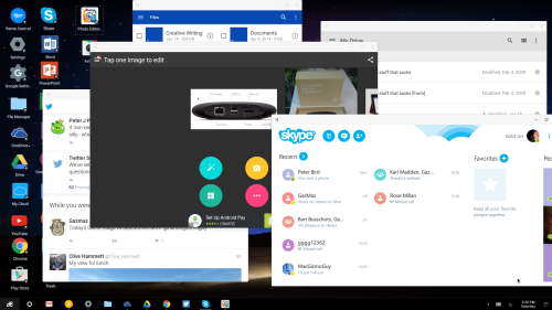
You get a basic grid of applications there by default or that you’ve installed on the desktop. The default seems to be to add them on the desktop when each is installed. These are aliases or pointers to the actual apps that reside in what you COULD call (I wouldn’t, but you could) the Remix’s Start Menu. You don’t have to leave them on the desktop if you don’t want to and you can drag them to the desktop (as an alias) later on if you find you use a particular app a lot.
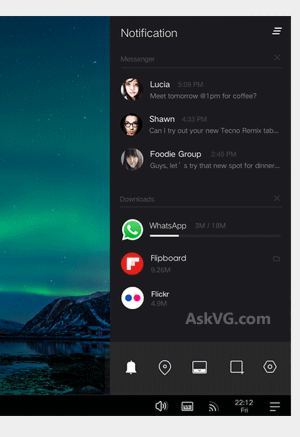 There’s a Taskbar too that you can have an alias to oft-used applications that also shows all currently open apps. Apps that are open show a gray bar underneath their icon that has two states. A small dot if open but not the currently focused on app, and a solid bar if it is the focused app. If desktop space is at a premium, or if too many open apps are a distraction, you can minimize each app and reselect it when you need it again. Not the most complex way of doing it, but it works in this minimalist environment.
On the right side of the taskbar is a set of three lines that opens the Notifications Center. From here you can set the OS to “Do not disturb” which turns off live notifications, Turn locations off, Auto-hide the Taskbar when the mouse icon isn’t near it, open your Remix OS Settings menu, and probably my favorite, do screen grabs. Screen shots are crazy easy. Hit the icon and the screen darkens a bit and a lit up section with six-way controls lights up. Move to any window and it grabs just that window. You can also grab any section of the screen to include multiple windows, or just grab the entire screen. Unless you specify differently, all screen grabs are put into the “Pictures” folder accessible from the File Manager. It’s a well done feature.
Moving on to performance, whether connected to WiFi or through a wired connection, it displayed information pretty snappy from the web. I didn’t do any comparisons with my 2010 Mac Pro (I mean really?), but it rendered everything reasonably well. Whatever it uses for graphics I’m sure isn’t a beast, but it does up to 1920 x 1080 resolution and things looked fine. I don’t think it’s up to playing Call of Duty anytime soon, but that’s not what a computer like this is meant for.
I had multiple applications open at the same time and didn’t notice an appreciable drop in performance. I also played the movie Cars off a networked connected drive and it…played. No frame drop out that I could tell, but at full screen things were not as sharp or crisp as I’ve seen from the same file on an older Macbook Pro or the aforementioned 2010 Mac Pro but it was watchable. Nearly all applications opened within a reasonable amount of time in my opinion. It also has BlueTooth 4 which connected with everything I had available to me at the time of writing this, but I did see other reviews that mentioned it didn’t work with some.

One thing that Android has that iOS does not is a file manager called well, File Manger. Think of it as a Finder-lite. VERY light as it can only display the contents of one folder or volume at a time and doesn’t really work too well with the back and forth buttons to go from the folder contents back to available volumes. The Remix OS doesn’t improve on this any, but considering that iOS has nothing to compare it to, it’s hard to find too much to fault it for. Drag and drop is hit or miss as well. Files going from one folder to another in the same File Manager window works as does going from the desktop to the File Manager (and the reverse), but how well individual programs deal with it is iffy at best. For example, trying to drag an image from the File Manager to say, a MS Word Document doesn’t work at all. Neither does trying to drag an image to Google Drive from the File Manager. Most have some way to access those files, but it’s hardly very elegant.
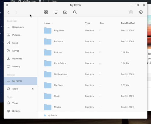
There’s basically two different views; Grid and List view. Also included is a search feature which will really come in handy if you’re one of those people who don’t like using the default locations for saved files. Word of advice, let things save in their defaults. You’ll be much happier this way
Because this is Android, you should also be very careful with your security settings. Take the time to carefully check each one and only allow the information you’re comfortable with be used by Google and the applications you install. Fortunately, on each install you can see exactly what parts of the OS each app is asking access to. Consider carefully not installing apps that want access to parts of the OS or your information that they have business or requirement needing. Oddly enough, there are actually two different places for settings (possibly more). The Remix OS has some settings related to the look and feel of the OS, as well as things like network and Bluetooth, printers and other hardware and Google has settings related to security and information. Pay close attention to each.
Last part, Jide has taken the time to look at some of the apps that work well within this environment and has an app “store” of a sort. There’s not too many of them, but they’re well known apps like YouTube, Plex, FaceBook, and Skype as well as the Microsoft Android apps. It’s not a bad place to start before going off into the wilderness of the Google Play Store.
When I first saw this device and decided I wanted it, I really didn’t know what to expect. It’s not OS X or Windows, that’s for sure, but for much less the cost of either you get a pretty decent operating system and access to a lot of free and low-cost software. Since I do have a choice, I wouldn’t use it for my main OS or computer, but there’s a lot to like here and I look forward to watching where they take it in the future.

Leave a Reply
You must be logged in to post a comment.