FileMaker Pro 14
Company: FilemakerÂ
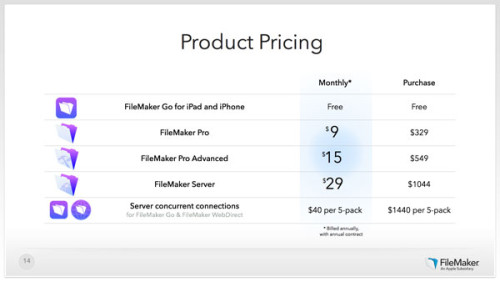
Price $329 Full version, $549 Advanced, $196 Upgrade
See more options on pricing at end of review!
When FileMaker Pro 13 appeared in the summer of 2013 we found it a good, stable and useful upgrade to the venerable database product family. FileMaker (which is celebrating its 30th year in business in 2015) is a wholly-owned subsidiary of Apple’s. It has millions of users, excellent 24 x 7 technical support and a vibrant and widespread network of consultancy and development specialists.
Now version 14 of the database and productivity suite, which runs on all major hardware platforms, mobile devices and the web, is available.
This latest update does not provide so many new features as some users might have expected given the same somewhat steep pricing structure as has applied in recent versions (new, upgrade and licensing).
The thrust of version 14 is clear. As the processes of flexible and sophisticated-looking data capture, management and presentation grow potentially ever more complex, users need accessible, open, yet powerful tools and environments on any/all of their platforms/environments (Mac desktop, web, phone, tablet, Windows). FileMaker is to be congratulated on achieving a virtual platform for integrated database management – regardless of device.
The fact that such integration works as well as it does should be a factor in deciding whether it’s worth paying for this latest version.
If you need a solution that’s independent of platform and device, streamlined, good to look at and work with, then you’ll probably overlook the absence of a mass of new functionality in Version 14. It really does go further in polishing and adding visual appeal to the way that Layouts can be built and made even more attractive. For developers the new Scripting environment is a major step forward.
As Apple users know, transparent synching and sharing of data is not easy… duplicates, inconsistency of versions and records, reliable parallel updating can often occur as the result of ambitious aims in the notoriously difficult world of updating multiple-devices.
Version 14 really does let users (and developers) of FileMaker pick up where they left off in all necessary operations – from retrieving data using simple queries to advanced development of fully-encapsulated solutions for distributed end-users. All involved now really can (continue their) work regardless of device, environment and operating system. This release gets it right. Testing for this review resulted in flawless access to data on the variety of platforms on which the software now runs.
Transparent
For instance, you can now begin to craft a button that might have a complex script (see below for a significant change in the Filemaker scripting environment) on your desktop installation; break off; and then see your changes reflected immediately on your iPad, iPhone or even iPod as well as – via WebDirect – in any of the major browsers in other locations. Similarly, changes to data effected by a user/customer/client in one environment are reflected instantly any other(s) to which they (need) access.
The changes in FileMaker Pro 14 are substantially geared towards supporting this transparency and building on the success of its introduction – essentially in version 13. Specifically, ease of design (for non-specialist designers) with the underlying technology of CSS 3 and HTML 5 are the chief new features in this version. As well as a handful of focused major new features and a bevy of enhancements.
Script Workspace
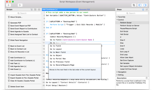
Scripts have long been one of FileMaker Pro’s most powerful tools. There isn’t much that they can’t control, react to/detect and initiate. Now the idea of a ‘Script Workspace’ allows developers to enjoy a dedicated, consolidated area in which to create, edit/debug and oversee scripts and calculations.
The new IDE (Integrated Development Environment) will be a delight to experienced scripters and significantly speeds up the development process. More and more powerful and comprehensive though FileMaker’s scripting process has become, the limitations of having to work in a rather clumsy and wholly closed editor analogous to AppleScript’s own proprietary editor have often frustrated those used to more flexible environments.
This entirely new way (for FileMaker) to use scripts is a rewritten Editor which supports sophisticated auto-completion, indentation, favorites (marking of the script steps you use most often), in-line editing, shortcuts, and script step descriptions. They all have in-line Help, and automated command-lookup. Other features like keystroke shortcuts also speed development.
The aim of this new Script Workspace is perhaps to encourage those without programming or scripting experience to venture into creating their own custom solutions… but once there, the paradigms of the new environment will be both familiar and easy to use.
FileMaker uses point-and-click simplicity and contextual guidance to achieve this. No-one should expect scripts to write themselves, of course. Expertise is still needed. But Script Workspace makes work both quicker and much easier. During evaluation, the Script Workspace was found to be the single most useful advantage of this new version (14). Entire scripts can be built outside Filemaker (in BBEdit, for example, to take advantage of its advanced text editing functionality) and drafted into (and back out of if necessary) FileMaker when ready.
WebDirect
FileMaker WebDirect has been redesigned for Version 14. Again, the aim is to make it easier for non-specialists to build database tools that will be familiar because such developers are so used to the models for interactivity on the desktop (drag and drop, hierarchical menus etc), yet work on all platforms/devices.
It’s gratifying to see that this new version has taken nothing away, over-simplified nothing in what has been added. This is no reduced selection dumbing down. Everything’s (still) there that needs to be there. The sophistication that users have come to expect (in automatically resizing elements, for instance) is now more easily achievable.
WebDirect claims to be up to 25% faster and has doubled the number of supported concurrent connections (from 50 to 100). Browsers on more recent tablets are now fully supported.
Version 14 of FileMaker finally brings to the applications’ own environment a real feeling that you are working seamlessly in a dedicated space, which has sophisticated menuing, interactivity, responsiveness and a completely modern presentation layer; and not with what used still to look like a somewhat crude front-end to a database.
Design
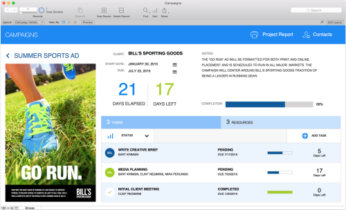
Indeed, launch a FileMaker database from even a few years ago and it looks… like a database; standard, wiry icons, plain fonts, somewhat anonymous controls and uninviting layout. Version 14 takes the changes which have been introduced successively over recent versions of the product to a level that will surely satisfy demanding designers.
New in this version are several very pleasing ways to control the look and feel of your application: buttons can now be aggregated in a fully responsive Button bar, field-labels and objects (component) styles are much more flexible and controllable. Custom icons (140 of them) are now available to use on your layouts; the control of colors in the palette is now enhanced by inclusion of suggestions consistent with the current theme.
While these are not major innovations, their availability really will make a difference to the appeal (and hence accessibility, usability and uptake) of a FileMaker Layout. Such, after all, is what users now expect.
Launch Center
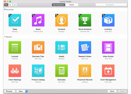
The “Launch Center†presents an an app-like interface to each of your database files with big, bold icons in place of OS-specific dialog boxes and pull-down menus. You can organize things visually, choosing from nearly 30 in-built icons, or design ones of your own. The fact that this Launch Center works across the entire FileMaker Pro 14 platform offers a welcome consistency of experience for end-users who just want to get things done.
Non-specialist end-users may now use the platform for the most sophisticated workflows (multi-user approvals, version control, for instance) without necessarily even realizing that they are using a database as such.
Mobile
There are also enhancements for iOS users. New script steps provide more control over the look and feel of databases on iPad and iPhone. FileMaker Go 14 (the free app available from the App Store) has a newly redesigned iOS 8-style interface, which is a lot cleaner; scripts and gestures can be used to go full screen; portrait or landscape views can be locked; extra information can be gathered when capturing signatures.
Server
Behind the ubiquity of FileMaker clients has always been a robust server suite. This too has been enhanced in this update. Advanced developers/administrators will appreciate the new automatic reconnect from FileMaker Pro 14 solutions to FileMaker Server 14 in the event of a lost or unreliable network connection. Security enhancements have also been made in the FileMaker Server Admin Console… chiefly with stronger password controls. There is also a new “standby server†option in FileMaker Server 14 to give experienced administrators intended uninterrupted availability of service.
Conclusions: It’s hard to see which changes FileMaker could introduce to SQL-based relational database design at this stage in the game; so “front-end†improvements, and ever more reliable cross-platform/environment integration are almost inevitably where the effort to add value must lie. It has been done well in this version, even though such additions and improvements are arguably over-priced.
In effect Filemaker Pro 14 pushes still further the direction of solid integration taken by recent versions. Particularly successful is seamless cross-platform and cross-device transparency. At the same time, access to an ever more pleasing, modern-looking and intuitive presentation layer has been made yet more immediate. The sophistication of the FileMaker environment, though, has not been compromised. Yet one wonders whether these changes – useful though they are – really justify the high prices asked, particularly for those upgrading from previous versions.
Pros: builds very successfully on a solid and sophisticated system to take cloud-like/cloud-based integration still further; the new Script Workspace is a real boon to scripters; enhancements to presentation (custom icons, button bar, greater control over Layout components) add to professional aesthetic that non-specialist designers can achieve; greater control of iOS usage; some improvements in server connectivity and security.
Cons: many users may find the balance between major new features as such and the by now established significant expense for the version and upgrade hard to swallow.
System Requirements: essentially Mavericks or Yosemite (10.9, 10.10) are recommended for the full functioning of all features.
MyMac Review Rating: 8.5 out of 10

