Capture One Pro 8: $299 (or $15 per month subscription)
Apple’s Digital Asset Management (DAM) and photo editing software, Aperture, was released in 2005 priced $499. Three years later, Aperture 2 came out at $199; and in 2010 Aperture 3 appeared with the price reduced yet again – to $79. Last year (2014) Apple announced that Aperture 3 would be the last version; and that the company would no longer be updating the product. Apple’s support for Aperture will also eventually end. A final maintenance release (3.6) appeared in October 2014 for compatibility with Yosemite (10.10), the last OS with which Aperture is guaranteed to work. Users are on borrowed time, which is a pity because Aperture is an excellent product and has a mature and dedicated support structure.
Apple identified its Photos app, which appeared with 10.10.3 in April 2015, as the preferred upgrade path from iPhoto as well as from Aperture. The majority of users of the latter, though, saw the inadequacies of Photos as soon as it became available.
Although the array of editing features in the newer Photos is greater than that in iPhoto, the feature set and almost all aspects of Asset Management, workflow, tagging, organization and publishing in Photos fall short of the requirements as an official replacement for Aperture. Only the most casual of non-specialist users are likely to find Photos in this release satisfactory. Many have begun to look for alternatives.
Some considered Adobe’s Lightroom as an alternative to Aperture; but its pricing structure and policy, its integration with other – perhaps unwanted – Creative Studio products, and its difficult user interface make it a far less attractive alternative than what has been a market-leader in DAM, editing and workflow software: Phase One’s Capture One Pro, which is now at version 8.
This review both evaluates Capture One Pro (v. 8.3) and examines the process which “refugees†from Aperture could well follow in order to transition their valuable collection of digitized images into what is really an exceptionally good, flexible, robust and reliable application. Phase One’s Capture One Pro 8 will turn well-organized and sophisticated photographers’ apparent loss into a real gain.
Phase One
Not, perhaps, the best known name to Apple users, Phase One is a company based in Copenhagen with offices in New York, London, Tokyo, Cologne and Shanghai. Because it’s not a public company, figures on finances and market share are not available. But it is a recognized leader in open-platform based medium format camera systems – bespoke, high-end hardware.
Phase One’s support for the wider world of photography extends beyond its hard- and software: it actively supports cultural heritage preservation, for instance; there are the Phase One Digital Artists Series Photography Workshops and a certified professionals scheme. Although designed to promote the company’s products of course, opinion is that these are nevertheless extremely worthwhile enterprises.
Now at version 8, Capture One Pro has a growing reputation as a Digital Asset Management and image-manipulation suite. It’s a well deserved one: during the lengthy period of evaluation taken for this review Capture One Pro 8 was found to be outstanding both as a DAM system and photo-editing suite and is warmly recommended.
Capture One Pro 8 is a worthy replacement for Aperture in terms of managing, cataloging and retrieving/viewing your photographs. It has all the functionality for photo editing, adjustment, enhancement, correction and “effects†which all but the most demanding user is likely to need. (Professionals who need a wider array of photo editing tools will almost certainly gravitate towards PhotoShop, anyway; even then they will lack an integrated DAM system.)
Any software which aims both to organize images and allow their electronic manipulation has to strike a balance between library workflow and editing if it’s not to be unwieldy. Aperture struck such a balance well. Capture One Pro 8 does just as well – in some respects better.
Activating
The download is over 300 MB; but was found to be quick. (The software is also available on Amazon). Be sure to get the correct version, though: there are four flavors including two Sony-specific ones and one that’s effectively bundled with Phase One hardware. Price also vary according to the number of seats required. The default is two: use Capture One Pro 8 on a machine at work and at home; or on a portable and desktop. It can be trialled for 30 days, too, to see if it really is the best successor or alternative to Aperture for you.
It’s worth mentioning that the actual process of activating should be negotiated carefully. Once you have an Activation Number, and – important – a Phase One Account Profile, launch Capture One Pro 8 and select the first of the four options that appears: “Proâ€.
Click “Activateâ€, accept the terms and conditions, then enter your 16-character license code string. Next, under “Profile†you must enter the email address associated with that Phase One Account and click the perhaps somewhat unintuitive “Get Profileâ€.
Enter your Profile’s password (an internet connection is required for the server to validate the latter) in the popup. Assuming all goes well, the three fields, “First Nameâ€, “Last name†and “Company†will now be populated by this process for you. Click the “Activate†bottom at bottom right and you’re ready to start using Capture One Pro 8.
(The status of activations and licenses can be checked – respectively – from the software itself and the “License Management†section in “My Pages†on (your account on) the Phase One website.)
Now you can also watch one of many of the excellent Phase One tutorial videos from within the application itself at this point; or dive right in.
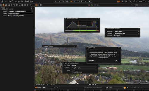
Capture One Pro 8 permits two types of file organization: Session-based is best when you’re only (or mainly) concerned with the act of capturing… perhaps on-the-go with a camera tethered to a laptop. Whereas, catalog-based organization of images is suitable for permanently managed, adjustment, retrieval and enjoyment of collections.
As with Aperture, your first decision – if not tethering – is whether to adopt a Catalog (Capture One Pro 8’s equivalent of Aperture’s Library) with the Referenced model, where your images are accessed untouched by the software while remaining in place on the Mac’s filesystem. Or the Managed model where they’re actually imported permanently into Capture One Pro – as your photos are into iPhoto, or as are audio files etc in iTunes. Many photographers prefer Referenced because of the flexibility it gives – for use with future DAMs, for instance – and for the fact that it leaves your images themselves untouched.
Functionality
As said, Capture One Pro 8 represents a very happy balance between a huge array of carefully-organized features, and an interface that is neither overwhelming, nor confusing. A lot of thought has obviously gone into UI design.
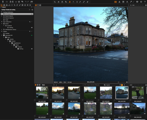
Like Aperture’s, Capture One Pro 8’s screen  is essentially divided between the larger portion (on the right by default) where your view images(s), and the area on the left which controls workflow, image management and manipulation.
Although superficially like Lightroom in appearance and close to Aperture in structure, it would be advisable to familiarize yourself with the layout of its menus etc before doing anything (permanent or irreversible) to your images – particularly if you do opt for a Managed Catalog.
Some users will find the size of the font a little small – as they may well have done with Aperture; text on Capture One Pro’s black background is actually easier to read than you might at first think.
The software allows you to configure, customize and save Workspaces for later use, which is a real advantage over Aperture. Workspaces determine such things as which menus etc appear on screen, and where etc… perhaps one best suited to dual monitors, one for concentration on actual image editing without the management options. Tooltips are always available to remind you what each icon does/leads to – perhaps until you know Capture One Pro well enough to work unassisted. But they’re all obvious and well-designed. Keystroke equivalents can all be assigned by the user.
Menus
Situated by default in a horizontal row at top left, the nine main controls for Capture One Pro 8 are:
- the Library: control of images, files, folders etc
- Direct Capture from a tethered camera
- Color adjustments
- Exposure adjustments
- Lens adjustments
- Cropping adjustments
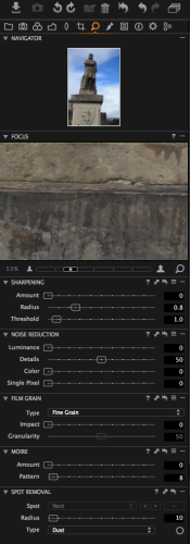
- Detailed editing… focus, sharpening, noise reduction, film grain, Moiré and spot removal
- a second set of image manipulation options: what Capture One Pro calls “Local†adjustments (see later)… white balance, exposure, HDR (High Dynamic Range), sharpening, clarity, noise reduction, Moiré, purple fringing and a color editor
- Metadata… Keywords, and a wide range of EXIF and IPTC as well as vendor-specific values
- Process “Recipes†and batch controls (see later)
Each top level menu populates the column on the left underneath with its own corresponding sets of controls and/or further options. These are collapsible; and so are accessible via disclosure triangles. Immediately to its right are three icons for Viewer modes: Multi view, Primary view and Toggle Proof Margin.
Along the top of the screen are three further sets of icons: at the very top are those to Import and Capture; Rotate; and Manage (Add to Album, Delete, Manage Adjustments to and editing of) Variants; Variants are clones of an image.
In the center and relevant when effecting Adjustments are ten icons to Select and Apply, Pan, Loupe, Crop, Straighten, Remove spot, Mask, Pick white balance – and (one of the many things missing from Aperture) a tool to correct camera tilt etc – typically vertical lines in shots of buildings (see later).
Top right are nine more controls for image adjustment: to toggle the Focus Mask; hide Grid/Guides; show Exposure Warnings; to auto-adjust and process Variants; copy Adjustments to, and apply Adjustments from, the (Primary) Variant; Print; and show Tooltips. There is a “micro menu†immediately below this to control the zoom level of the image… one of many examples of how carefully-placed is each and every one of these many controls. After but a few hours use of Capture One Pro 8 these menus really do all “fall into placeâ€.
As most users probably found when becoming familiar with Aperture’s layout and menus, to learn just how much can be achieved in Capture One Pro 8 will need some time at first; but this software really doesn’t have a steep learning curve. Intelligent grouping and placement of menus – even in their default locations – helps immensely.
Equivalences
When you begin to use the software, you need to know Capture One Pro 8’s equivalent terminology for Aperture’s entities:
- the Aperture Library is the Capture One Catalog; you can have more than one of these. Though that’s not advised because a search operates only within a single Catalog. Better to divide the entirety of your images into Projects, Groups, Albums
- an Aperture Project is (also) a Capture One Project and an Aperture Album is (also) a Capture One Album
- an Aperture Folder is a Capture One Group; see below
Organization
The Library Tool (in that first row, top left) reflects these divisions; it’s divided into three areas. These are different in concept from Aperture’s structure; they benefit from a little explanation.
Collections are aggregates of images. Some cannot be changed (by the user): all images, recent imports or captures, and the trash. You organize your own Catalogs in the User Collections area.
Capture One Pro 8 supports four ways to group, relate and organize your images logically, and to aid manipulation, viewing and exporting etc: Albums, Smart Albums, Projects (each the equivalents of the same in Aperture), and Groups (the equivalent of a Folder in Aperture). (Smart) Albums will usually be placed inside Projects. Groups are free-form organizational tools.
Sounds complicated. But hardly more so than in Aperture. What’s more, unlike Aperture, Capture One Pro 8 supports a system of setting up, duplicating and organizing Catalogs and Sessions with Templates.
A typical way of organizing images and their groups/collection in Aperture has been as follows:
Assuming you’re lucky enough to travel worldwide to take photographs, each country you visit would best be its own (Aperture) Project: Britain, Canada, France, USA etc. These are also Projects in Capture One Pro… conceptual subdivisions of the Aperture Library/Capture One Catalog.
Inside each country-Project come (Aperture’s) Folders – essentially to make organization easy, logical and consistent… England, Ireland, Scotland, Wales for Britain; the Provinces for Canada; Regions for France; the States for the USA etc. These are Groups in Capture One Pro.
At the lowest level of the organizational hierarchy come Albums. These will most likely each correspond to a county and/or city for each of the England, Ireland, Scotland, Wales Groups inside the Britain Project etc.
The Folders area lets you see where Catalog files are located; it summarizes imports, the structure/location of images… paths on your filesystem outside Capture One etc. Whether or not to show the complete folder hierarchy is customizable too. It’s also here that – if you are using a Managed Catalog – you’ll see that your images are the “Catalog†sub folder.
Folders managed outside Capture One Pro 8 can be (Re)Located and Synchronized in this area – much in the way that Aperture allows reconnection with links to images in the filesystem. If you wish or need to organize your hierarchy(ies) “virtually†without necessarily moving image files around in the (Pictures folder on your) filesystem, there is greater flexibility here than in Aperture 3 to do so.
Another of Phase One’s video tutorials explains this clearly.
Features
By default (there is more customization available to the user than is the case with Aperture 3) the Tool Tab area is located in a column on the left of the Capture One Pro 8 window. But its position – like those of the Viewer and Browser – can be changed to occupy the best position for your way of working… like OSX’s Dock (including an auto-view/hide on cursor hover option) if you will. Each group of controls can be “torn off†and re-docked, for instance.
In fact, you won’t have worked with Capture One Pro 8 for very long before you begin to appreciate the extensive possibilities for customization; you can remove and re-organize almost everything on screen in order to concentrate on the task in hand from library and file management to detailed photo-editing. Exemplary!
Next time we’ll look at how Aperture users should go about making the transition; Adjustments; and offer a final evaluation of the product…
System Requirements:
• Intel Core 2TM Duo (Intel Core i7 or better recommended)
• 4GB of RAM (16 GB recommended)
• 10 GB of free hard disk space (more recommended + a fast hard disk, e.g. a Solid State Disk)
• fast Graphics card from Nvidia or AMD e.g. AMD Radeon 7950 with a minimum of 2GB RAM recommended
• Color monitor, 1280 x 800, 24 bit resolution at 96 dpi
• OS X 10.9.5 or 10.10.x
• internet connection when activating Capture One Pro 8


