Distant Suns (max)
App Developer: First Light Design
Version 3.4.3
License: US $8.99 Compatible with iPhone (optimized for iPhone 5), iPod touch, and iPad. Requires IOS 5.0 or later.
As an amateur astronomer and a volunteer telescope operator at the Flandrau Science Center observatory, I enjoy sharing the night sky with the public. My primary objective, when inviting the public to look through the telescope, is to encourage them to enjoy viewing the heavens and to ask questions. I recognize that not everyone wants to be an astronomer and I certainly understand the magnitude of what is required to pursue a career in this profession. Today, the “buzz word” in education outreach is STEM, an acronym for science, technology, engineering, and mathematics. Certainly STEM applies to the curriculum associated with earning the required credentials to be a professional astronomer.
The Distant Suns (max) application, like many of the other astronomy applications, is not only entertaining, but is a good educational tool that fits nicely into my STEM education tool box. The application has some limitations that a serious amateur or professional astronomer would recognize, but it still provides a multitude of useful features for the average astronomy buff. For example, only the Messier and Caldwell Deep-sky catalogs are provided. Figure 1, extracted from the Distant Suns website, list the many features provided by the application.
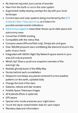
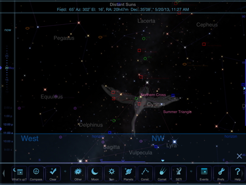
As one can see, there are a host of features that are typical in many of the astronomy and planetarium type applications. What I found to be different from the many astronomy applications that I use is mainly the user interface. When you open the application your see a display similar to the one illustrated in figure 2. There is a tool bar across the bottom of the screen with so many icons that you have to scroll from left or right to display them all.
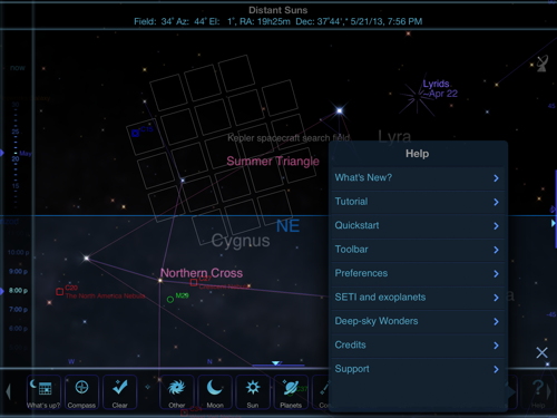
After quickly exploring each of the icon tools I realized that there are so many subtle features within the application that it was time to find the user instructions. Figure 3 illustrates what opens when you select the Help tool. This tool gives you access to several sub-levels of information including a simple tutorial and quick start instructions. The Quickstart and Tutorial selections explain how to start up and use most of the applications features. However, they are constrained within this small, non expandable, window and I personally found the instruction somewhat cumbersome to read. Fortunately I located an expanded set of Quickstart and Preferences instructions, in PDF format, at the Distant Suns website.
Even after following the tutorial, I still had to seriously practice using each of the tools to begin to understand just what each feature actually does. I had some difficulties trying to do a search for various astronomical objects. There is not a search tool in the top level tool bar. You can do a search but it is somewhat limited and is buried within the lower levels of the tool bar. The search function is not a general search tool where you can simply type in what you are searching for. Instead, you are limited to using the existing lists of objects contained within the Other, Planet, and Constellation tools.
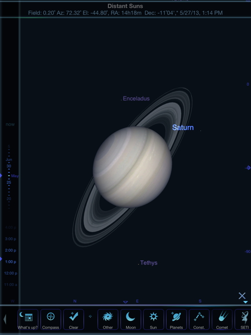
You can also simply scroll around the display area and select objects to zoom in on and gather additional details by tapping on the more info display. I ran into a minor problem with using the standard iOS pinch in and out jesters to zoom in on the planet Saturn. Figure 4 illustrates this problem. The rings were rendered behind the globe of the planet instead of being around the planet. I contacted the developer and he explained that this has to do with a limitation in the 3D drivers and libraries. “It’s called Z fighting and happens when an object is sufficiently far away; the system doesn’t have enough resolution to know if one part is further away from another and therefore hidden. You can find that in nearly any 3D program if you really look for it.” I checked and this minor problem does not occur when you use the Planet tool.
Let me take you through some of the features provided by the application. Selecting the What’s up icon on the far left brings up the display shown in figure 5. This window shows you what is up in the heavens at your current location, selected date, and time.
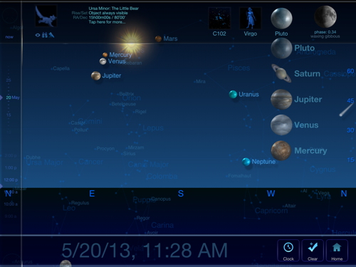
You can control your date and time by scrolling up and down on the left had vertical tool bar. the tool bar on the top of the display is also interactive. I had selected the planet column so it presented the five vertical planet icons which are also interactive. If you tap one of the planet icons in this column your are presented another interactive icon that shows up in the upper left top tool bar. Hopefully your are starting to see my point about the many subtle levels of the user interface.
Visiting the planet Jupiter as shown in figure 6, you see across the top another tool bar. The little spaceship icons allow you to virtually fly back and forth from you location above the planet to its four Galileon moons and then out to the other planets. The plus and minus icons provide zoom in and out. The Home icon returns you to Earth.
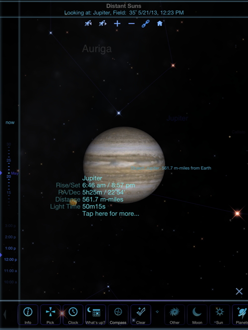
The one of the function that I could not ferret out was the chain link icon. After many trials of unlocking and relocating the chain link and attempting to see just what this function was interacting with I finally gave up. I contacted the developer and he explained that the chain when locked, will lock your viewpoint to the object you are above so it will follow along like a chase plane when you change the date or time. When unlocked the chain, your viewpoint will stay fixed and the planet will whiz away from you as the time is changed. The developer assured me that this explanation will be covered in a future update to the application.
Information about Jupiter is overlaid on the planet and if your tap the screen where it says “Tap here of more…” you bring up the display illustrated in figure 7.
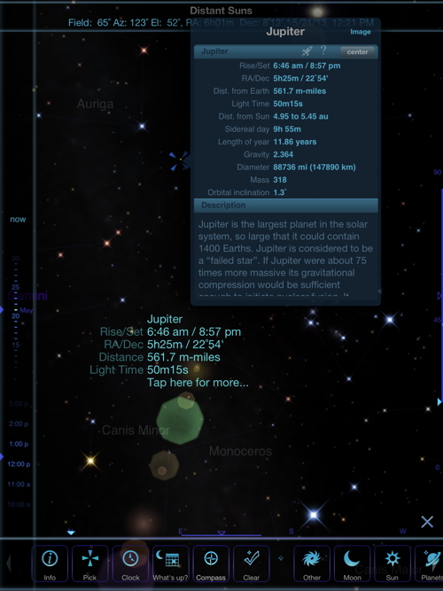
You now have access to another small window with additional information about Jupiter and another set of control icons. Like the help window, this window does not expand so you are constrained to scroll up an down through the information contained within the window and its sub-windows. This process is essentially the same for all of the planets and object you can visit using the Distant Suns application.
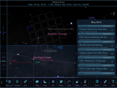
Returning to the main page tool bar, I like the Events icon. Figure 8 illustrates what this function provides. This tool lists the events for the current month that are are available in your local area according to information provided by the Night Sky Network. Our local astronomy club is a member of the network so our monthly meeting and club star parties are listed. Meeting details, including a map and our clubs web page, are also provided.
Like similar astronomy applications, the camera on the iPad and iPhone can be used in conjunction with the built in compass to point and locate objects in the sky. I don’t have an iPhone so for my review of this application, I used my WiFi only iPad (generation 3), and my iPod touch (generation 5). With my iPad, I can scroll around the sky by moving and pointing at the sky using its built in compass, but on my iPod touch, which does not have a built in compass, I can only scroll the sky manually.
The few examples I presented illustrate just a portion of the capabilities of this application. One can spend hours exploring the application’s capabilities and enjoy touring our solar system and the universe. Keep in mind, there is a learning curve you have to climb to understand the capabilities offered by the application. This latest version 3.4.3 is fully iPhone 5 compliant, and has added tracking support for Comet Pan-STARRS. It also updates Earth cloud patterns every three hours instead of daily. The price, in my opinion, is about right for this type of educational application. I am awarding Distant Suns a MyMac.com 8 out of 10 review rating.

Leave a Reply
You must be logged in to post a comment.