The Photographer’s Eye – Interactive edition for iPad
Company: The Ilex Press Ltd.
Author: Michael Freeman
Price: $9.99 US
When Amazon announced the Kindle with its electronic store, then Apple introduce the iBooks Store a few years later, I was feeling happy about the fact that bricks of books would become digital. But I was fast disappointed when I saw that most digital books were simply a copy of the physical books. When something goes digital, I expect a bit of interactivity.
This is where the digital version of The Photographer’s Eye application for iPad shines. This copy of Michael Freeman’s very successful book (200,000 copies sold and translated in 20 languages) in digital form is the great book you’d expect, with features you could not find in any paper book.
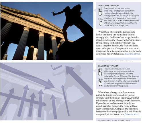
The introduction features a video from the author, and throughout the book, many images or concepts are accompanied by audio content from him. Audio content is marked with a hand with a speaker icon. Each time you see a hand, some type of interactive content is available for further investigation. This could be another image showing the same concept, an overlay on the image showing the concept more visually, or it may show you opposite concepts turn by turn. In this regard the application delivers and is very well-done.
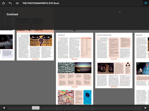
The book navigation will appear when you tap once anywhere. Navigating is a bit strange at the beginning, but you get used to it very fast. The navigation is done by swiping left or right to move from section to section, and once in the section, swipe up and down. You can browse with a vertical or horizontal menu for quick access to a specific section. Another welcome addition is links. When reading a passage, if the text is highlighted in blue, a tap on it will refer you to another part of the book. You can come back to where you were with the back arrow in the navigation menu.
The application is not perfect. I would have appreciated a bookmark feature to pinpoint parts I want to read again, as well as a comment or note feature. When browsing the content in menu mode, an important part of the screen is dedicated to the title of the section. Except for the title showing, a large black stripe hides the content; this could have been used to display more information to the user. In the horizontal menu mode, it is possible to swipe left and right, but not up and down to the hidden part of each section. The application does not provide pinch/double-tap to zoom on the text or image.
The Photographer’s Eye itself is excellent; a nice reading for any photographer. It has been a best seller for good reasons. I gave the application a 7 out of 10 rating, but would probably give the book a 10 out of 10 for its great content.
The Photographer’s Eye on Amazon.com
MyMac Review Rating: 7 out of 10


Leave a Reply
You must be logged in to post a comment.