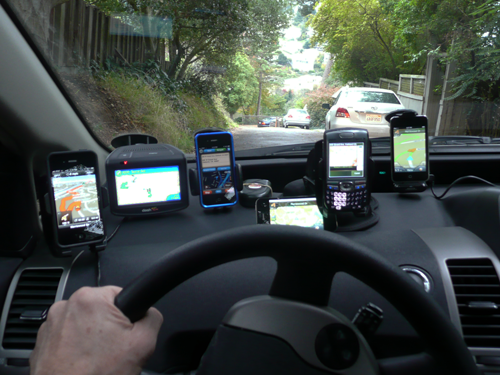
Let’s talk Mobile Navigators. Those wonderful little programs you pop on your mobile phone, and they tell you how to get from where you are to where you want to go. I love them. No longer do I have to think about how I get to where I am going, I just ask my iPhone to get me there, and I am off. It is just that easy, right?
Yes, that is me in the picture above driving my car with three different iPhone navigators, an iPod Touch navigator, another mobile device navigator, and a Dash stand alone as a known test case. I ran out of dashboard space, so the other three iPhones are sitting on the center console.
The first thing I learned about navigators is that they talk WAY too much! And running nine at a time creates an argument in your car every time you approach a turn. But that was just crazy fun, well, for all of about 30 seconds anyway. The other thing I learned is that they have made me a lazy driver. I have become dependent on these things. No longer do I take the time to know where I am going or print directions or maps before heading somewhere new. Now, I just jump in the car and trust one of these programs to get me there. And they usually do.
In reviewing navigators, I started out with a very simple goal in mind: I would look at as many navigator software products I could obtain for the iPhone 4, pit them against each other in a series of tests, pick out the one that performed best, and write about that here. Given that you often spend $40 to $60 or more for this software, I thought you should know which one was “best” before you plunk down your hard earned cash. Sadly, this was not the simple task I hoped it would be. And I started this over a year ago!
![]() Â Â Â
   ![]()   Â
   ![]()   Â
   ![]()   Â
   ![]()   Â
   ![]()   Â
   ![]()   Â
   ![]()
![]()
So what happened? First, there are a lot more of them than I first thought, and I discovered a few more at Macworld last January, and now I discover I am still missing even more released since then. Secondly, the companies are changing and updating their products so often, that just when I thought I had them all reviewed, one or two of them would release a new version with major changes to their UI and features. In some cases, almost as if they were reading what I was writing. I would go back to editing this review, be just about finished, and then others would update. I simply could not and cannot keep up any more. In fact, two of the items tested here just updated as I am writing this paragraph.
But that is also the good news. The makers of these applications are keeping their programs up-to-date with frequent refreshes, so you get new maps, bug fixes, and feature enhancements often. So much better than any stand alone navigator which gets none of that. The bad news, it is impossible to pick a “best,” because they keep changing and improving them all the time.
Overall, as I used them, I discovered some interesting facts. First, I think most fall into three simple categories: Great, Good, and OK . With two exceptions, none of them was really bad. They all work, they all get you there, and they all have good points and bad points. Secondly, often a program feature I liked in one program was not what other people who tested with me liked, and vice-versa. This means that there is no best for everyone, only what is best for you. And that is a problem. If you can find someone who has the iPhone app you are considering, check it out before you buy to be sure it fits your needs. (This is something seriously missing from Apple app store purchasing in my opinion, the ability to return software if it does not meet your needs. No big deal for a 99 cent app, but these can cost as much as $60!)
I should also point out that I only looked at the North America or U.S. versions, as most of these apps have versions for many other countries as well. Also, many of these apps also offer an iPad version, which I am also not covering. To me, putting an iPad on the car’s dash just seems like overkill, not to mention that I probably would get a ticket for having such a large device on my dashboard blocking my view. Also keep in mind that to use this software on an iPad you must have bought the model with the 3G modem in it to get GPS. These will not work with WiFi iPads. Lastly, there are apps that offer hiking and walking navigation, and those too will not be covered here, although many of the apps I tested do have routing for walking as well. But this was all about driving.
All of these apps require a GPS enabled iPhone, and I tested them mostly on my own iPhone 4, or a borrowed few when I needed to compare features. That said, most navigation apps should work with an iPhone 3GS as well, but do check the product description before you buy. Some will even work on a second generation or later iPod Touch, but those require an external GPS device to make them work.
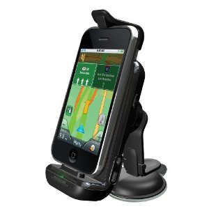
Magellan offers a special GPS window mounting bracket (around $100) that includes a built-in GPS radio and a way to power your device while docked. You can even dock a newer iPod Touch. Not only does it let the touch become an in-car navigator, but when the car kit is used with your iPhone, the GPS accuracy is significantly improved. In most cases, I found the GPS accuracy of the iPhone 4 to work just fine without this however.
My last realization was that while ALL these navigators will get you from point A to point B, they will probably not get you there how you might drive it, nor do they always give you what you might consider the optimal path. Using them in an area you already know can be an interesting journey, as you will find yourself often arguing with them. They really should have voice input for these so they know when you disagree on a turn!
Be aware that using a navigator app is a power hog. It runs the CPU in the phone at full speed, it keeps the screen on all the time, it plays sound, many communicate over the wireless internet connection for data and traffic, and they use the GPS radios all the time. These apps can seriously drain the battery in just a few hours of driving. And don’t forget to exit the app when done driving, or they continue to draw power sitting in the background, not to mention they may start giving you spoken directions while in your pocket!
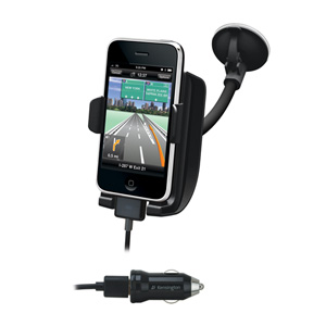
It is also ideal to place the phone where you can easily see it, so It is highly recommend that you get a powered window mount to hold the phone near the dash facing you. For my tests, I used a Kensington Power and Mounting Kit for iPhone ($49.95) which worked great, powered the device, and easily removed form the window for stowing away when out of the car.
What I Tried
Here is the list of navigators IÂ tried (in no particular order):
•   Navigon (from $29.99 for regions to $59.99 for North America)
•   TomTom ($49.99 US only1.4 GB to $59.99 for US and either Mexico or Canada, 1.5 GB)
•   Motion X GPS Drive ($0.99 14.1 MB)
•   CoPilot Live ($4.99 USA no text-to-speech, 1.19GB to $19.99 North America 1.34 GB complete)
•   Sygic Aura ($14.99 US East 1.54 GB or US West 1.52 GB)
•   Sygic Mobile Maps ($24.99 US, 1.5GB. Note it will download more map content after it is installed)
âƒÂ   As I write this, Mobile Maps and Aura were discontinued and they introduced Sygic GPS Navigation, a combination of both products best features.
•   Sygic US; GPS Navigation ($19.99 US, 1.84GB, $29.99 North America, 1.85 GB)
•   Magellan Road Mate USA ($49.99)
•   Waze (Free)
•   Gokivo GPS Navigator (Free for 30 days, then 1 month add on: $4.99, 1 year add on: $39.99 2.7 MB)
•   MapQuest 4 Mobile. (Free 5.3 MB)
Many of these apps offer upgrades and in-app purchases, the most popular of these being traffic. Because traffic was a paid, add-on feature for many of these apps, and I did not have it for all programs, I did not test the traffic feature on all programs. This option often costs as much as $30/year for the service (and as I write this, Motion X GPS Drive just announced free traffic). For the ones with traffic, there were issues for me. For one, while they tell you there is a problem on your route, they do not automatically route you around it (this too is changing with updates – so check product descriptions). The other was the accuracy and timeliness of the traffic data. They would tell me about a problem on my route, but more often than not, it was gone when I got there and no longer a problem, so I found myself ignoring their warnings. I have not renewed traffic on any of these programs, as I saw little value in it. Your driving area may vary.
I also do not include the built in Google Map app, as while it offers a turn by turn list of instructions, it is not a full navigator. I also did not test AT&T’s Navigator for the iPhone, which is a “free” app, but costs a hefty $10 a month to use. Not only is that very expensive (they refused to let me try it out for this review) but frankly I cannot see why anyone would pay $10 a month for a navigator from AT&T when in less than a half a year, you can own a much better navigator on your phone from a major company like TomTom or Megellan with free updates!
Most of these are paid apps, but Waze and MapQuest are free. Gokivo also offers a “free” navigator for a short time, but after 30 days, turn-by-turn spoken directions require a subscription. Even more confusing is CoPilot, which offers a free version for 30 days, a USA only $5 version without spoken directions (which you can add for $3 in app), and a $20 North America version that does speak. OK, now I’m confused.
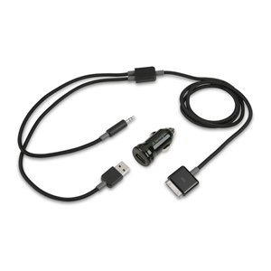
Lastly here, most of these programs offered iTunes integration as well. So if you plug your iPhone into your car stereo (using something like the Kensington 2-in-1 Car Charger and Aux Audio Cable) you get your music and your turn by turn directions through your car stereo speakers. The navigators turn down the music when they speak their directions, and most offer in-app control like play, pause, skip, and back controls.
Lets Get To Navigating
All these programs offer similar features: A top down 2D map view, turn by turn directions, spoken directions, points of interest, travel time, E.T.A. to destination, distance to destination, and the ability to save favorites. Most also offer “3D” views, a sort of over the car look at the road ahead, and some offer to speak street names in instructions while others simple say right turn or left turn.
But they differ greatly in how well they actually navigate, how well they speak directions, the user interface, and how they get their maps. TomTom, Navigon, Mobile Maps, Aura, and Magellan include the maps for the area you purchased built-in to the app. Others, like Waze, MapQuest, Gokivo, and Motion X require a full “on” data connection, and download the maps as you drive. While I worried about this eating up my data plan’s monthly limit, the amount of data turned out to be relatively small, unless of course you drive long distances every day, in which case, you will put a serious dent in your usage. I also wondered what happened if I drove in an area that had no signal? You can pre-cache the maps you need, but you have to remember to do this before you start your trip. On the flip side, the apps with the maps built-in average in app size from 1GB to almost 2 GB, while the ones that download data average 10 to 20 MB in size, so if your devices’ memory is getting full, a full navigator may be a problem. Note that once the smaller ones start downloading maps, they can use well over 2 GB as well, which was the case with MapQuest app, so perhaps there is no savings at all? The on-line maps claim more up-to-date maps, but I found Tom Tom (for example) downloads updates quite often, so again, I saw no advantage to the on-line version.
Inputing your destination also differs from app to app, and there is really no way to tell you which one you will like or not like. Typically though, after you select destination, almost all let you can choose from your contacts, a list of favorites, “home” as a fixed destination, recent destinations, or points on the map. All of them also let you enter an actual address, where you pick a state, then a city, then a street, and then a street number. This is where they differ, some limiting your choices as you enter info, others letting you type away to fail. Most offer “look ahead” and give you a list of matches, which gets smaller as you keep typing.
Once you say OK, they all take you back to the map view or 3D view, and star telling you where to go. And this is where it got interesting. In the picture at the top of this article, I tried to run 9 different navigators (6 are visible in the picture) at the same time to see how they would stand up against each other. Big mistake. For the same destination starting from the same place, there was a lot of disagreement. When I came to the first “T” intersection after starting to drive, 3 asked me to turn left, 4 said turn right, and 2 said to make a U-Turn where possible. No matter what, if you disagree and go a different direction, they will all quickly recalculate a new route based on your last turn, but I found it interesting that “fastest” route was not the same from navigator to navigator.
The good news is that they all got me to my destination. WIth the exception of one stand-alone unit that is no longer sold, they all did it in fairly reasonable routes. Most of these also let you adjust your route preference to avoid freeways, take the shortest route, or take the fastest route. Note that the shortest route is usually not the fastest if a freeway or highway is involved. The bad news is seldom did they go they way I would have gone, and with the except of Dash (the standalone unit) they do not remember that preference for next time.
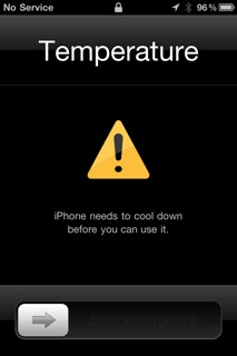 One last general note I should mention here. The best possible position for a navigator is on the dash in front of you. It makes the display easily visible as you drive, so you do not have to take your eyes off the road, and of course it gets much  better GPS reception as well being near the window. Sadly, during the day, this also means your iPhone is sitting in the hot sun most of the time. And I learned something new: iPhones can over heat, and when they do, you get this wonderful screen until they cool down. Imagine my surprise as I drove down the road to see this display pop-up on the screen instead of my map. Yes, the phone, working overtime on navigation, and sitting in the sun, got too hot. I moved the phone off the dash, switched my A/C to full on high and after a short while,  I was back to navigating again, but beware of this issue if you live in a warm climate.
How Did They Do?
In my tests, I felt that the big name navigation companies (TomTom, Magellan, and Navigon) had a real edge here. Their apps tended to be more polished, their routing was often better, and they have had years of user testing to fine tune their features and user interface. But even here, I found the user interface for entering detinations on the Navigon to be not so great (it kept putting me in the wrong state). Other companies, like Copilot, which I did not know of before Macworld, offered an amazing set of well polished products, including navigators specifically aimed at truckers.
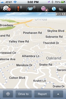
Of the two truly free apps, I liked Waze. This offers reasonable turn by turn directions, but adds a gaming and social aspect to the user generated maps. As you drive, you verify roads back to Waze, and thus keep their maps up to date, as well as send real time road conditions. When you are on a road that has not been verified lately, small dots appear on the road, and your car turns into a PacMan, gobbling up the dots for points. What the points are for is not clear to me.
This app also offers the dumbest feature ever to be offered on a navigator: The ability to socially interact with nearby friends or acquaintance as you drive (all are members of various groups you can join, like “Prius Owners” or “405 Drivers”). A small marker will appear on the map when a “friend” is nearby, and you can send text messages right in your navigator! Yep, you can send a text message, while driving, to that friend, or just post something for all to see. You can also report police, accidents, traffic jams, and other hazards, all while driving, right in this app. Sorry, but navigators are already too distracting, and adding a text element is just outright stupid!
Good Things, Issues and Problems
Since I cannot review every app here in full detail (however, look for more in-depth reviews on some of these in the future) , I will list some stand out features of these navigators, and maybe some issues and problems I encountered as well:
Just about every app I tried had issues with Day and Night color modes. They all claim to charge colors in the app automatically to reduce glare at night, switching to dark map and interface colors. But almost all of them still put up bright white background menus and/or option displays even in night mode, which is blinding at night. While Navigon and TomTom did not do this, I was surprised when industry veteran Magellan put up white and grey menus in night mode. They should know better.
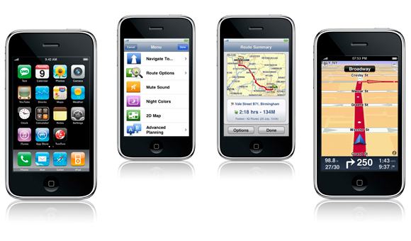
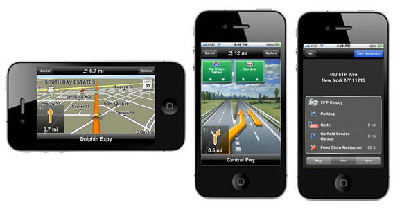
TomTom: This was the clear winner for me. I found their driving map display easy to read, their UI was easy to navigate, and their routing was rather good. TomTom also was the clear winner for spoken directions. Not only do they speak the street names clearly, they were the best at handling music volume, and this was the ONLY navigator I could easily use without having to see the display all the time, offering compound instructions when needed, like “Turn right on Main Street and then turn right on Broadway.”) This is especially important when a second turn occurs quickly after the first. Other navigators wait for the current turn to complete before telling you the next, which is a problem when turning onto a multi-lane road and you do not know which lane to turn into. TomTom also offers regular updates to the maps, and the ability to offer corrections as you come upon errors as well, which are shared with other users.
MyMac Rating: 9 out of 10
Magellan:Â In a close tie with CoPilot for 2nd place, I found their map easy to read, their UI display is clean with cool with little info windows that change info with a tap along the bottom. Their menus are easy to use with large iconic buttons, but unfortunately, they violate the day/night menu colors almost as much as CoPilot. (Why is this so difficult?) Their routing is as good as the other top contenders, and their spoken instructions are fine, although I had trouble understanding the spoken street names at times. Magellan does offer real time traffic included, although I never seemed to need it on my tests. I also like that Magellan will put the navigator to sleep if you leave it in the background for too long, helping to conserve battery life. They all need this feature.
MyMac Rating: 8 out of 10
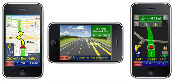
CoPilot: This was a close second top pick for me, and a surprise since I knew nothing about them before I started. However, they are one of the worst offenders of brightly colored menus and setting displays in night mode, switching back and forth from dark background to light and back again. It was difficult to use at night. That said, their menu system for options and settings was among the best, with large, easy to see buttons, and spoken instructions on menus. Their data entry for destinations breaks their large button UI at times, but is still fairly easy to understand and use. I also liked the ability to add a quick stop on the route or calculate a detour. I do not find their driving display to be as good as either Navigon or TomTom, being rather too simple in my opinion, and that dropped them down a few points.
MyMac Rating: 8 out of 10
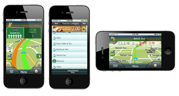
Navigon: I really though this would be the clear winner, as I have used their stand alone navigators and loved them, but they fell to fourth place. Their map display is great, and they give reasonable spoken direction. But I had real difficulty with their destination entry system. Their UI asks for a city name first, and after typing in a local city, many times, nothing showed up. Seems the UI assumes what state you are in based on something, and that is not obvious from the interface. A tiny box at the top right hides the current state, which you have to change separately first before entering your destination. This confused everyone who tried this software. They know your current position, why not look up nearby cities and just use the right one? Also, taping their display while driving changes the 3D map to 2D, but getting it back was not trivial, often ending you in some top down zoomed out view with tiny back button for back which was hard to use when driving. This was just no where near as good as their stand-alone units, which they no longer sell.
MyMac Rating: 7 out of 10
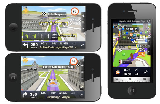
Sygic Aura and Sygic Mobile Maps are now Sygic GPS: I tested the original two apps, now merged together. This will be a close tie with Navigon and CoPilot as well, but looses on a few issues. First off, this app is big, weighing in at over 2 GB now with the downloaded map data. The original Aura was my winner for the most cool looking 3D mode, with buildings drawn on the map as you travel in a town. But now the new display is WAY too busy with little, unknown icons all over the place crowding the screen. And once again, the night color scheme is not making it to all displays, with bright white showing up when least expected. The original app did not speak street names, but its timing of directions was very good. Now street names are spoken, but the voice speaks way too fast and is hard to understand.  On text entry, they used to have their own small key keyboard rather than use Apple’s text entry, and it was just awful, freezing while typing, and making entering text for destinations a real pain. Thankfully, that too is gone now too. Originally, when turned to portrait mode, the screen formatting was all wrong, doing things like cutting off two digits from the time, or eliminating info all together. Again, this is greatly improved. I found the original program to be fairly large for covering such a small portion of the US. Now with all of the US covered, it is still large, but it covers a larger territory, so that is less annoying. Given the improvements over the previous apps, I expect good things from this company, and continued improvements with new releases.
MyMac Rating: 7 out of 10
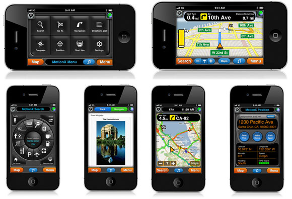
Motion X: This apps works well, and they had one of the best menu functions of them all, and it navigated well too. They claim the use of “predictive solutions with Neural Network Technology and advanced mathematical modeling”, but I can’t say they were any better than the top contenders in navigation. Unfortunately,  spoken instructions were weak, and while it spoke highway and freeway names, it did not speak all local street names (this may have been fixed in the latest update by the way). I also found that is tended to offer turn info way too early before the turn, making it a bit confusing, especially when streets were close together. More than other navigators, this app had me on the wrong street many times. Even when trying to place my “home” address, it kept moving my house on the wrong street, one over from my actual street, and I could not seem to fix it. This unit caches local maps, and needs to download the maps for areas it does not have as you drive, so it uses your data plan and you must be on-line. I know this is supposed to be to save space and offer up-to-date maps, but it knocks it WAY down the list. I tried this one in parts of Arizona and lost navigation because it could not get a map. Standing out among the others is one very cool new feature. This app will integrate with Pioneer’s new “AppRadioâ„¢” and will display the maps right on your in-dash system like a built in navigator. If they would improve their spoken directions, this one could move up to the top quickly.
MyMac Rating: 6 out of 10 (Update: With the new updates and good voice options, this is now 7 out of 10)
Waze: As I said above, for a free navigator, this one does rather well, but that social texting aspect just makes me want to scream. Get this for driving, not for texting. Navigators are already a big distraction while you drive, so texting on top of that will surely end you in an accident.
MyMac Rating: 6 out of 10
The Two Exceptions
Mapquest: I hoped this would be a reasonably good free navigator given Mapquest’s background in mapping, but it did not live up to the Mapquest name. Maps are only top down view, there was no day/night color mode, and it requires a full time Internet connection for maps (like the Apple map app, which it looks like). And while it offers some interesting “nearby” info features, it was simply not a very good navigator.
MyMac Rating: 3 out of 10
Gokivo: On this one, do not waste your time, even for the free 30 days. The UI and display are not good at all. This also looks like you’re using the Apple map app, with turn by turn spoken directions and a few new menus added. And given the cost, it was no bargain. For the yearly subscription price, you can almost buy TomTom, Navigon, or Magellan. Also, this app crashed all the time, over and over (and I tried it on several devices), and while it offers to resume your trip when it restarts, after about the third time it crashes in five minutes, you will be ready to throw it out the window as well. I am sorry to say, this one did not even stay on my phone for the full testing time. This one was definitely last place for me.
MyMac Rating: 2 out of 10
For navigation, you have a lot of choices, and the field seems to be expanding all the time. Read through each product description carefully to be sure it has the features you want. As phones get more powerful, these apps will just keep improving in features and routing, and become easier to use. I really hope to see Siri integration into one soon as it would be so cool to just say, “I want to go to 100 Mission Street in San Francisco”, and have it take you there.
As for each of these apps, most of these companies are releasing updates at a very fast rate, and I would not be surprised if many of the complaints I have mentioned here will be fixed already.
Happy driving.


Great round-up and summary. Regarding MotionX-GPS Drive, synthesized voices (text-to-speech) for announcing local street names was added a few months ago.
MotionX-GPS Drive now offers one synthesized voice that can be downloaded for free (go to Menu > Settings > Voice & Sound), as well as several additional voice options such as American English in female/male, UK English in female/male, etc for 99 cents each.
Thanks Mark. Because I reviewed all these navigators over a long period of time, some were over a few months ago, I did not get back to see new features. As I said in the article, the updates were coming so fast, I could no longer keep up.
Great news that Motion-X now has this feature, it would definitely move up in the scoring with that added. Now, if there were just an option to automatically cache the maps when you have network, so the connection is not needed as you drive, this will be a top contender.