InDesign CS 5.5
Adobe
Upgrade, single application, suite, and academic pricing available
I begin this review with a caveat. Adobe loves the word “professional.†I mean really! Their CS Suites are for professionals, and I can tell you right now, those people will leave me in the dust with their skills. But I am here to say that we ordinary people will love CS InDesign 5.5. This review is in two parts. The first will cover basic publications, PDFs, booklets, and the useful controls and workspaces that pertain to the print world. The second part will zero in on interactive publications, including the very lucrative and expanding field of ePub.
With InDesign 5.5, you too can design and publish your church newsletter. You too can design posters for your art group. You too can produce interesting interactive PDFs that can be used on the Internet. And yes, you too can publish your own ePub book as a tutorial, or for a family reunion or for pure vanity’s sake. I did, and I am not a professional by any stretch of the imagination.
This review is not for the “pros.†If I mess up the terminology, or use the long way around a task when you know the shortcut, forgive me. I was self taught in the very first CS Suite, and I know that anyone with any computer literacy can learn at least three Adobe programs (Photoshop, Illustrator, and InDesign), and come up with wonderful results. Adobe did a major upgrade in InDesign 5.0, so my review will by necessity cover elements of that upgrade. My keyboard references are to a Mac since I don’t do Windows.
DESKTOP
The download of the CS5.5 Suite took a while (Internet speed playing a part), but it went without a hitch. When I opened InDesign, up popped the Welcome Window. I started to click Don’t Show Again and then took a closer look. It is a mini menu, including a list of Open a Recent Item list and a Create New. Very helpful is the Getting Started menu, with links to information for setup, an overview of the program, and available tutorials. It also has What’s New in CS5 and CS5.5, which if upgrading is very helpful.
A word here about the tutorials. I am a paper user, so give me a print PDF anytime, but the video tutorials are extensive and excellent and I will work through them as time and need allow. So for a while, the Welcome Window will remain.
Below the Main Menu (File, Edit, Layout, Type, Object, Table, View, Window, Help) is the Applications Panel which includes an icon for Bridge (Hint: shift click for Mini Bridge; more on that later), zoom level, and view options. On the far right is the Essentials link. Clicking Essentials brings drop down panels designed to organize your work flow. If creating simple document to print, you can use the default panel setup, but there are other panels specific to the work you will be doing that cluster shortcuts to commands you use in typography, printing and proofing, and interactive documents. And of course InDesign allows you to save your custom workspaces.
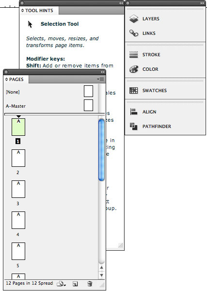
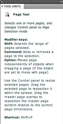
The third bar is the Control Panel. This relates directly to the Tool Panel, by default placed on your left, but can be repositioned. Adobe offers a plethora of tools for your use. Take time to explore; there are a few new ones if you are upgrading from an older version. New is Tools Hints, accessed through the Windows menu. Click on a tool and open Tools Hints; it will give you not only the shortcut, but ways the tool is used! Pretty cool. Just a reminder, when you are working with a tool, the Control Panel is where your attention should be fixed to get the maximum benefit of controls at your fingertips.
I was very happy to see on my new Desktop many of the same things I am used to. This is always a concern when upgrading, “Don’t mess with me, I have work to do!†Surprise, surprise – when I went into my hard drive looking for old InDesign documents to open and edit with some of the new commands, CS5.5 had beaten me to it! There, with the bright maroon button icon, were all of my previous InDesign documents lined up, ready to be brought into the new version.
PAGES
The first thing I did was look at Pages, to see if there were any major changes. For those new to the program, the Pages panel gives visual thumbnails of the setup you have made to begin your document. Master Pages are displayed here. Those of you who have used InDesign know the possibilities of using master pages which are, in effect, templates for your work. This assures the same paragraph styles are carried over into pages you designate.
Adobe now give you a Pages tool linked to the Control Panel allowing paragraph format changes, alignment, column controls, and text wrap formats among other things right at your fingertips. Also, you now can have different size pages in the same document, which means you can have a business letterhead and a business card contained in the same file making it easier to coordinate fonts, paragraph styles and color. Adding, deleting, and moving single pages is not much of a problem. However, I primarily work with spreads (two pages side by side), and to move a left or right page to another location in my Journal sets up a fluttering of action like tiny little birds flying hither and yon. Unfortunately this has not changed. There are commands to keep spreads together, and I have a cheat sheet to help, but even in tutorials, after a careful explanation of page spread moving, it is suggested you might want to cut, copy, and/or paste in the new location instead! You can add color labels to pages, an instant visual go-to for specific articles that are imported. Good thing.
TYPE AND FONTS
Open Type Minion Pro Regular font is now the default. Perhaps the rationale has something to do with Internet publishing. InDesign has two type tools: Type and Type on a Path. Handy if you want to make decorative designs with type, and easy to use. You can create irregular shapes with the frame tools to fill with type of your choice. Fonts, selecting, deleting, moving, copying, text kerning, leading and tracking, bullets, indenting, pacing, drop caps, and more, are all there for the typography designer.
COLUMNS
A new addition is how columns can be controlled. You now can balance the text within columns within the text box. In addition, you can pan a paragraph or banner across multiple columns or split a paragraph into multiple columns within the same text frame. If you have ever struggled to make columns look good you know what a bonus this is. Anyone producing a newsletter, journal, or website will so appreciate this feature. Hurray!
OBJECTS
Working with objects has always been easy in InDesign, mostly because of Links. Every object imported into InDesign has a “home†somewhere, and it is simple to get back to the original if you wish to modify. All of my object imports come from Photoshop, and once imported, placed, fitted, etc., all I need to do is to select and Option click to go to the original source. Once an object has been changed and saved, it is reopened in InDesign as the new version of the image.
I discovered something while I was testing object placement. As I moved my object frame, it passed over the center of the page and a line appeared showing me the exact center of the page and object centered. Love it! Also a duh! moment came when I discovered that the Control Panel for the rectangle frame tool which I use for placement has text wrap controls. How long they have been there I don’t know, but I know now, and it is handy.
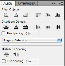
Another great design help is the manner in which you can distribute objects evenly on a page. To find the Align panel, go to Window, Objects and Layout, and then click Align which allows input on the alignment you choose. New in InDesign is Live Distribute, which aligns a series of objects automatically for you without input. (Hint: if you often place multiple objects, open the Align Panel and drag it off to your workspace where it will be at your fingertips when you need it.)
A very important addition is Anchored Object. When you begin to work with interactive PDFs, maintaining placement of an object in relation to text is very important. Because of the various devices on which your work may appear, text flow is altered. If an object is not anchored to your point of reference, it may appear as an afterthought a few pages later! By anchoring your object to the text frame it insures it will remain with the information that is pertinent to that image. If you want it anchored to a specific paragraph, you need to have that portion of your work in its own text frame.
All of the usual graphics tools are there: transforming, scaling, shearing, rotating, using opacity, to name just a few of the many. A new panel combining color and stroke is available and can be left on your workspace if you often use frames around images and objects.
MINI BRIDGE
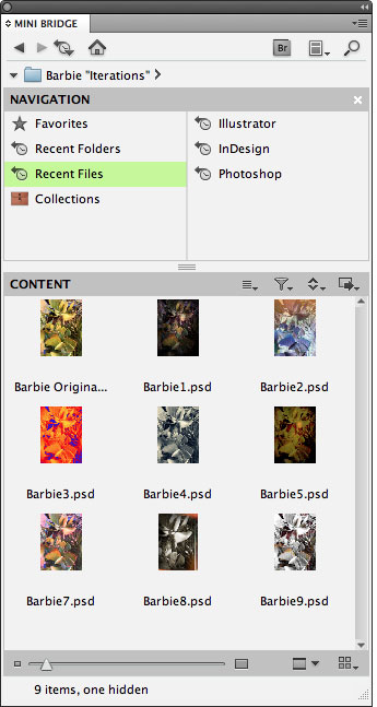
This is a good time to talk about a new addition, Mini Bridge. It opens in the InDesign or Photoshop application (shift click on the Bridge icon on the Applications Panel) and acts as a mini-browser if I may use that term.
I have a love/hate relationship with Bridge. When I told a friend that I didn’t like using Bridge, a look of horror came over his face. I think I lost a great deal of respect because he is a very fine photographer and spends all his computer moments working Camera Raw. And for me, a photograph or an image is only as good as the manipulations, filters, color changes, and distortion I can give it. I have kept my original CS Photoshop with Browser and still use it for file handling of my images. I have tried to use Bridge, but it got in my way and it seems to have legs of its own, so I would go back to the Browser, sort of “running home to Mama.”  I will now, however, make an effort to incorporate Mini Bridge into my workflow.
All of this said, I will preach again. Software for me is only as good as it performs a task I need to perform. How does it fit? Can you easily (or at least with a reasonable workflow) accomplish your task?
COLOR
Color management can be as simple or as complicated as you need. Because this software has been developed for the pros it seems there is no limit in the applications and manipulations of color you may choose, both for print and for digital. The Type Panel allows for color switches easily when using fonts, and strokes and frames can easily be chosen from their own panel now. If you advance past CMYK and RGB, you are beyond this reviewer’s ability to discuss. I do use the Swatches Panel occasionally to store colors for future use in similar publications but most of my color planning is taken care of in Photoshop.
FINALIZING YOUR WORK
InDesign offers Story Editor where you can edit your text to your heart’s content. Graphics, objects, columns are not displayed, only your raw text. This is a good place to utilize Spell Check and Find/Change.
EXPORTING DOCUMENTS
Let me count the ways. Adobe is offering so many options that again it comes down to your requirements in this field. First on the list are Adobe PDFs, print or interactive, with many options, based on color, compression, pages, or spreads just to name a few. Then EPS, Flash Player (SWF), and new is Flash Professional (FLA). You can also export your copy as a JPEG for the Web, with options for quality and resolution. Your need, your choice.
IMPOSING PAGES FOR BOOK
If you compose a booklet using spreads, these spreads need to be arranged as imposing pages (printer’s term). When you are working on your book, you have two pages side by side. However, to print properly they need to be put into printer spreads. Because I work with spreads a great deal,when I start my documents in InDesign I make a paper mock-up to help me visualize the final production. Perhaps you have not thought much about how a book is put together, but if you look at a paper mock-up, you will see for instance that on a four page booklet page one is side by side with page 4, while pages 2 and 3 are together. Sounds like mumble jumble, but this is the way a printed book works and of course the more pages you have, the more imposing there is to do for print placement. (Hint: in order to print a booklet you must have multiples of four pages but you may leave blanks if necessary. A mock-up helps). InDesign takes the work out of page handling by using the Print Booklet command on the File menu. There are a few options, but the basic procedure is quick and easy. When your booklet is printed, the pages are paired properly and it is collated and ready for folding and stapling
PRINTING AND OUTPUT
Printing directly from InDesign is handled competently through the Print command. This will bring up a familiar looking Print Box dependent on the printer you choose. You will see things like General Settings, Output, Graphics, and Color management giving you other options and showing a Preview to display information about the document. Nothing really new here. When you have completed all options, click Print and off it goes.
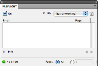
If you are sending out your work to a commercial printer, you need to make sure all your ducks are in a row. InDesign does that handily. When you open Live Preflight Panel (Window, Output and Preflight) a box will appear listing possible errors in your document. This might be fonts not available, or perhaps objects not linked or text overflows not corrected. Hopefully you will see an empty errors box and a small green light in the lower left of the box indicating you are good to go. If you do have an error, clicking on the problem will take you to the spot, and you can correct the problem. Also as you are working, in the lower left hand corner of your workspace there is a small visual indicator that is updated to potential problems as you work.
PREFLIGHT AND PACKAGING
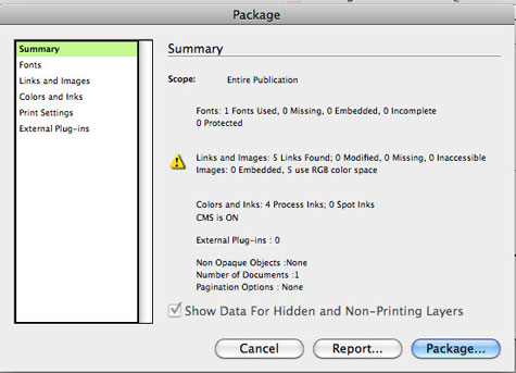
The final step to sending off your work to a publisher in printable form is to create a package. Both Preflight and Package is where I really think InDesign shines for the average user. First, you pass the hurdle of Preflight where errors have been detected and corrected. InDesign now does its magic and puts the whole package together in a file with links, formats, fonts, even print directions and conacts for your service provider. The accompanying screen shot gives you an indication of what you will see. There are many options and opportunities to clarify the parameters of your work. Click Package and in nano seconds your InDesign document is stored in a Package file on your desktop. Your work is done. All neat, packaged and in a file, ready to send off. Your publishing service will have all it will need to recreate your document as you envisioned.
ADOBE TUTORIALS AND HELP
I am at a loss at how to direct you here. There are so many excellent tutorials available on every possible scenario you might encounter that it would take too much space to document. My best advice for reviewing and assistance is to start at www.adobe.com/support/indesign. From there, follow the bread crumbs to the help you need. There are many websites that give you comparisons of earlier versions of InDesign to the newest issues. Adobe also has an outstanding service they call Adobe CS Live. It is an online service that gives you access to a website offering a jumping off point to many services and includes CS news and updated resources links. It gives you access to Adobe ConnectNow, with a Share My Screen command allowing you to connect in an online meeting with others. In addition is has an Adobe Device Central which allows you to see how your product will look on mobile devices and testing in real world situations. I speak from personal experience when I say that Adobe customer service is outstanding and the caliber of their tutorials, both PDFs and video, are top notch.
FINAL WORD
Please remember I am self taught, not on a professional level, and you might say a garden variety computer user. My review reflects that, and I hope to encourage others who are just dipping their toes into the digital publications world to go forth and conquer! InDesign is user friendly, and yet it has the capacity to move someone into the highly lucrative field of digital publications.
I am very excited about the upcoming second part of this review. It will cover interactive documents, created with new actions and commands, that are a major part of the InDesign 5.5 upgrade. Little ol’ me created a very small, handsome ePub book in minutes that now has pride of place on my iPhone! Thanks, InDesign.
To be continued, and rated, in Part Two.

Leave a Reply
You must be logged in to post a comment.