Microsoft Word 2011 Macintosh (Version 14 if you are counting)
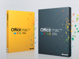
$149.99 for Home and Student version of Office
$279.99 for Business and IT Pros version of Office
http://www.microsoft.com/mac/
For as long as I have been using both versions of Word, one for Mac and one for Windows (yes, I use a Windows computer too), I have often wondered if they truly came from the same company. While they can read and write compatible files (mostly), their user interfaces have always been quite different, making it difficult to go from one version to the other and remember where all the commands are. Additionally, the two programs would leapfrog each other in features, almost as if they were competing with each other to see which could outdo the other with their latest features. And Word 2008 for the Mac seemed to completely miss the boat when it came to using some of the newer and cooler interface design elements of Mac OSX, almost as if the designers had never seen such a system. With Word 2011 for the Mac (Intel Macs only), most of that has changed.
For good or bad (your view may vary), Microsoft has made significant changes to the Word program for Mac, bringing the functionality and design in par with the Windows version. Sadly, in my opinion, this also means changing the UI to look more like the Windows version, rather than making it look more like a Mac OSX application. Also sadly, this is still a 32-bit Carbon app, which means they are not taking full advantage of the Mac software and hardware. That said, the Mac Business Unit of Microsoft has stated that this is an investment in better compatibility between the two versions, and I say, “About time!â€
For any of you who have used Word on Windows since Word 2007 may recall something they call The Ribbon interface. The Ribbon is a long strip of miscellaneous, arcane, and often confusing icons along the top of the document window that are changed by selecting one of many function tabs. The ribbon provides access to functions that few really know what all of them do or even use. Obviously, Microsoft feels that using menus is just so old fashioned, so you get multiple strips of unlabeled icons instead. Hovering over an icon gives a hint to its function, but that is a lot of hovering when looking for a specific tool. It is not all bad though, as many of the icons are similar to what you used before on the Mac (things like bold, italic, justify, etc.), but now they are arranged to match more closely to the Windows layout. But for the seasoned Office Mac 2008 (or 2004) user, they have all been changed and rearranged, and the new interface hides many of them behind tabs, often making it much harder to find the function you really need. If it really annoys you, you can always just hide the ribbon, as unlike the Windows version, the Mac makes most of the functions available in the “yesterday’s menus†at the top of the screen. Here are the other ribbon choices:
That said, for those who have moved from Windows to the Mac and really miss the ribbon, fear not, it appears almost exactly as expected in Word 2011 on Macintosh, albeit the names of some tabs are different. It seems in Microsoft’s quest to have the Mac version of Office follow more closely to Windows, the Mac team at Microsoft has followed the Windows UI design. OK, some of you may like this, especially if coming from a Windows platform, and others not so much, but a unified UI is a step in the right direction in my book. This should have been one consistent product long ago. Unfortunately for Mac users, this new interface also means that when you update to 2011, you can once again just forget most of what you have learned from the previous Office updates and changes, and get ready to learn all over again with yet another interface.
Or so I thought! Above the ribbon is another area of unlabeled icons, controlled by the Toolbar menu item under View. Here you can turn on and off Mac toolbar items you know and love from Word versions past. And you can still customize the bar as before, so you can configure your UI to look somewhat like the older Word versions if that is what you truly want. And you can do all that while still having the ribbon there to learn the new interface. There are only two old toolbars, so I quickly ran out of space, but score one for Microsoft for letting me choose one or the other, or both.
In the ribbon, you get the new and improved Elements Gallery and Office for Mac Formatting Palette, more non-Mac like interfaces to keep you busy learning HOW to use this software, rather than just using it. Familiar tabs now appear for controls such as Layout, Elements, Tables, Charts, and Review, but tabs for these functions change the ribbon icons, and you need to hunt and peck for what you want and how it works each time it changes. I found it very cumbersome to use for some time, and it really slowed down my writing at first.
Missing from all this is the ability from the last version of Word to detach your toolbars and ribbons and use them as small floating windows. I know many did not like this feature, and Microsoft seems to have gone backwards in time now to a place where many bars cross the top of the window, pushing your document into an even smaller and smaller writing space. This is especially annoying on today’s widescreen monitors that have plenty of width for floating pallets to the side of the document, but considerably less height, so I find all these many ribbons and tool bars annoying at best plastered to the top of my writing area.
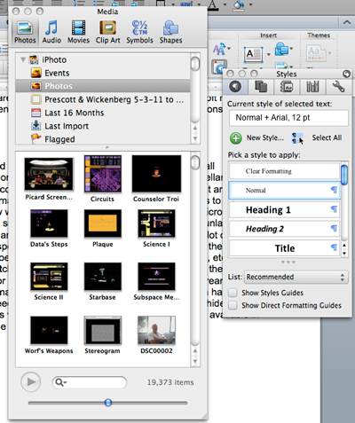
Yet, two items still show up as a small, side detached windows, and I am not sure why these remained. The Media Browser, launched from the view menu, shows up as a side window, as does a window that includes tabs for Styles, Citations, Scrapbook, Reference Tools, and a Compatibility Report.
But don’t worry, in a few weeks you will have nailed this interface, and be back up to your usual Word progress, and probably just in time for the first update, which will undoubtedly change something again.
OK, enough bashing of the UI. The real question: Can we use this new version at all?
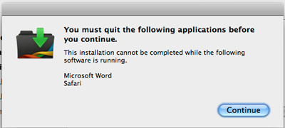
Let’s start with install. For some reason, many installers on the Mac now ask to quit Safari to continue. Microsoft Office was one of them. However, nothing installed should affect your browser, so this remains a mystery as to why it was necessary. (No answer from Microsoft on this one.) When started, the installer just starts running without warning for some time. It ran about 10 minutes or so, looking as if everything was going fine, and got all the way to the very last 1 minute remaining before it popped up the warning dialog on Safari. This means you need to stay with your machine while installing for fear of it pausing, waiting for your approval at the end.
Note that neither the installer warning dialog nor the installer window itself had a Cancel button, so there was no backing out or changing my mind once I started this install. Talk about yesterday again! This is just bad design when you cannot cancel an install, especially at a warning dialog.
Anyway, back to my review, already in progress…
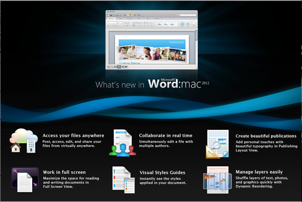
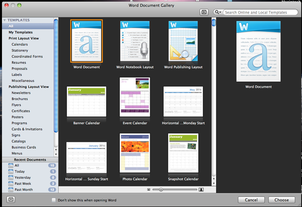
While the look and feel of Word on Mac is now much closer to Windows, in some ways, I find the Mac version more refined than its counterpart. And there are some Apple style touches that have crept in, Windows UI not withstanding. For example, a What’s New screen appears when you first launch, and this seemed quite reminiscent of how Apple might approach this program if they did it. It is customer focused and friendly. Another Apple like influence can also been seen in the new Document Gallery as well (formerly called the Project Gallery), which also has an Apple like look and feel, with elements reminiscent of Mac OSX.
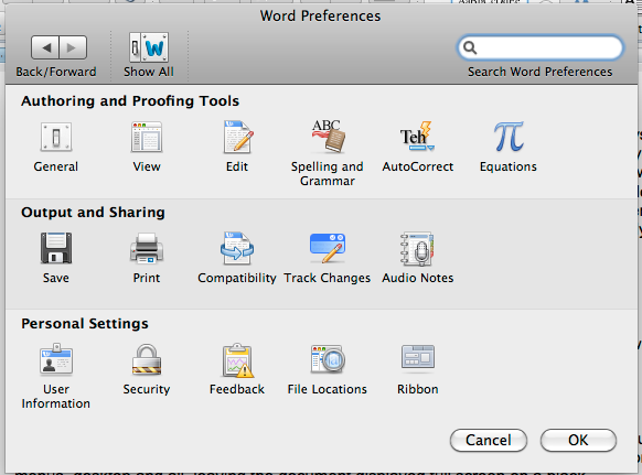
The Preferences menu also launches a window that looks much like Mac OSX’s own System Preferences window, with small icons arranges in rows, and interactions and selections working exactly like the Mac Preferences.
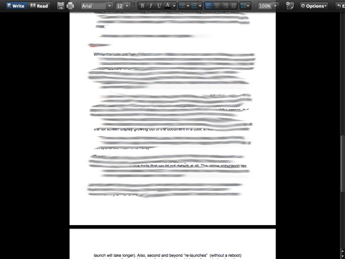
I also like the new Full Screen mode, which also feels very Mac OSX like. When you enter full screen mode, everything else on the desktop disappears, including the ribbon, menus, desktop and all, leaving the document displayed full screen on a black background. A drop down tool bar displays for a short time at the top of the screen, but slides away above the document, returning only when you move the cursor to the top, then revealing the most used tool bar functions. This is great when you need to eliminate every distraction and just get to writing. Even the transition in and out is very Apple like, with the full screen display growing out of the document in a cool, smooth zoom transition.
There is also a new Publishing Layout, which lets you design a page by placing objects on a page, and then rearranging them by dragging them about the page.
The previous version of Word for Mac tried a bit too hard to merge Windows and Mac interfaces with a combination of the mostly useless Elements Gallery, to the floating Toolbox (which I admittedly liked), to some tools that would not detach at all. Word 2008 felt random and scattered. Word 2011, on the other hand, has an interface that is much more integrated and easier (in time) to learn, and feels well integrated.
Launching speed has improved as well, now opening almost as fast as on my comparable Windows machine. On Windows, Office launches and is ready in about 5 seconds, while on my 2.4 GHz Intel Core 2 Duo MacBook, it took about 7 seconds (the very first launch will take longer as some tools are configured). Also, second and beyond re-launches (without a reboot) launched even faster, taking less the 4 seconds, which is a far cry better than the painfully long launch delays of previous Mac versions of Word. That said, the first launch after a reboot still took more than 25 seconds.
On the Mac, upon launching, you are dropped into a new gallery screen (you can disable this), which I really do not like. Typically, I just want to open a previously viewed document, and that ability is now buried under a second menu and several clicks away. I do not see the use of this window at all.
Volume license versions of Word 2011 have also brought most of the collaboration tools from the Windows version to this product. Does this mean Microsoft has finally accepted Macintosh as an Enterprise level tool? It seems so, and that may explain why this product looks more like the Windows version. Consider this Microsoft’s help in getting Macs into the Enterprise!
There is also built in collaboration support for sharing through Microsoft’s SharePoint and SkyDive services (Part of Windows Live Mesh with 5 GB of free on-line storage: http://explore.live.com/windows-live-skydrive, which works much like Dropbox).
Word 2011 even includes a collaboration communication tool to let you interact with other team members. Microsoft has also added security features (using Microsoft’s Information Rights Management of course) which gives you control over who reads and edits, when the document expires, or what each user can create. Sadly, don’t look for this in your home edition; to use these tools, you will need a Microsoft Rights Management server and a volume license edition of Office, meaning forget about it outside an Enterprise setup. Too bad really, as I often collaborate with others on documents, this would have been a great addition to the product for consumers using Microsoft’s own Windows Live Mesh service. I think they missed the boat on this feature.
Lastly comes pricing. As far as I can tell, Word is ONLY available as part of the Microsoft Office 2011 package. Missing from this version of Office is any update pricing options, but the retail price is quite fair now. Office 2011 for Home & Students is just $149.99. Gone is the restriction you must be a student to buy this edition, so home users can now legally buy this lower priced version, and this box contains 3 licenses/installs for that price. This home version contains Word, Power Point, and Excel as well as Messenger, Remote Desktop connection for Mac, and support for Office Web Apps, and comes with 90 days of tech support. A Business and IT Pros version is also available for $279.99, adds Outlook for Mac, one year of premium tech support, and Windows Share Point Services support, but contains only 1 license. You can buy directly on-line from Microsoft for the download version, or pay an additional $12.99 to get a DVD. There is a 30 day free trial on Microsoft’s website, so you can check it out before you buy.
All in all, I feel this is a good update to what has been a solid workhorse of a product. Once you get over the interface changes, you will find it performs well, is very stable (so far, not one crash), and finally brings the Mac user up-to-date with the Windows version.
MyMac rating: 8 out of 10. Needs some tweaks, but a solid product.



Leave a Reply
You must be logged in to post a comment.