Adobe Illustrator CS4 (version 14)
Company: Adobe System, Inc.
Price: $599.00
Upgrade from $199.00
www.adobe.com
Ah, vector graphics. If I am not working with actual photographs, chances are I’m doing artwork in Adobe Illustrator. I enjoy working with the program for most of my art needs. While I’m not a graphic artist, I can create some good production-type work more easily in Illustrator than I can in Photoshop.
There are some major and minor changes in this version of Illustrator, some of which I like, some I don’t, and some which seemed, at first, to break my workflow in such a way that I was pulling my hair out. It took some people at Adobe to show me the work-around, and while I appreciate it, I still find it annoying that it happened in the first place. But more on that later.
Interface Changes
Ah, tabbed windows! I actually thought I would enjoy working with tabbed windows in Illustrator, but I don’t. (I hate it even more in Photoshop) After a few days, I turned the feature off via the preference menu. Problem is, it does not stay off. I have, time after time, been dragging a window around when, snap, it pops into the tabbed interface with another open document. That’s annoying, and something I hope Adobe will address in an update soon. I also know it’s not a problem only I have had, at least according to some Adobe Illustrator boards I frequent.
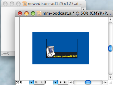
For those who don’t know what a tabbed interface means, here is an example. In the first picture, you will see one window / document open above another. (non-tabbed.)

In the second, the same two graphics, but tabbed. It very much reminds me of Mac OS 9 days with tabbed windows. I like the feature in an operating system window, but not in Illustrator. (Or Photoshop, where the same tabbed interface carries over.)
For those familiar with Illustrator, you will find many changes: some good, some bad. The ability to convert a shape (square) into crop marks has been moved to the Filters menu, which is where it should have been all along. Also, Pathfinder is now grayed out unless you actually hold down the modifier key, rather than the other way around.
Remember how oddly clipping masks worked is CS3? You could still select invisible artwork from a clipping mask, which is not usually what you would want to do. Now, not only are they hidden, but your selection tool will not be able to select that art. A nice feature. Actually, less a feature than a correcting of a long-standing gripe of mine.
Artboards – The Good and Bad
The major interface change is the new Artboard (multiple pages) workflow in Illustrator. With multiple artboards, each artboard is assigned a number, which basically uses the same type of numbering system as slices in Adobe Photoshop. This was, at least for me, confusing. Because most of my workflow revolves around web graphics, I often use slices in Photoshop, so seeing a very similar numbering / layout in Illustrator kept me guessing. I can be slow at times.
It may be confusing for some people when using Artboards in Illustrator for the first time. It is hard to wrap your head around. While the multi-page metaphor works, Illustrator does not simply lay out pages for you as Apple’s Pages or Adobe’s own In-Design does. Rather, you draw squares, creating different artboards on your workspace. Think of it more as a light-table, and you arrange different pages on the table.
Opening legacy Illustrator files can be a major problem with the new CS4 version. And it is here that I have had the most frustrating time incorporating Illustrator CS4 into my daily workflow. Inconsistencies abound, from simple relinking errors (a major problem when Illustrator went from versions 8 to 9) to broken placed PSD files with transparencies.
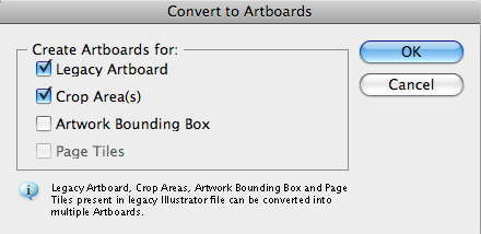
The Adobe Illustrator team was kind enough to help me work my way through the problems I encountered, but the fact remains that an average user won’t have that same level of help available to them. Worse yet, large production houses doing packaging work, and opening legacy Illustrator files, will have their entire workflow broken. Much time will be needed to either convert older files to take advantage of the new Artboards feature, or fighting with CS4 to work the same way CS3 (and CS2, CS, 10, 9, 8, etc…) did. There should be a very simple “always open legacy files in CS3 layout” preference. But, alas, there is none. Designers and production artists will find creating new Illustrator files, using the new Artboards layouts, helpful and make them become more productive if for no other reason than to have commonly needed graphics in every file (‘ala a logo). But the daunting and time consuming task of converting older files, correcting production files at every step, will quickly eclipse any real time saving Artboards will provide.
Of particular note, placed transparent PSD files with crop marks work very differently in CS4 than in CS3. For MyMac.com, I have a number of templates that I use to create our front page graphics. (with the black boxes that say “review” or “podcast”) Using these are a huge part of my online workflow. While I could do the same thing is Adobe Photoshop, I enjoy working in Illustrator more. But opening these files with the default settings makes them unusable, as Illustrator creates different Artboards for the artwork and the cropped areas. I can see no rhyme or reason for this. And while Adobe did send me the workaround, why is that even necessary?
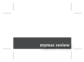
Illustrator CS3 file, with crop marks showing

Same file as above, opened in CS4.
Separations
One of the best new features, for those using Adobe Illustrator in a production setting, is the new Separations Preview. This will be a huge time-saver in high volume production houses and print shops. It is one of the last big steps in going direct from Illustrator to plate / print.
Blob Brush
This is the other new “hot” feature of Illustrator CS4, and the one I have spend next to no time using up to this point. Eventually I will write a follow-up and talk about the Blob Brush. CreativePro.com goes into great depth on this new feature. I can’t wait to find the opportunity to use it myself.
Plug-ins
I don’t use a huge number of plug-ins, and the ones I do, worked fine. But like every version of any program that uses a plug-in architecture, there will be problems as those third-party applications need to be updated. If you have plug-ins that you must use, check out its compatibility before upgrading.
You may think that I don’t like the new Illustrator CS4, what with all my gripes. I do like the program, and I think the newest version is the most significant update in a decade. Legacy files and some interface tweaks need to be fixed, sure, but nothing actually precludes me from using, and enjoying, the application. Users have been asking for multipage support in Illustrator since version 2, and we now have it. Sort of.
Speed-wise, I actually felt that CS4 runs a little faster than CS3 did on the same machine, so production houses take note.
Of more importance is the fact that Illustrator has no competition on the Mac platform, and next to none on the PC. (Sure, Window users have the less expensive CorelDRAW, but have you ever tried to use it? It’s a kludge.) Usually in these situations, where a piece of software is as essential for some entire industries, and there are no alternatives available, companies can become complacent. Adobe has not done that with Illustrator over the last three versions. A lot of designers were upset when Adobe purchased Macromedia and turned around and ended Freehand (a great application in its own right) but so far, Adobe has done itself proud with its vector-based program.
email – MyMac Magazine – Twitter – Advertise – Reviews Archive – Podcast

Leave a Reply
You must be logged in to post a comment.