
A little over 7 years ago, Mac OS X made its debut. With it were a lot of changes from Mac OS 9, including a now unalterable Apple Menu. No more could you put anything in the Apple Menu Items folder. It didn’t exist anymore. The new place where Apple said we would be able to add frequently used items was a new feature called the Dock.
Adding items to the Dock can quickly cause overcrowding however, and a lot of people simply missed their Apple menus. Several 3rd party solutions came along, most of which were docklings (which are no longer supported). In late 2001, FruitMen made its debut. It made the Apple Menu even more customizable than in Mac OS 9. Once again you could add anything you wanted, plus you could also alter what Apple put in there.
There is a dark side to FruitMenu, however. Every major release of Mac OS X has broken it because it is dependent on things in the OS that Apple says programmers shouldn’t do. Things that always change greatly when a new version of Mac OS X is released, and which changed dramatically in Mac OS X 10.5 Leopard. This isn’t completely bad. FruitMenu disables itself if you upgrade Mac OS X so it won’t cause you trouble. Upgrades to FruitMenu were always quick in coming until the release of Leopard. This time it has taken several months for the first beta to appear.
As a long time FruitMenu user, I was in an awkward position shortly after 10.5 was released. My customers were increasingly asking me about Leopard features I wasn’t very familiar with because I hadn’t upgraded. Having been dependent on FruitMenu during my day to day work, I needed to find a replacement. All of these work with Mac OS X 10.4 or higher and are Universal for both Intel and PowerPC.
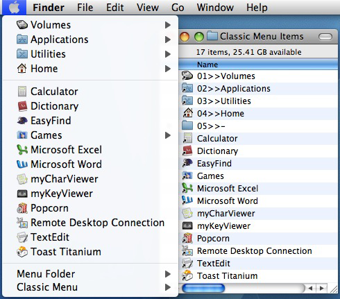
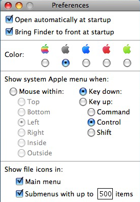
As I said in my first look, the first one I looked at was Classic Menu 2.8.1 (4 out of 5, application, $10) from Sig Software. Classic Menu is a semi-faceless background application whose “window” is an overlay of the Apple Menu. By default the standard Apple Menu is accessed by holding Control when clicking. This can be changed in the preferences to a different key or to a mouse click in different areas of the Apple Menu. Other preferences configure the Apple icon color, menu icon options, and startup (actually login) options. The “Open automatically at startup” option inserts Classic Menu as a Login Item in the Accounts system preference.
Classic Menu is the only one of these that uses the Apple Menu, but it does so without integrating it. It excels at simplicity. The majority of items are the user created things in the Classic Menu Items folder in the user’s Preferences folder. Anything, even system preferences and applications that Apple stashes in the System folder such as Software Update, can be added with an alias and documents and applications that do not need to be in a certain place can be added directly. Items can be reordered and separators added as shown using empty folders. Clicking on an item opens it, clicking while holding Command shows the item in the Finder, and clicking while holding Shift shows the item’s Info window. The remaining menu commands bring up the About, Preferences, Register, and Quit commands as well as opening, adding to, and changing the Classic Menu Items folder.
Classic Menu will open a seemingly infinite number of subfolders, which is very helpful when you use it to access mounted volumes. It is inexpensive, simple, flexible, and fairly powerful. It does show a few invisible items that it shouldn’t, such as the Network Trash Folder, but as an application it is far less prone to being disabled by a system upgrade or update.
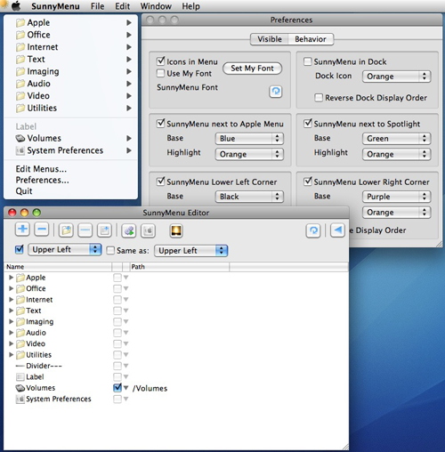
The second one I tried was SunnyMenu (1 out of 5, application, $12.88) from Light Being Software because I could use it side by side with Classic Menu since it used the upper left corner. SunnyMenu is by far the youngest of our 5 reviewed programs, having debuted only 7 months ago. I started out with version 1.1.4 with one corner menu, and now 9 updates later version 1.2.3 has 4 corner menus. It looks like the developer is working toward a less expensive alternative to MaxMenus.
The best example of my reaction to SunnyMenu is when you select SunnyMenu Help from the Help menu. A dialog appears that says “Help isn’t available for SunnyMenu.”. It’s quite rough around the edges. Features have been added fast and furious, the preferences and editor are much easier to figure out than they were in 1.1.4, but the documentation is still lagging behind.
SunnyMenu is the only one in this group that has its own Dock icon and menus. This makes for some behavioral oddities. If the Dock icon is active, clicking on one of the menus brings you out of the application you’re in and into SunnyMenu. If you change your mind and don’t click back in the window you were working in, you may find yourself in an unexpected place. Programs like this work best when the interface is at a minimum with no menu bar or Dock icon. The Dock icon can be turned off in the preferences, but if you open the menu editor the Dock icon reappears and will not go away without quitting SunnyMenu. Another strange thing is looking through several sub-levels of folders some invisible items show (AppleShare PDS did) and some visible items do not (how can the System folder not?).
When first run, the upper left menu auto populates with many of your applications, sorted into Apple, Office, Internet, Text, Imaging, Audio, Video, and Utilities folders. Below this are the Edit Menus, Preferences, and Quit commands. The other 3 corner menus and the Dock menu are unpopulated. Within the menu editor there are buttons to add and subtract items and they can be reordered by dragging. Other buttons can add dividers, labels, and active applications and System Preferences menu items. There is also an option to make one menu mirror another, but in using this the application frequently froze. The preferences allow you to activate and deactivate the individual menus, change their colors, and set options for menu icons and fonts.
SunnyMenu is very much a work in progress. The developer updates it frequently and I expect it will eventually be a good application. Right now it has too many annoying quirks to recommend it.
XMenu 1.8.1 (2.5 out of 5, application, FREE) from Devon Technologies was next on my list because it’s free. Free is good, but in this case you get what you pay for.
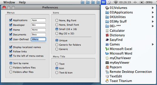
XMenu places as many as 5 menus on the right side of the menu bar: Applications (the only one by default), Developer, Home, Documents, and User Defined. The menus are turned on and off in the preferences, which are accessed by holding down the Command key and clicking on any XMenu menu. The first four, as the names suggest, are not configureable and show the contents of the respective folders on your hard disk. The XMenu items folder, located at /Users/yourname/Library/XMenu, contains the things that appear in the User Defined menu. Anything can be put in the XMenu items folder (aliases, applications, documents, etc.), which basically renders the other 4 menus pointless. I mean, why activate the Applications menu when you can just put an alias of it in the User Defined menu?
There are a couple things about the User Defined menu that are frustrating. Other than a preference that controls whether folders are before, after, or sorted alphabetically with files, the items can’t be reordered. You’re stuck with alphabetical sorting. Also, on the startup volume you can go down an infinite number of subfolders but on removable volumes you get only the top level and no folders. Some invisible items (the etc, tmp, and var folders for example) that shouldn’t be are visible. Dividers can’t be added either, but that’s minor in comparison to not being able to reorder.
Other preferences set if the menus appear to the left or right of Apple’s menu extras, icon and font options for the menus, and menu title options. Other commands accessible with the Command key are About XMenu, Check For Updates, Open Folder in Finder, and Quit. There are also modifier keys for the menu selections. Selecting a menu item while holding Control shows the item in the Finder and selects it, Shift shows the original of an alias (or behaves exactly like Control if it is not an alias), Option shows the the original and hides the current application, and Command shows the Info window for the item.
XMenu works well if you don’t mind the limited sorting options compared to Classic Menu and the other little quirks. Heck, the price is right.
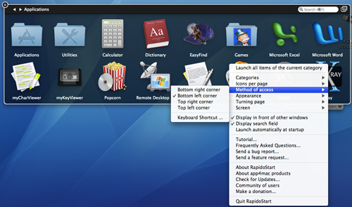
Another free option is RapidoStart 2.1.1 (4 out of 5, application, FREE) from app4mac. Unlike the others, this one does not create menus. It launches a translucent palette via a green dot icon in the lower right corner of your display, the location of which can be changed in the preferences. F1 through F19 (no modifier) can also be set as a keyboard shortcut to bring up the RapidoStart palette. When open it looks a lot like the grid view of the Stacks feature of Mac OS X 10.5. Even though it doesn’t do menus like I was originally looking for, it’s appearance is so appealing I wanted to evaluate it also. RapidoStart has the nicest appearance of all the software being reviewed here.
When first launched, RapidoStart immediately goes into a tutorial that tells you everything you need to know about how to use, setup, and configure the different options. This is a most impressive and helpful feature. You can go back to the tutorial anytime by selecting it in the RapidoStart options menu at the lower right hand corner of the palette. Items are added by dragging them in from the Finder just like the Dock or by clicking an empty space, bringing up a dialog to add an item. Anything (applications, folders, files) can be added. Rearranging the icons is a little different, however. When rearranging, icons swap positions rather than sliding over like the Dock. Like the Dock the names can’t be changed, so if you add something like a system preference you could end up with some funny names. If a palette is full when you add an item, another page is added and green dots appear on the sides to turn the pages. To remove an item, Control click or right click an icon and Choose Remove from the menu that appears.
There are several other configuration options. The number of icons per page can be set to 8, 16, 32, 48, or 64 and RapidoStart will not allow you to select a size that is too large for your display. The appearance and page turning effects can be changed. A check to launch automatically at startup, plus a few other options and access to web based support and updates.
RapidoStart is a great compliment to the Dock. Where you might put your most frequently used items in the Dock, you can use RapidoStart to launch other needed items without overloading the Dock with icons. There’s no limit to the number of things you can add, and you can create additional categories. Thankfully with no limits the RapidoStart palette includes a Find field. Since it is a palette, there is no submenu access like the other programs.
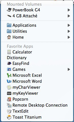
The thing that separates Proteron’s MaxMenus 1.5.1 (4.5 out of 5, preference pane, $29.95) from the rest is power, beginning with a very well configured set of defaults. At this point this threatens to turn into a review of only MaxMenus, but it just has so many more features than the others. It has keyboard shortcuts, drag and drop menus, grab and drop menu items, and there is a very thorough 12 page manual that opens in TextEdit by clicking the question mark in the lower left corner of the preference pane (printing this is definitely recommended). These are features that are not in any of the other software featured here.
MaxMenus is a preference pane. Like many, it’s double click to install and it will ask if you want it available to all users or just your account. The master on/off switch is in the Options tab. Once running there are four colored menus, one in each corner, and another that is triggered with Command-Option-Tab which shows currently running applications. The upper left corner, green by default, is the Applications folder. Control or right click to get the Applications (Mac OS 9) folder, if present, and Command click to get the Utilities folder. Blue in the upper right corner shows open applications, mounted volumes, and the Desktop. Control (or right) clicking shows your Home folder, and Command clicking shows Desktop (Mac OS 9) if present. The lower left red menu is your Documents folder. Right or Control clicking displays your Music folder and Command clicking displays Pictures and Movies. The last corner, lower right, is yellow and shows the user Favorites folder. Control (or right) clicking shows the System Preferences. Colors can be changed if you wish.
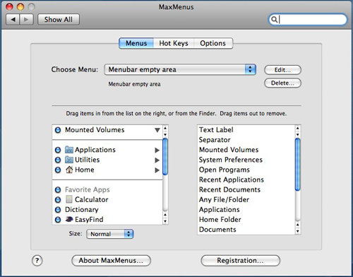
MaxMenus’ menus can be configured any way you like in the Menus tab. You can add files and folders to existing menus by dragging them from the Finder into the left side of the preference pane or by using the Any File/Folder option on the right side. MaxMenus built in options, such as text labels, separators, system preferences, mounted volumes (submenus go as deep as there are things to go to, but some invisible items can show), open programs, and all of Mac OS X’s standard folders and a few other items (just too many to list here) can be added by dragging them from the right side to the left. Folders can either show a text label with the contents in line (triangle in the pref pane flipped down) or as a submenu (triangle flipped right). Menu items are rearranged by dragging them up or down and removed by dragging them out of the System Preferences window, resulting in the standard Mac OS X “poof”. There are six menu icon and font size options. The default is Normal, and there are also Small, Big, Bigger, Huge, and Prodigious. Double clicking on a menu item brings up a selection of options for that item, especially for folders. Icon or no icon, customized name, hide documents, and folder access and sorting options.
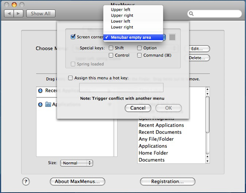
New menus are added by choosing New Menu… from the Choose Menu popup. From there you choose the menu location (with modifier keys if needed) and/or hot key that triggers the menu. In addition to the corners of the main display, menus can be added to the corners of any secondary displays, to the empty middle section of the menu bar, and menus that trigger at the cursor with a keyboard combination just like the default Command-Option-Tab menu. MaxMenus will tell you if the trigger you are setting up is already in use by an existing menu to prompt you to choose something else. With all these combinations you can literally create dozens of menus.
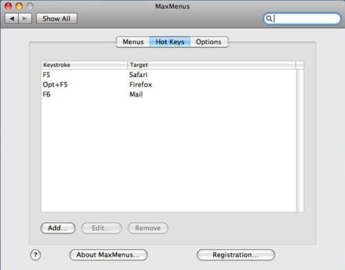
Menu items can be assigned hot keys directly in a menu by hovering the cursor over the item and pressing the key combination you would like to use. They can also be deleted by hovering over an item that has a hot key and pressing Delete. All configured hot keys are listed in the Hot Keys tab, where they can be changed or deleted. Hot keys aren’t restricted to the menus. Anything can be given a hot key in the Hot Keys tab by clicking Add, making your choice, clicking in the Hot Key field, then pressing a key combination. The hot key for an item will appear in any menu the item is in.
The drag and drop feature can be used to move, copy, and open files. When you drag a file to a menu, you will see the cursor change to a pointing white hand that signifies drag and drop mode. Let up on the mouse button and the MaxMenus menu will open, allowing you to choose a folder to copy or move the file into or an application to open the file with. Two of the modifier keys used in the Finder (Option to force a copy and Command-Option to make an alias, but not Command to force a move) also work in MaxMenus. Drag and drop also works with the keyboard triggered popup menus, but not the empty menu bar menus. Simply drag and hold on the file then press the keyboard combination.
The opposite also works to copy, move, and open files via their menu items with MaxMenus’ grab and drop feature. To grab a menu item, open the menu and click and hold on the one you want then press Command-G. You can then drag the item into a Finder window, onto a Dock icon, or even onto one of MaxMenus’ menus just as if you had picked up an icon in the Finder. There is also an extensive list of keyboard commands in the manual that take effect on menu items, such as delete, get info, and several others.
These five programs provide a good variety to choose from. If power and flexibility are at the top of your list, then MaxMenus will probably work best for you. If reliable simplicity at a low price is what you want, Classic Menu is a great choice. RapidoStart is the one if you prefer a palette to menus, and it’s free. XMenu works if you’re looking for something that is free and are okay with its limitations. SunnyMenu has a lot of potential, but too many issues to recommend it at this time.
Classic Menu 2.8.1 – 4 out of 5
Pros – Inexpensive, simple, and flexible.
Cons – None really, but it does cover the Apple menu which may bother some.
MaxMenus 1.5.1 – 4.5 out of 5
Pros – Keyboard shortcuts, drag and drop menus, grab and drop menu items, good defaults, easy, powerful, very flexible, and excellent documentation.
Cons – Pricier, but the feature set justifies it.
RapidoStart 2.1.1 – 4 out of 5
Pros – Tutorial on first run, simple, free, and expandable.
Cons – Rearranging icons swaps instead of slides, can’t edit names.
SunnyMenu 1.2.3 – 1 out of 5
Pros – Auto populates on first run and nice menu editor.
Cons – Too many interface annoyances, buggy.
XMenu 1.8.1 – 2.5 out of 5
Pros – Simple and free.
Cons – Very limited sorting options.
email – MyMac Magazine – Twitter – Advertise – Reviews Archive – Podcast

Leave a Reply
You must be logged in to post a comment.