One of the upgrades that I looked most forward to for my business was Apple’s new Mail Stationery feature. I’ve always wanted a way to send graphic emails as opposed to simple text-based letters. I’ve tried using various programs – both web-based and 3rd party applications, but all of them were too time consuming for simply creating a few graphic personal or business letters that I wanted to do right within my Mail application.
Image heavy/graphic HTML emails, however, can be a turn off for some computer users who may have low storage email accounts. And recipients of rich text emails may not always get the email has it was originally formatted. But graphic emails are often more appealing for certain types of letters and information. I would say nearly 80% of the emails I receive these days have graphic content. A well done attractive email with graphic content can often get the message across ten times faster than mere words. It’s like the old adage says, a picture speaks a thousand words. One the other hand, a poorly done graphic email can also be a turn off for many readers because it’s weight down with graphic and obscuring the point of the message.
So what do I think of Mail’s Stationery now that I have the ability to finally create graphic emails on the fly? Well, I have mixed reactions.
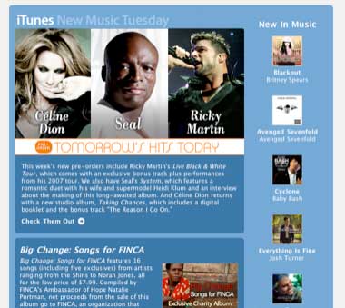
Like many of you, I get graphic emails from Apple that look like this:

This Apple newsletter is well laid out with graphic links and strong font styles. If I were interested in the content, I’d certainly click through to one more of the items included in this email. But this is not the type of stationery template that comes installed with Mail.
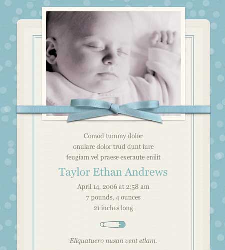
One of Mail’s Stationery templates looks like this

Take another look at it. There’s not a Mac Leopard-using parent in the world who wouldn’t want to use this template to announce the birth of their newborn. All they have to do is click the New Message button, select Show Stationery in the menu bar of the email, and locate the template. They don’t have to open iPhoto to locate their newborn’s photo. In Leopard’s Mail, they simply click the Photo Browser right next to the Stationery browser and locate Bobby’s cute week old digital image. Next they add a personal note, a few email addresses to the message, and they’re good to go. And who wouldn’t want to receive this type of email? Most recipients of this e-letter won’t have to open an attachment of baby Bobby’s photo because they will see nicely embedded within the email. Now, that is sweet.

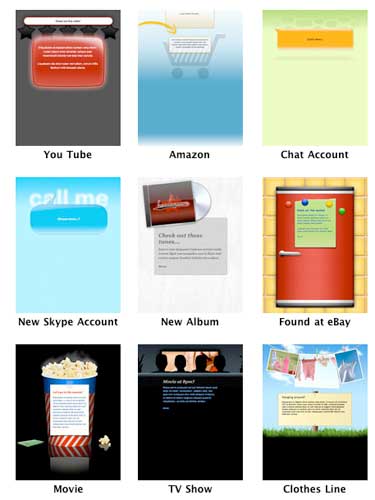
Apple provides about 32 similar templates for all types of occasions, e.g. birthday, announcements, sentiments. (Incidentally, I’m surprised to see that there are no templates that match the designs of iWeb templates.) The templates are colorful, typically playful like in design, with appropriate headings to get you started. Of course, you can customize the text content and picture placeholders of the templates. Though most of the body text is formatted with a center alignment (which is not a good format for long letters), all that can be changed by simply clicking Format>Alignment>Center Alignment in Mail’s menu bar.
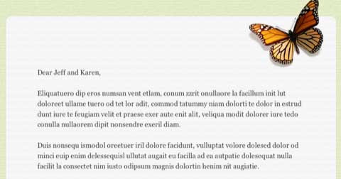
What you can’t change in the templates are their graphic elements. You can add photos in designated places, but you can’t change the color of the template’s background or borders. If for example, you want to exchange the butterfly graphic in the template below with say your company logo, that can’t be done. You’ll just have to find a different template. If you want had a linkable graphic, you’ll also be disappointed.

Now when I say you can’t change the templates, I mean that they can’t be changed within Mail. But any long time user of Macs probably will know that you can hack your way into the templates and make changes that way. With some background knowledge in HTML coding and with a graphic image editor like Photoshop, you can further customize or create your own templates. One of the better written how-to instructions for doing this can be found on Josh Pigford’s site, the theAppleBlog. Another blogger, Jeff Turner, has posted a simple down and dirty business Letterhead template that you can download and put into the mix.
Stationery Packs
For those desiring more templates, software developers of Equinux have already come out with their new product, Stationery Pack ($29.95; free trial version) , a collection of over a 100 stationery template options for Mail. You don’t have to install the entire pack of templates at once. You can access and install from the special Stationary Pack application that keeps them sorted according to categories and keywords. Once inside installed in Mail you can select and store your favorite templates in one place for quicker access.

Those who grow to like Mail Stationery templates will no doubt want these extra choices. I already have my eye on a few for my business. But I have to admit, I found it interesting that Equinux didn’t use one of its own Stationery templates to announce their new product. They used a more fully featured rich text email that contains graphic links, among other things. That’s not a swipe on Equinux. I like Equinux’s templates. I’ve used their iSale templates a few times for my eBay sales. But I point out the difference to further illustrate the limitations of the Stationery feature. There is room for customization. And I’m sure with further upgrades, Stationery will become an even greater tool for home and business users, especially providing the latter with a personal edge in its communication. I’ve already started using a few templates in my correspondence and haven’t heard any complaints.
Mail’s Stationery is just one more way that Apple is helping us express ourselves in creative ways.

Leave a Reply
You must be logged in to post a comment.