![]()
Inspecting the Inspector (expect the unexpected)
One part of iWeb that you’ll get to know very well is the “Inspector†window. This box is what makes almost all the changes behind the scenes. iWeb relies on this box and its sub-windows for almost everything you’ll need to do beyond dragging and dropping graphics and text boxes. So let’s talk a bit about the Inspector. Please note that the Inspector I’m talking about is the one for iWeb 2 (part of the aforementioned iLife 08) which added a few tricks not available in iWeb 1 (iLife 06).
The Inspector window has several tabs on it, each which performs various tasks. You can bring it up (if it isn’t already there) by using a menu command or by hitting the “Inspector†icon at the bottom of your site window.
Site Tab and Site
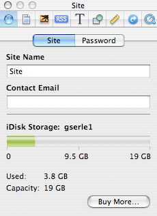
The first tab is the “Site†tab. This has two buttons on it; “Site†and “Passwordâ€. Under the Site button, you can name (or rename) your site, publish your site to a group, enter your email address, and see how much room is left in your “.mac†iDisk account.
Password
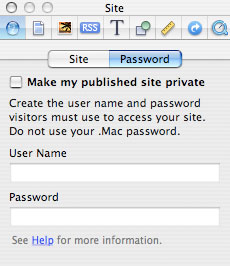
The Password button allows you to make your site private by adding one (and only one) name and password for access. It tells you not to use your .mac password and this is probably a good idea. The two most important parts here are your site name and your email address. Your site name is what will be listed when you upload it to your “.mac†account or publish the site to a folder. Your email address is the one that will be used if you use the “Send Email†icon anywhere on your site. You can naturally use whatever icon or text that you wish and have it link to the email address (or addresses) of your choice, but using the iWeb email icon makes it very simple and it’s one less thing to think about.
Page Tab
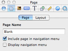
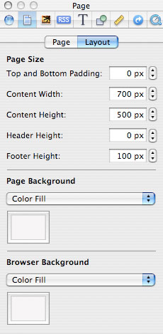
The second tab is the “Page†tab. Like the Site tab, it has two buttons on it labeled “Page†and “Layout†The Page button has a field to name each page in your site and whether or not you want it show up in iWeb’s default navigation bar. If you’re making your own navigation window (which I’ll tell you how to do later), uncheck it for each page. Under the Layout button, you can determine the width and height of the page along with the height for your header and footer.
With Layout, you can also select a background color for the page (including gradients which can look pretty cool) or choose an image. Choosing a color will bring up a different window with several different options for choosing colors. While you can choose between millions of different shades, the best bet is to select the simple crayons or web safe color icon at the top. Choosing an image gives you several other options including tiling (if the graphic doesn’t fill the page, it will be repeated until it does) or stretching (which will distort the image which can have its own pluses or minuses). Remember that iWeb does not make any changes to the image itself, so you may want to open it in a graphics program to reduce its opacity to more easily allow the rest of your content to show up without distractions. The last option here is the Browser background color which adds whatever color you choose to any overlap in size between the pages you’ve created and the actual browser window as selected by whoever is viewing your site.
Photos Tab
The third tab is the “Photos†tab. Going with three for three, it also has two buttons, “Photos†and “Sideshowâ€. The first button (Photos) allows you to select your photo file size…kinda. The only real choice you have is whether or not you want the photos to be small (allowing for faster downloads with some degradation of picture quality) or a few choices up to and including full size. This is also the first instance of where you run into Apple’s way of allowing for others to be notified when you’ve made changes on your photo pages by allowing them to subscribe to your site with RSS (Real Simple Syndication). If you say yes, then a small icon is put on your photo pages that a subscriber can hit and he or she will be notified in their browser bookmarks when new stuff appears. Maybe. If the person that wants to subscribe uses a Mac, then no real problem. The two most popular browsers for the Mac (FireFox and Safari) both support RSS and will drop a notice to you the next time you use them. Windows users using FireFox should also have little to no problem. Internet Explorer users MAY have a little problem using the stock version of IE before version 7. Those people will need a dedicated RSS Reader to keep up with your site.
Back on topic, this tab also is where you allow or disallow anyone from making comments on your pics of your Aunt Betty at the last family reunion (or whatever). The comments do not show up on Photo or Album pages, just when you select individual pictures. These seems a little weak to me and not particularly well thought out and awkward. You can also allow attachments (perhaps other people posting pictures of their own on your site), but this makes me nervous and I’m not going to do it until I get it a bit more figured out on the security end of it. Both the “Photos†and “Albums†iWeb pages use these settings.
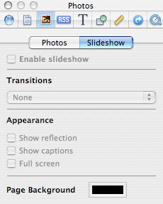
The second button is the “Slideshow†one. If you hit the checkbox that says “Enable Slideshowâ€, you can determine what transitions will occur in between each photo when the visitors to your site hit the “Play Slideshow†icon in any photo page. If you have played around with iMovie, you’ve seen these transitions before. Which one you choose is a matter of taste. You can’t determine how long each image will be onscreen before the next picture blasts its way into the foreground however. Other selections here include “Show Reflection (a slightly faded mirror image of the photo)â€, “Show Captions (your titles for each image)â€, and “Full Screen (whether or not you want your images to show in…um…full screen)â€.

Blog and Podcast Tab
The fourth tab is the one to set some of your RSS (as said before Real Simple Syndication) settings. If you look at the default “Blog†and “Podcast†pages, they are remarkably similar. Each has a “Main pageâ€, an “Excerpts†(or posts) page, and an “Archive†page. I’ll go into more detail later, but here is a brief description of these three pages. The Main page is the page that you can give a description of what the viewer will typically find in your blogs or podcasts and this is also where iWeb puts the RSS badge for your content. The Excerpts page is where you’ll actually create your content and the Archives page is where someone can go to look at all your past submissions.
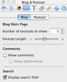
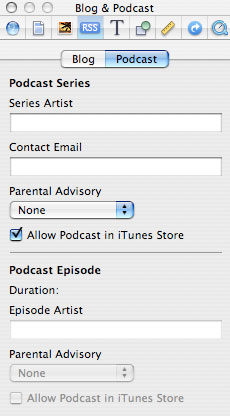
Under the Inspector, you have two buttons to choose from yet again. The “Blog†button (which also works the same for podcasts) has settings for how many excerpts you want to show and how long they will be on the opening or main page for your blogs or podcasts (the default being 5), whether or not to allow comments or attachments, and whether or to display a “Search†field. The Search field isn’t a connection back to the web for Google, it only searches your site. The “Podcast†button allows you to enter the name (typically your own) of the podcast series creator, a contact email, whether or not you want to set a overall parental advisory for your podcasts, and asks you if you want to be able to post it in the iTunes Music store (.mac only). Each podcast created can be attributed to an “Artist†and have a Parental Advisory of its own and it again allows you to include it or not at the iTunes store.
Text Tab
Next on the Inspector hit parade is the “Text†icon. It should probably come as no surprise that this icon is mostly dealing with the written word as created for your site, though it does do a few other things as well. All text created for an iWeb site must be within a text box. How that text in those boxes look is determined here. You can change some other things about the box itself elsewhere. Don’t worry, we’ll get to it later (tired of me saying this yet?) Breaking ALL the rules so far, this part of the Inspector has not two, but three buttons.
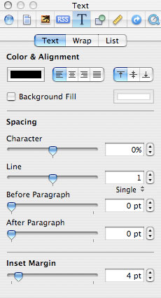
The first button is simply labeled “Textâ€. From here you can change the color of the text itself, if you want it left, center or right aligned, and what color if any you want the background filled for the text box. The controls for spacing your text are also here and what kind of margins you want to choose. These are a matter of taste, so when you start to actually create your site, play with them to your heart’s content.
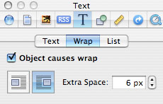
The next button is called “Wrapâ€. You can insert a graphic into a text box (explained later) and decide if you want the text within the box to flow to the left or the right of this graphic and how many spaces there will be between the graphic and your text.
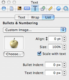
The last button here is labeled “Listâ€. If you’re a big fan of creating lists, you will love this section. Here you can choose what bullets or numbering you want, or even select a different graphic of your own. Align the bullets and resize them however you desire and even scale it. The bullet and text indent controls are here as well.
Graphics Tab
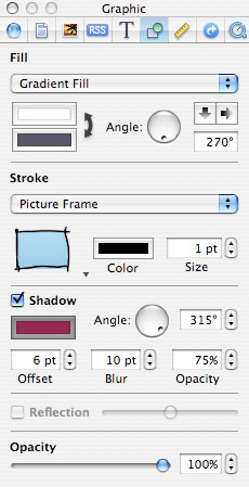
This next one is a personal favorite. It’s the “Graphic†icon. It’s a bit misleading as far as the title goes because the functions here work with more than just graphics, but text as well. So, as I’m explaining these, don’t just see them in relationship to pictures, but individual words and text boxes as well. This really swells up the kinds of effects you can easily do in iWeb. OK, no more cheerleading, let’s talk about what it does.
The top uppermost section has your “Fill†functions. Solid colors, gradients, and a few other tricks live here. Change their orientation at 90 degrees a push in either direction or use the “Angle†spin wheel for a little more control. Keep in mind that the spin wheel doesn’t change the orientation of the box, just what images or colors you’ve placed inside.
The next section is for unknown reason called “Strokeâ€. I guess calling it Frame wasn’t sexy enough for Apple. No matter, adding a frame to a text, picture, or graphic box is what this does. Choose from a few different types; change the color of the frame and even its pixel size from right here.
This is followed by â€Shadowâ€. It does what you might expect by adding a drop shadow behind whatever type of box you might have on your page. Change the color, the angle of the shadow, its offset, blur, and opacity all with a few clicks. You can also have it be a reflection of itself instead of a shadow.
Last bit is overall opacity. Maybe you want the image or text dimmed to allow for something else to shine on top of it. This is where you can do this. These easy to use controls really give you a lot of options for page layout, especially if you’re trying to get away from the standard Apple iWeb templates.
Next time we’ll look at the rest of the Inspector Windows and I promise right after that we’ll make some web pages.

Leave a Reply
You must be logged in to post a comment.