It’s finally here! The final part of the Finder Window article. This week’s installment will discuss how to use and customize the Toolbar.
The Toolbar
As I mentioned before, the top of the Finder window is called the Toolbar. The Toolbar can help you navigate through windows, and it also is where you can change how applications and files are presented in your windows.
By default the Toolbar looks like this:

On the left are Backwards and Forwards buttons. These act just like the corresponding buttons would act in a web browser. However, instead of going to a website you were just at, you can navigate to folders you just visited.
Next is a set of three buttons. These buttons control how applications and files are presented in the window. The first gives you the standard icon look. The second presents everything in a list format. By click the arrow next to the folder, that folder’s contents will be presented underneath that folder in list form. The third will present everything in a column format. Here, clicking a folder will show you its contents in the next column over.
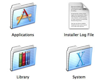
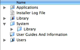
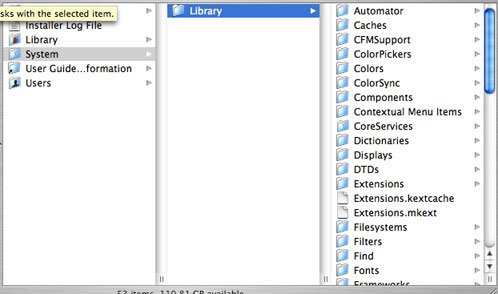
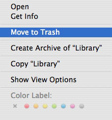
We then move to a drop down menu. This drop down menu will change, depending on the folder you are in . Options can range from sending an item to the trash, to making a new folder, to opening an application.
On the far right of the window is a search field. If you are looking for a file, you can type the file’s name in the search field. Press return. Depending on your Spotlight settings, you can even type some text from a document to be searched for.
Customizing the Toolbar
If the default set of icons on the Toolbar is not enough for you, you can add more items by going to “Customize Toolbar†in the View menu.
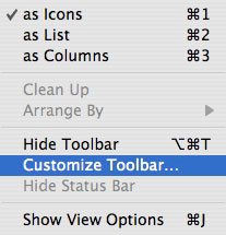
After choosing this option a window will drop down. In the window will be several more icons that can be added to the Toolbar. To add an item, click and drag it to your Toolbar. When space is made, let go, and it will be part of your Toolbar. To remove an item, drag it off and let go. It will disappear in the “poof effect†that I mentioned above.
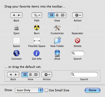
You can also choose how items look in the Toolbar with the menu in the lower left of this window. Here you can choose to only show the icons, or only show text, or to make the icons smaller.
When you are finished, click done. You can always go back and make changes if you change your mind.
At the Top
Above the Toolbar are a few useful tools, as well.

On the right is your window control buttons. These buttons expand (green), minimize (yellow), and close windows (red). I have discussed these before, so I will not go into further detail.
In the middle is the name of the folder. This is more than just a name. Clicking the name with the Apple Key pressed will show you a list of folders from where the current folder cam. Clicking one of these folders will instantly send you there.

Finally, on the very right is the “Show Toolbar†button. Instead of choosing the option to show or hide the Toolbar from the View menu, you can just click this button. It does the exact same thing.
Now you have one more way to customize your Mac OSX experience.
Did I leave something out? Do you have an idea for a future Macspiration article? Leave it below or send me an email.


Leave a Reply
You must be logged in to post a comment.