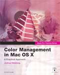
Color Management in Mac OS X: A Practical Approach
by Joshua Weisberg
Apple Pro Training Series / Peachpit Press
ISBN 0-321-24576-8, 381 pages
Includes CD with project and lesson media files

I am not happy with any previous methods used to match color from screen image to printed output. A serious investment in hardware and software is often necessary to make sure “what you see is what you get,†with reliability and consistency. Photographers and digital artists worldwide are frustrated, and so are my students and I.
Color Management in Mac OS X begins by introducing readers to concepts such as “gamut†and “rendering intents†that are defined and explained with detailed text, screen shots, and high-quality illustrations. From the opening chapter, we understand this is a serious instructional text geared to teach Macintoshers to use input and output color profiles to achieve superior results. Apple provides ColorSync for supported applications, and imaging applications (such as Photoshop) have their own capabilities.
Custom display profiles are created using special equipment that is similar to what serious darkroom photographers use. Digital camera, scanner, and printer profiles can be tricky to set up. Special applications and Photoshop plugins exist for this purpose.
Trial software is included to help readers begin the process. Over 60 pages are devoted to custom profiling, which is essential for attacking what follows in Color Management in Mac OS X.
Author Weisberg calls Adobe Photoshop “The Starting Point†for “Color Managing Images,†in Lesson Five, and this is where my prior knowledge begins. Apple’s Image Capture application can assist with scanner imports, as can a variety of other proprietary importing tools. Digital Camera RAW falls into this category.
The next hefty chunk of the book concentrates on achieving top-notch prints, beginning with soft (simulation) and hard (printed) proofs. Again, Photoshop is Weisberg’s designated software. “Managing Color Proofs†gets its own lesson, which may be worth a third of the cost of Color Management in Mac OS X.
Did you know that all Adobe Creative Suite apps “share a color-management implementation know as the Adobe Common Color Architecture� I didn’t. Standardized prefs are accessible by each component of the Creative Suite: Photoshop, Illustrator, Acrobat, InDesign, and GoLive. Yippee.
Chapter Eight plunges into QuarkXPress’s color preferences, with a goal of color managing all elements on a printed page. Not being a Quark user, I can’t comment on this unit, but it’s as detailed as all the others. The remainder of the book deals specifically with color accuracy on the web, in digital video, RIP workflow, PDF files, and a jumbo chapter on PDF file color management.
Every tutorial lesson begins with the approximate time required to complete it using the book and its included CD images. Writing is clear and concise throughout. If you take seriously your color matching, you should set time aside every day to immerse yourself in the wisdom included in this book. Color Management in Mac OS X covers a lot of terrain in an approachable manner that invites rather than repels readers. I’m going to begin at the beginning again with a goal to be the best “color manager†I can.
4 out of 5 is our MyMac.com rating. The book succeeds in large part by staying with the general rules and techniques instead of micro-managing individual images, and for this approach we applaud the author and publisher.

Leave a Reply
You must be logged in to post a comment.