System 10? More like System 6!
One of the surprising things about the OS X System Preferences panel is its similarity to the Control Panel in the early versions of the Mac operating system, up to System 6. Both are single panel devices which use a buttons to change the contents of that panel to display specific sets of controls. For those that don’t remember (or never saw) System 6, the Control Panel was accessed via the Apple Menu. It consisted of a palette with a series of buttons along the left hand side that changed the contents of the rest of the panel. Below is a screen shot of the Control Panel taken from my 1987 vintage Mac Plus; you can see the General, Close View, Keyboard and Map buttons along the side. The panel is displaying the General fields, allowing the user to configure things like the desktop pattern and volume.

System 6 was very different to its successor, System
7, where there
are numerous little panels and applications that apart
from living
together in the Control Panel Folder otherwise ignore
each other.
This is, of course, the same with other, essentially
System 7-based
operating systems, OS 8 and OS 9. Now take a look
at the System
Preferences panel in OS X. There are many more buttons
of course, but
press any one of them and you get the specific panel
required. Though
you don’t have all the buttons visible all the time,
some of them
are, as can be seen below.

So What’s New?
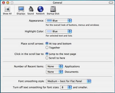
The System Preferences have been updated rather than
radically
changed. Many of the preference panels are unchanged,
such as the
Desktop, Dock, Monitors, Network, and Date & Time.
Others have been
tweaked a little, with extra features. The General
panel now has
better-explained font smoothing controls, so that
you can set
anti-aliases to suit specific monitors. Screen Effects
can show a
slide show of pictures from your .Mac account and
has a very pretty
abstract pattern screensaver module called ‘Flurry’.
There are a few cosmetic changes to look out for
as well, where
panels look a little different but are essentially
the same as in
previous version. The My Account panel offers some
new identity
pictures, and the Keyboard and Mouse panels have new
icons. Instead
of the dark grey images of the earlier USB keyboards
and mice, the
icons are now the same snowy-white of the latest iMacs.
Despite these
makeovers, these panels work just as before, which
in the case of the
Keyboard panel is not perfectly. There is no way to
disable to
default function keys on the iBook and PowerBook keyboards,
where F1
dims the screen, F2 brightens the screen, etc. If
you have any
applications that use function keys (like Photoshop
and Dreamweaver,
as well as plenty of games and flight simulators),
you’ll know how
annoying this is. There is a workaround, incidentally:
reboot in OS
9, and use the Keyboard control panel there to switch
off the
function keys. Amazingly, this behaviour will be carried
over into OS
X.
Some panels have been significantly improved. Energy
Saver is much better, a blessing for iBook and PowerBook
users. Besides the usual sliders for setting the time
for when the display dims and then computer goes to
sleep, the panel comes with a variety of useful presets.
These allow the user to quickly optimise the settings
for performance, DVD playback, presentations or battery
life. The Internet panel (inevitably, perhaps) contains
.Mac registration information and keeps tabs on your
iDisk settings and disk space. This panel also allows
users to sign up to .Mac and buy more iDisk space
if they want to. More traditional web and e-mail settings
are also stored in the Internet panel. The QuickTime
panel is part of the QuickTime 6 package, which will
require a new registration to unlock its ‘pro’ features
even for owners of previous QuickTime Pro owners.
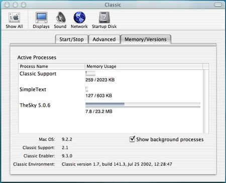
The Classic panel has been significantly enhanced,
in keeping with the overhaul of the Classic Application
Environment, which seems to me to launch faster than
before. The user can observe all the running applications
and see their memory allocations and use, just like
the “About This Macintosh” window of old.

There is only a single new preference panel, the
CD/DVD panel. This allows the user to assign applications
or actions to these media. For example, you could
have Toast launch when you put in a blank CD, but
iTunes for a music CD.
Final Thoughts
Jaguar isn’t really any more configurable that previous
versions of
OS X. Things are tidier, easier to use, and perhaps
a little deeper
in places, but otherwise this aspect of System 10.2
is very familiar.
The fact that System Preferences are, frankly, a bit
dull hides the
fact that here is the place where you can make your
OS X experience
so much better. Switching down the fancy features
of the Dock speeds
slow computers up a bit (turn of magnification, and
don’t use the
Genie effect). Reducing the colour depth of the screen
makes a
difference too (unless you are doing serious graphics
work, thousands
of colours should be plenty). Classic is the place
to make big
savings. Trimming the extensions back by launching
Extensions Manager
makes Classic launch faster at zero cost, since some
extensions, like
the Network and AppleTalk ones, are ignored by Classic
in favour of
OS X’s networking. The same can be said for the DVD
extensions. DVDs
and Firewire devices work so much better in OS X that
you probably
won’t want to use them in Classic, and their extensions
can be
switched off. Practically all Control Panels are obsolete
as well,
since OS X takes care of the user interface, TCP settings,
monitors
and peripherals. You really can’t do much harm in
System Preferences,
so it is well worth exploring. Have fun!
– Dr.

Leave a Reply
You must be logged in to post a comment.